Structure
After several conversations with the organization's leaders about their vision for the new site, many themes emerged, namely:
1. The new site should be beautiful and very clean.
2. The new site should be easy to update and keep current by both developers and content writers.
3. The new site should accommodate custom tools that had been previously built.
4. It was critical for the new site to tie together the political and social mission of the organization as well as function as an eCommerce store.
eCommerce Flow
Getting the eCommerce flow right was the highest priority due to the timing of the redesign. The new site would be launched before a major fundraising campaign.
Below is a screenshot of the previous site. Note first the order of tasks - pick a seller > pick up or delivery > selection > donation > purchaser information > payment information. The order is determined due to certain dependencies in the site's custom software. For example, the date and pickup/delivery options are interdependent. It was difficult, however, to know this as a user.
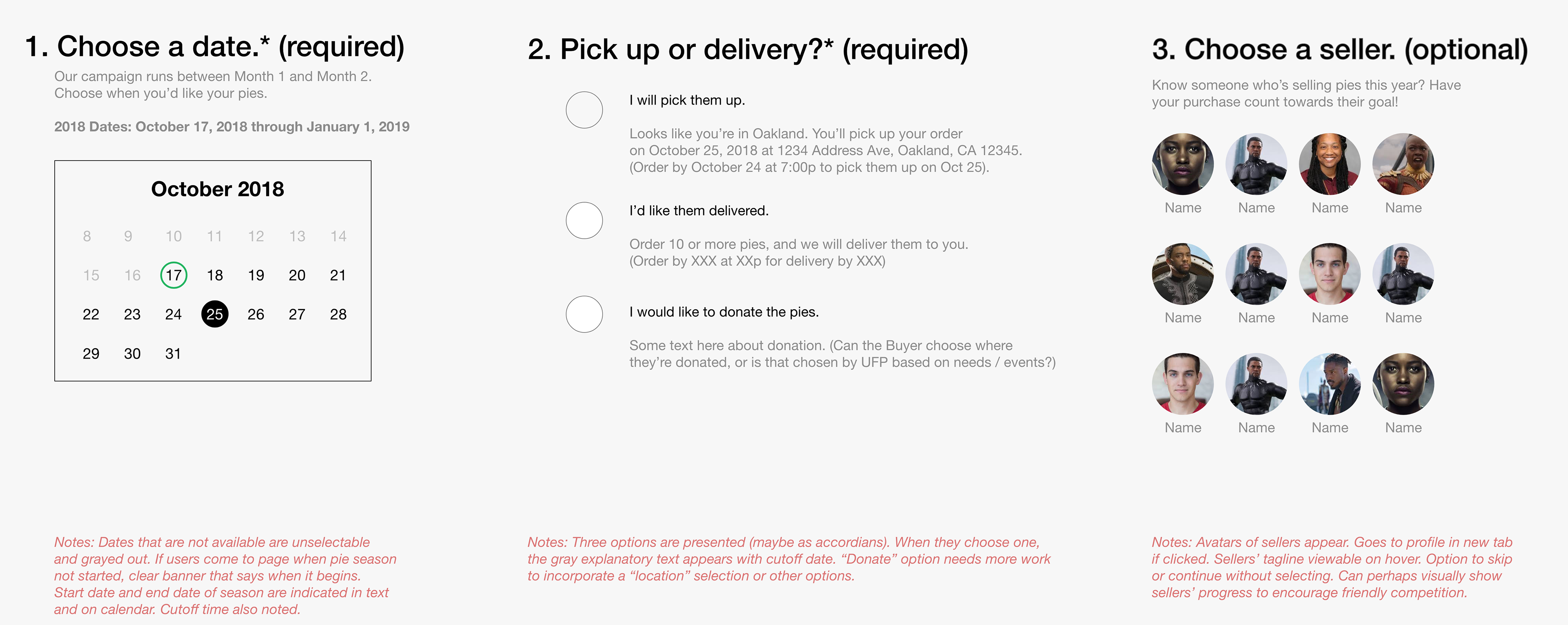
My first task, therefore, was to tackle the order of operations where possible and also to make them look, feel, and behave in a more user-friendly way.
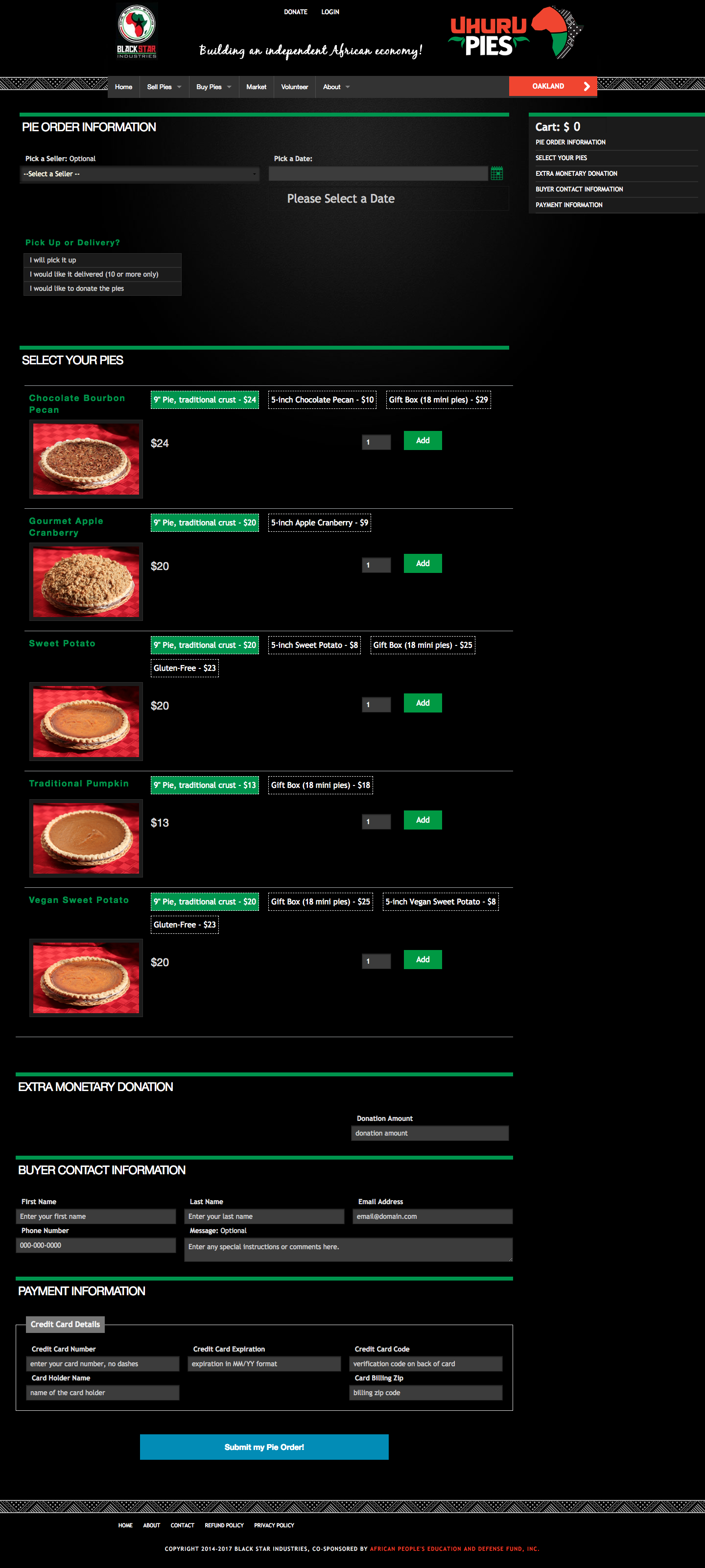
Previous Site's eCommerce Page
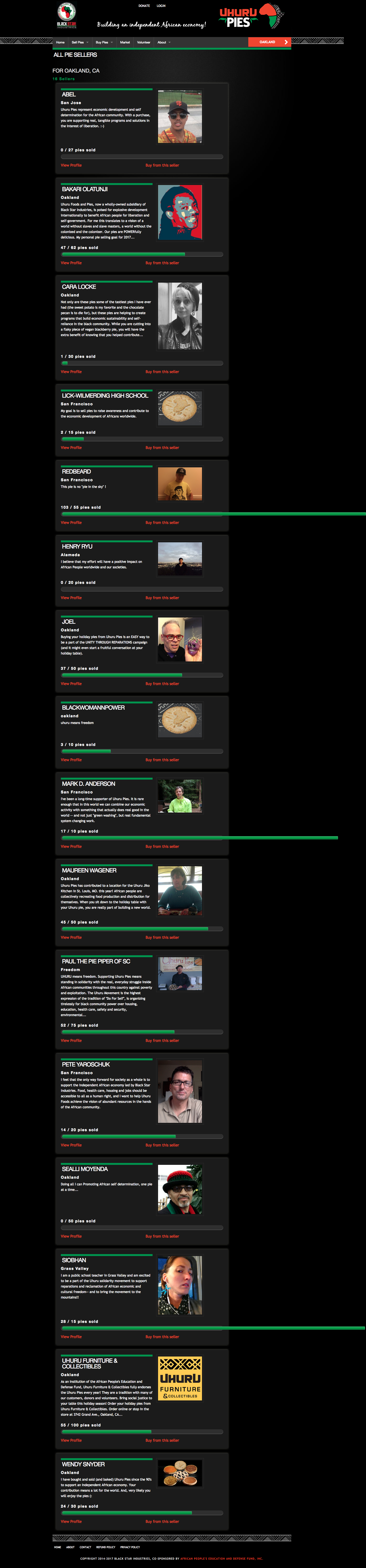
PPrevious Sits's Seller Page
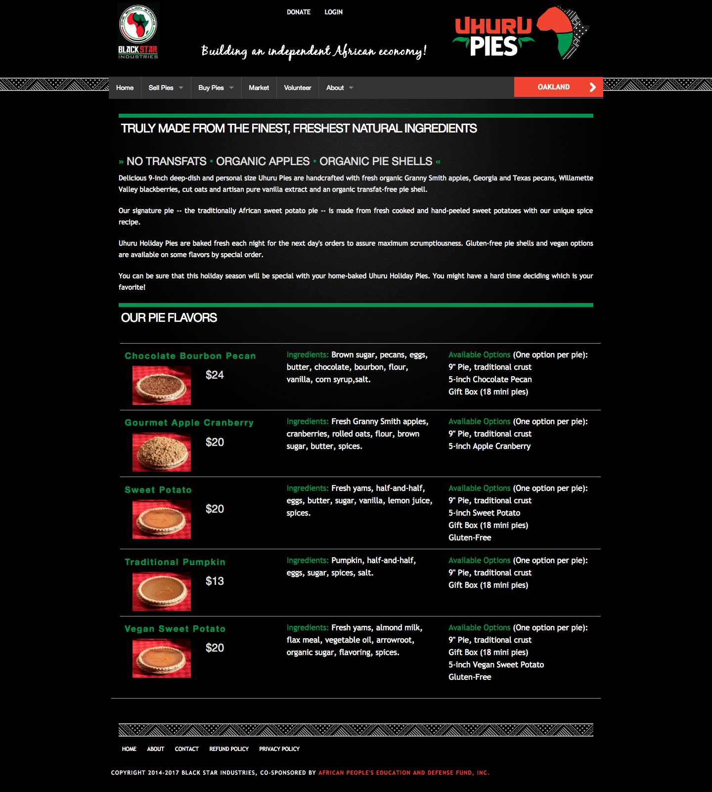
Previous Site's Pie Flavoris
eCommerce UX improvements
The order of "Choose a date." and "Pickup or delivery" could not be changed during the first redesign, so I left those as they were. By adding explanatory text, making the field required, and designing clearer calendar indicators, I hoped to make the experience smoother. A similar strategy was applied to the "Pickup or delivery" section. The explanatory text shows up on hover or click.
If there was a section of the previous website that I felt could use more visibility, it was the "Choose a seller" portion. Sellers are members of the local community who help raise awareness and money for Uhuru Foods and Pies. By adding explanatory text, placing their photos in a grid (rather than in a long column like before), and removing the long seller bios, users could quickly select the person they recognized (or make no selection) and continue to making their purchase.
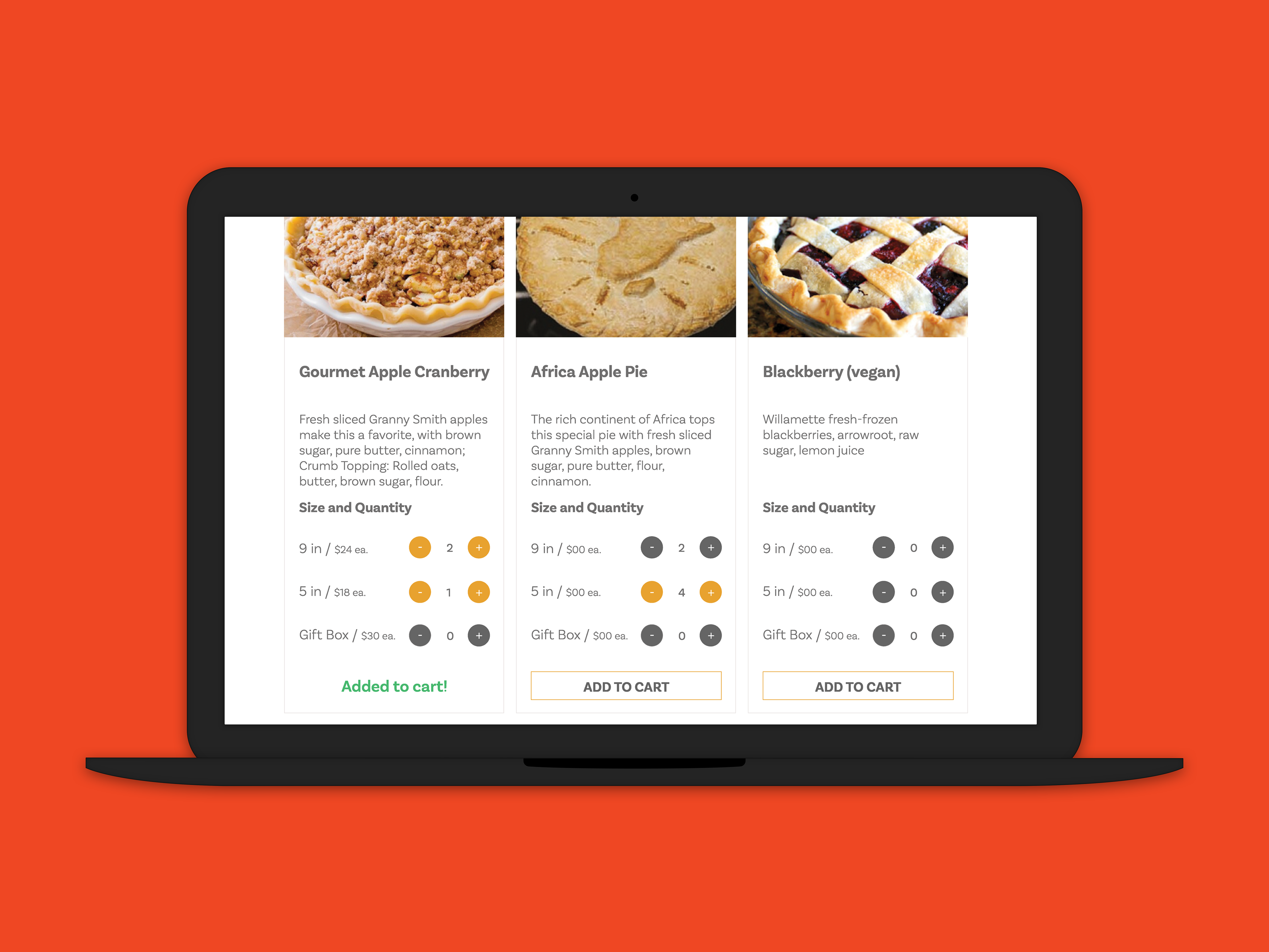
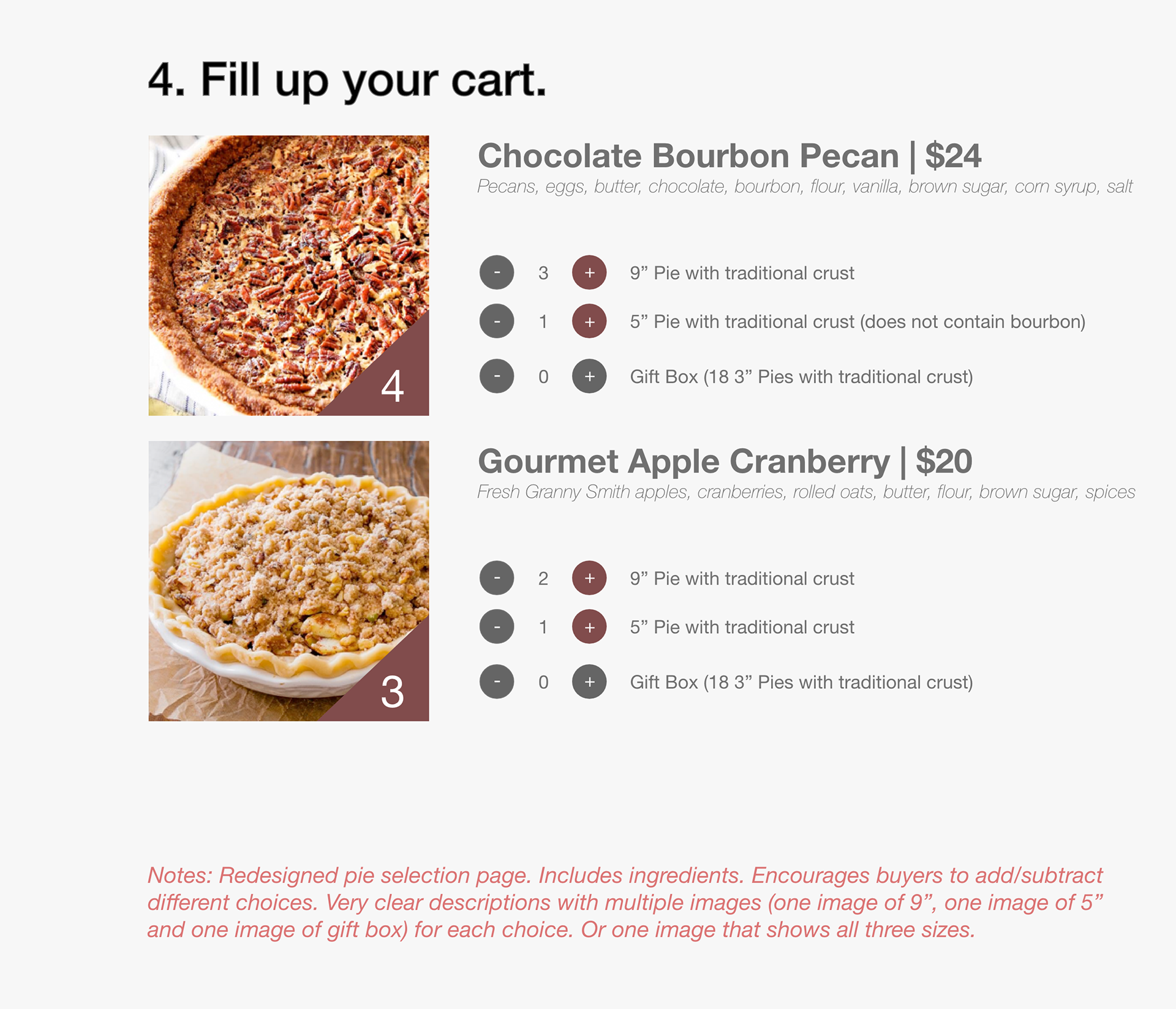
The next step was to tackle how users purchased pies. After doing a brief survey of popular food delivery apps and websites and working through some mockups, I made the following recommendations:
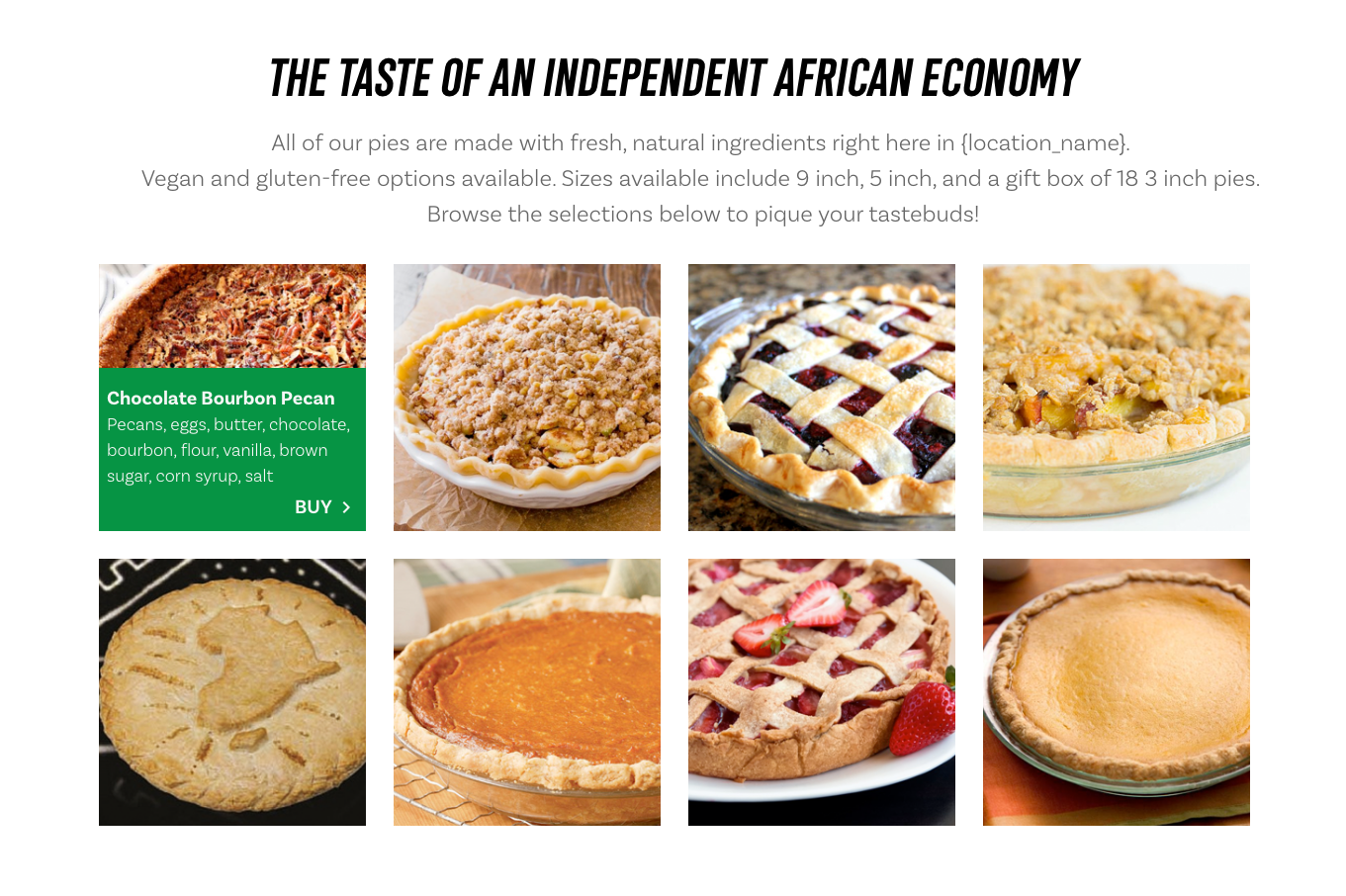
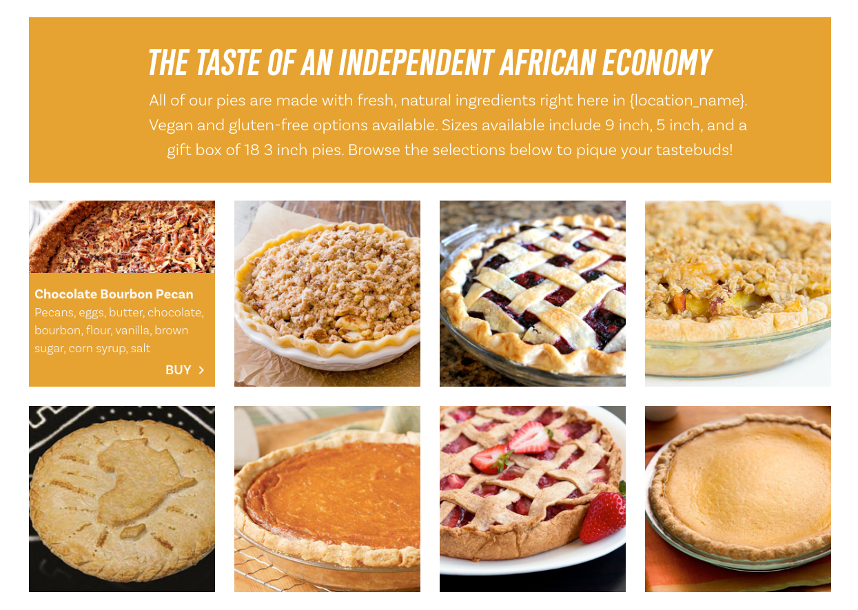
1. Show the ingredients at item selection rather than on a separate page.
2. Make it easy for users to differentiate between the options through descriptions, choices, and imagery.
3. Make it easy for users to mix and match.
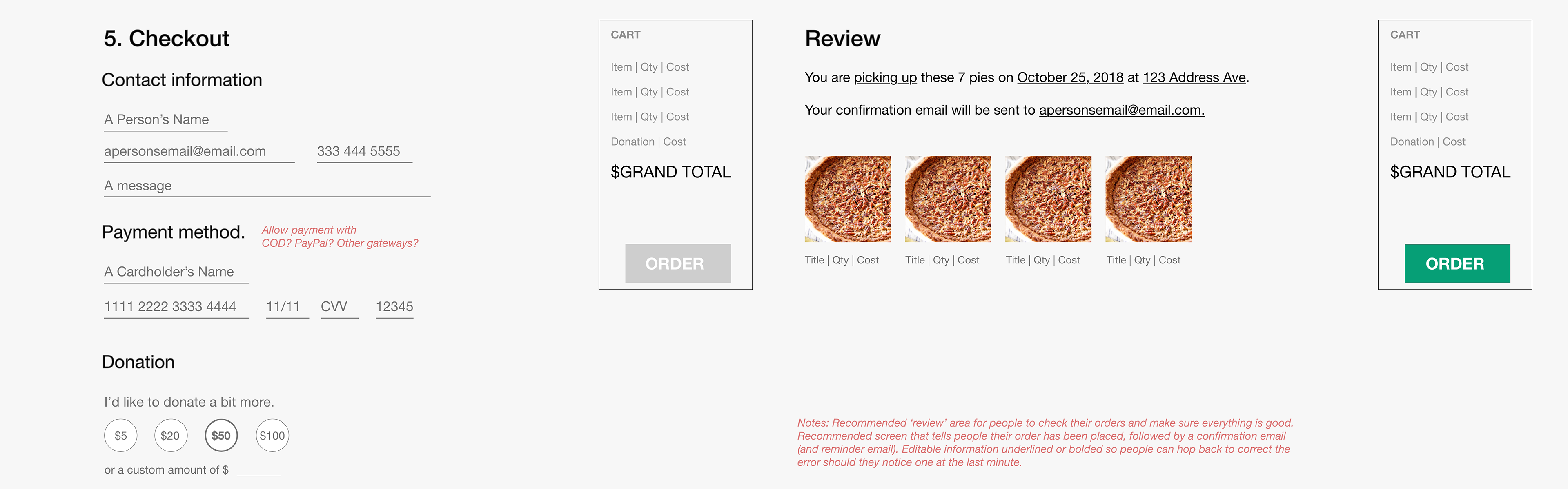
Now it was time to move to the Checkout flow. The inclusion of Contact Information and Billing Information is in agreement with checkout flow norms. As this would be launched prior to a major fundraising campaign, the pre-filled donation buttons would hopefully make it easy for people to donate. The newest addition to the design was a Review screen. Leaders had mentioned that there'd be some confusion about who was picking up which pies when. In order to address this, I recommended that there be both a review page as well as a confirmation email that outlined the order and next steps.
Typography and Visual design
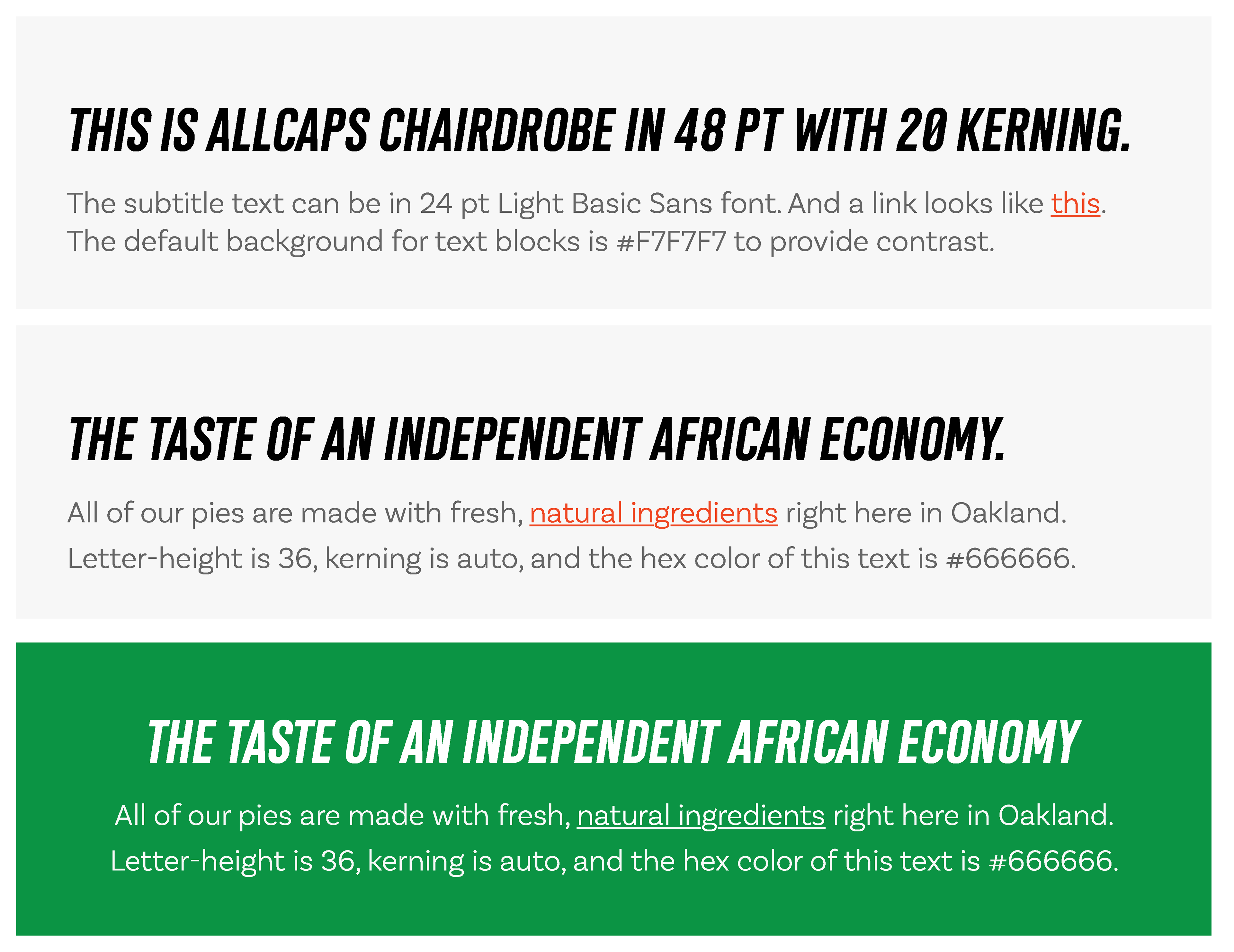
Choosing the typography for the site was difficult. The chosen type, I believed, should convey activism and raw energy. It should also be sans-serif and pair nicely with the lettering used in the Uhuru Foods & Pies logo. I strove to find a typeface that would not clash with New Century Gothic, the standard font choice in most of the organizations online publications. Fortunately, I found Chairdrobe as I recalled a similar typeface from PayPal's website. I appreciated the power it could add to the site when used tactfully.
The three main colors used throughout Uhuru Foods & Pies publications were each very bold. I experimented with color combinations and introduced a variety of complimentary grays.
Experimenting with #069F76
Using #E7A331 as the primary color

Toning down the block to make #E7A331 more impactful
Homepage
When I'd first learned of Uhuru Foods and Pies, I was having a hard time understanding what pies had to do with black economic development. Using this experience as a starting point, I suggested that this be the first question clarified when users come to the homepage. The organizational leaders I worked with found that insight valuable and agreed with the recommendation.
To design the new homepage, I first conducted a full survey of the site, taking screenshots of all of the pages to assess their content and purpose. The goal was to create a homepage with easy-to-digest content and addressed four major themes: about the organization, buying pies, markets and events, and opportunities to volunteer.
Walkthrough of an early homepage mockup. Created with Sketch + Adobe XD.