Designing for Projection
The back wall is made up of four acrylic panels, onto which four projectors project images and video. All experiences designed for this system must be carefully and precisely designed and calibrated to ensure it displays beautifully for our guests.
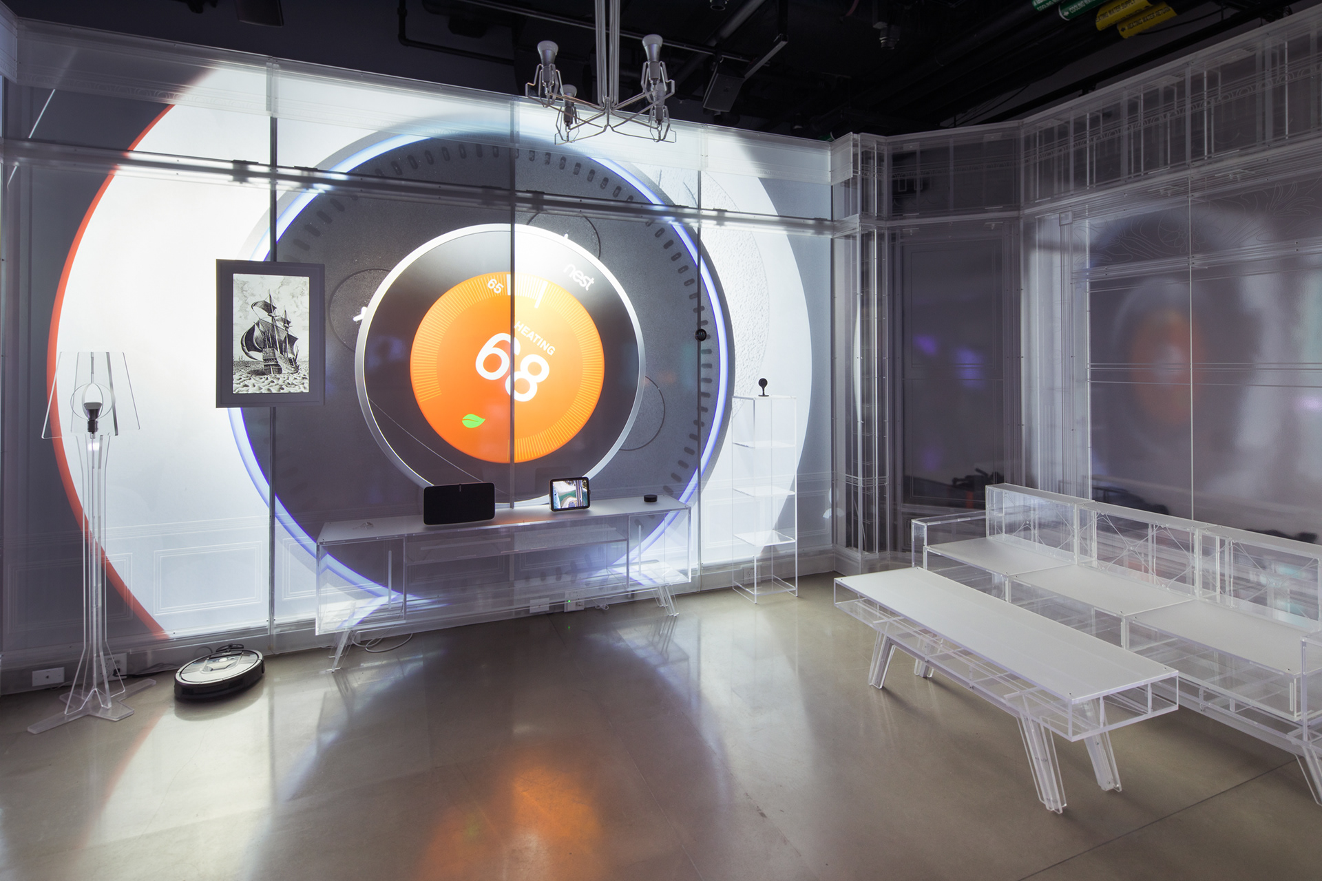
Underlay used to ensure digital experiences map perfectly to the panels and other features.
Credit: Local Projects
Key Design Decisions
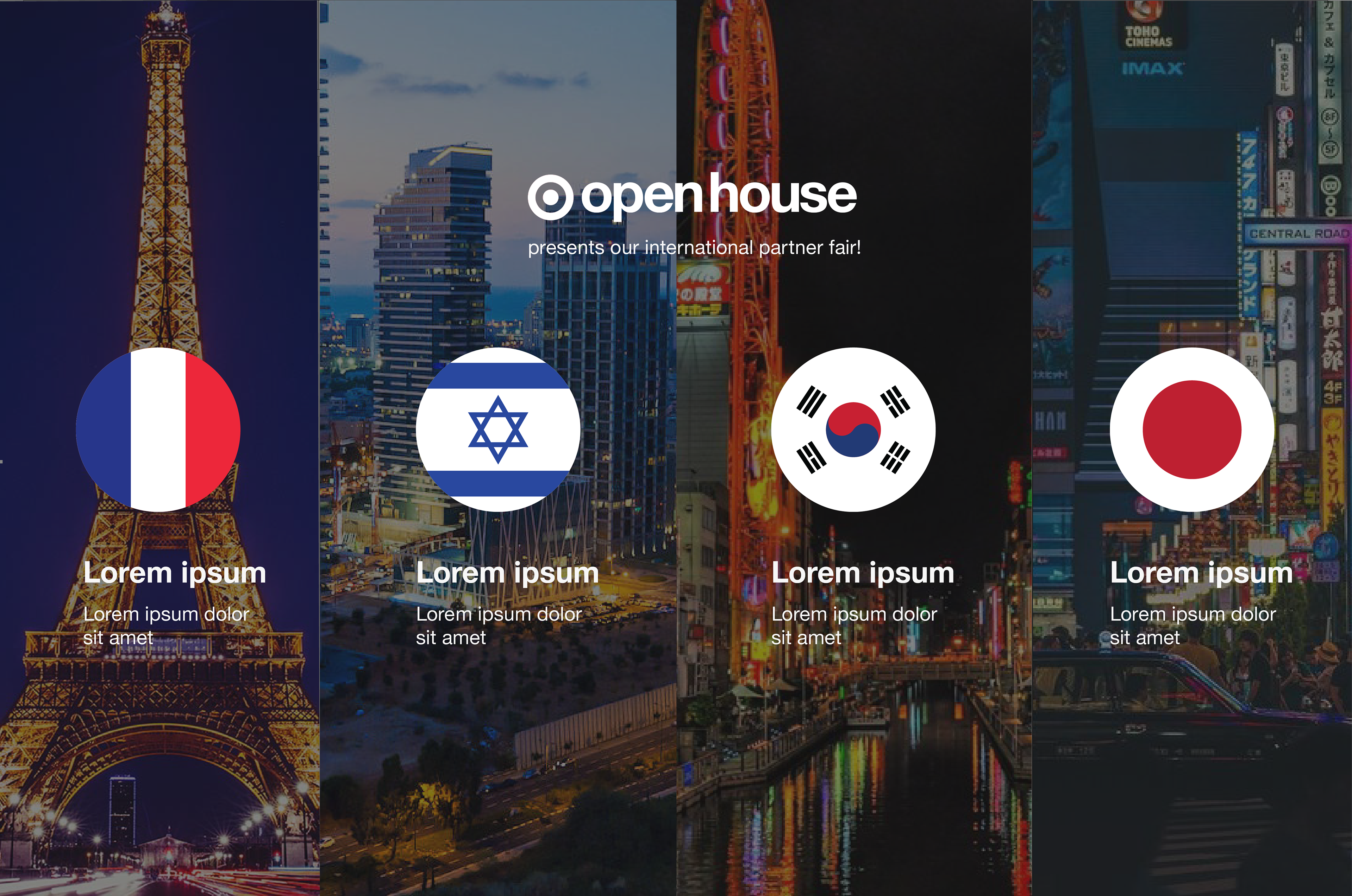
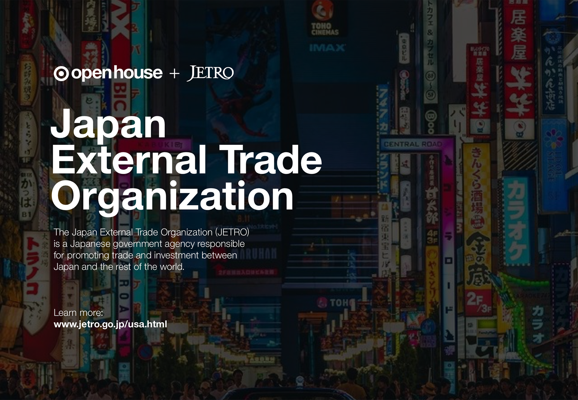
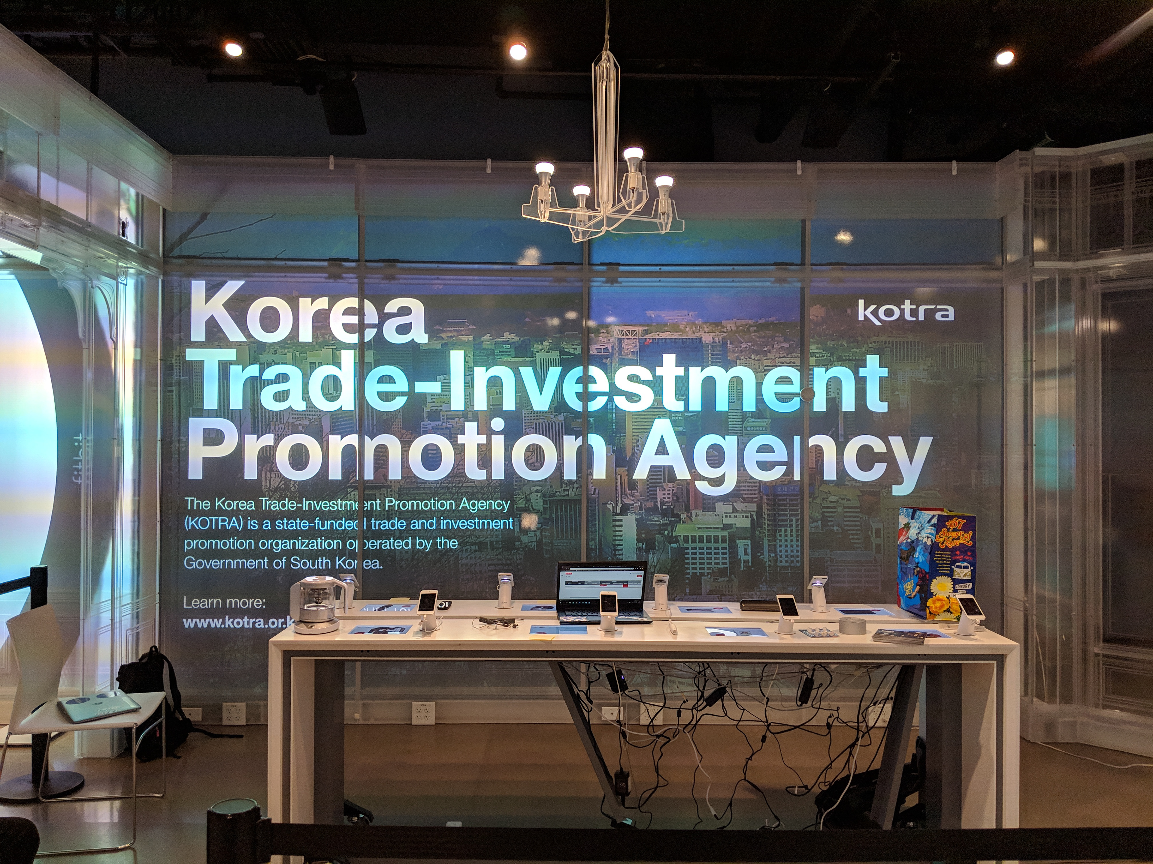
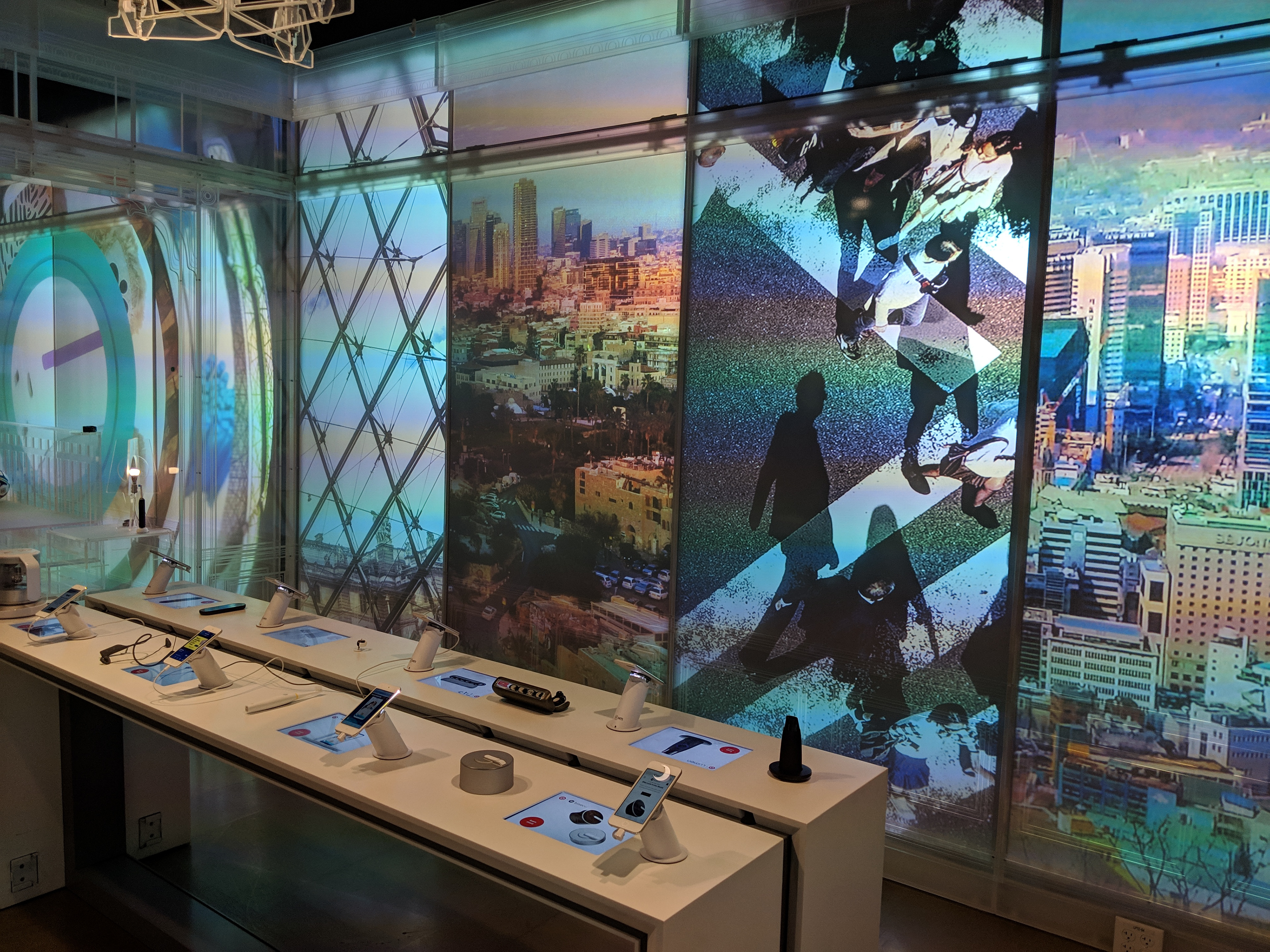
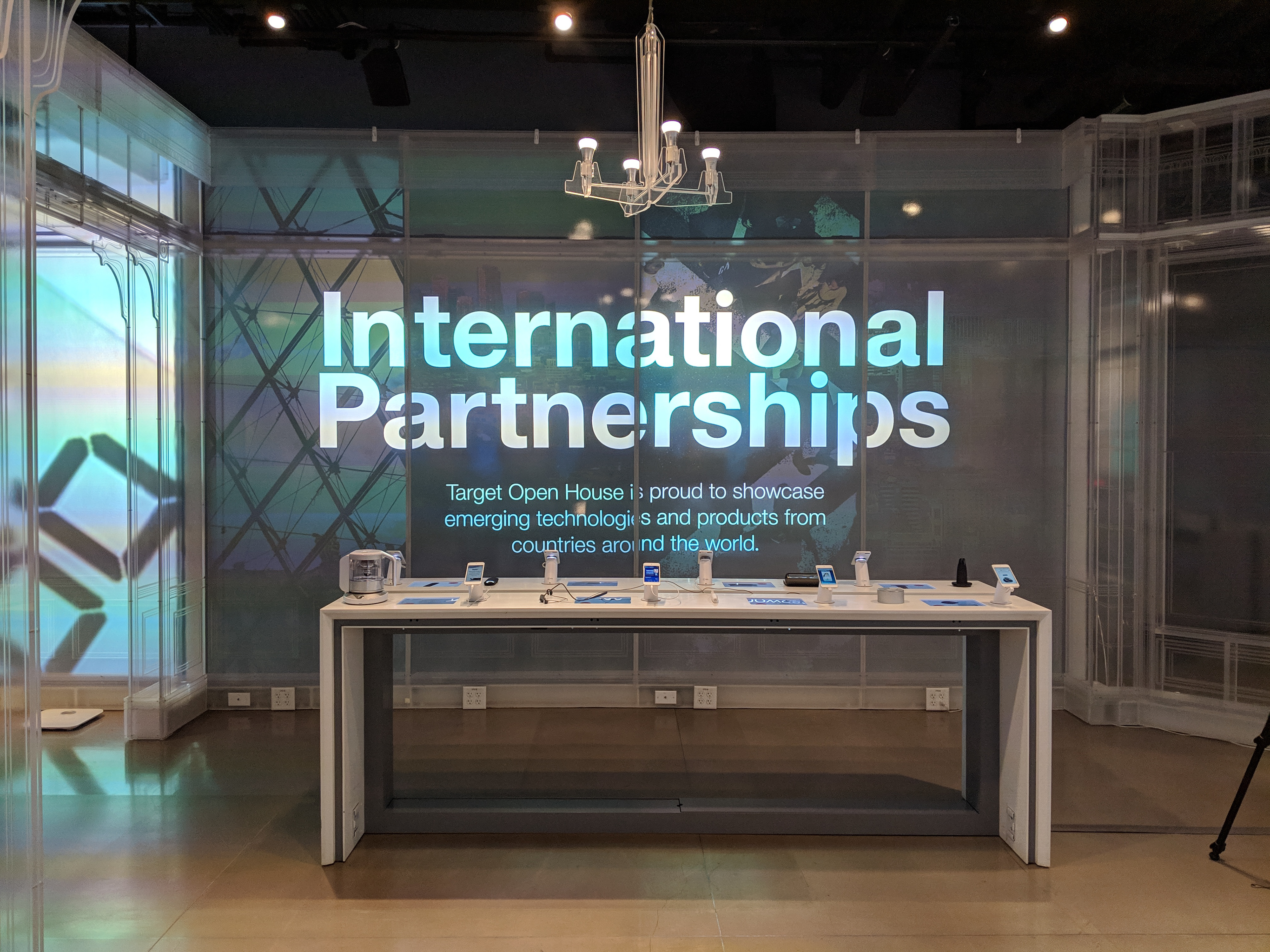
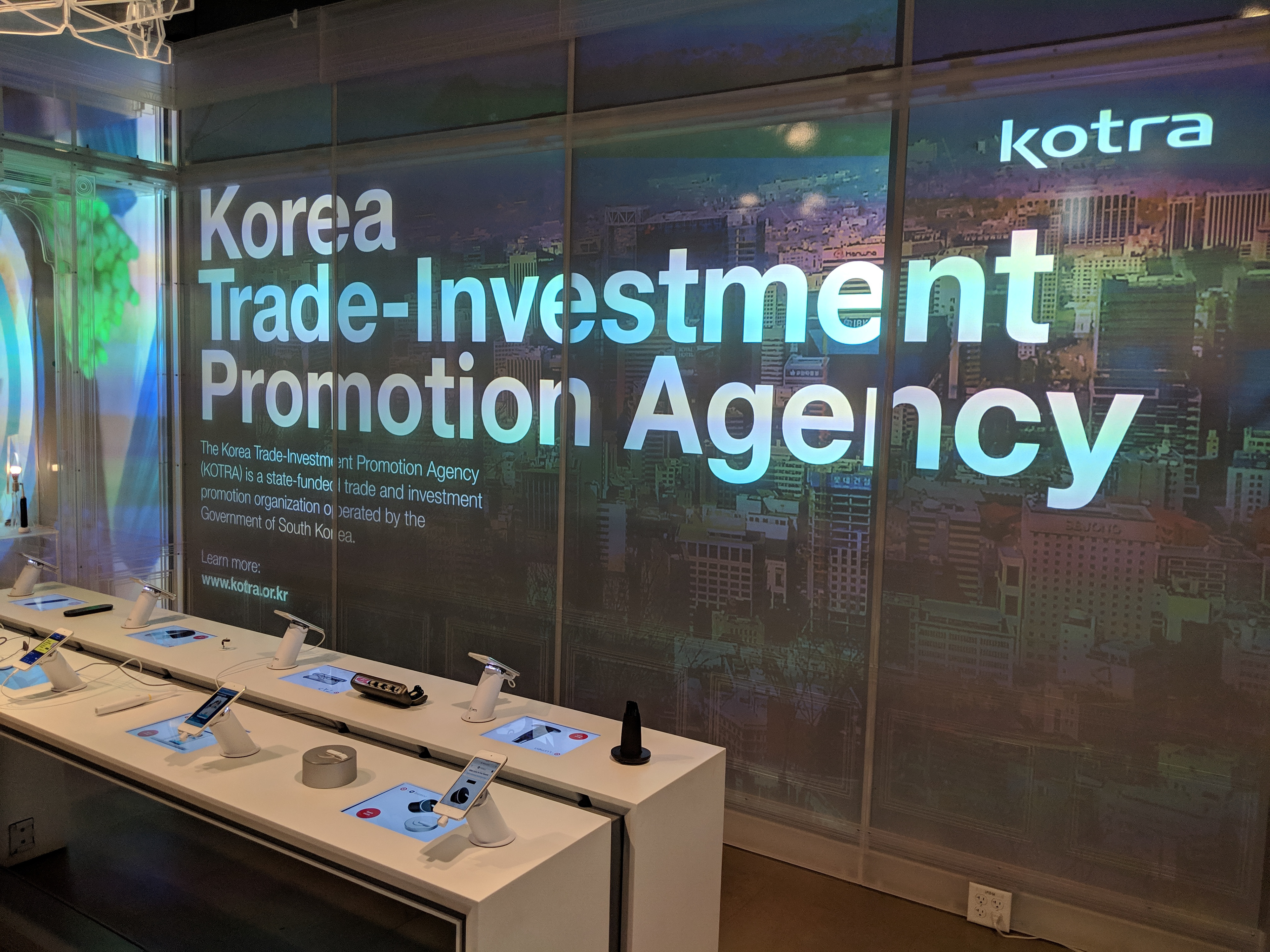
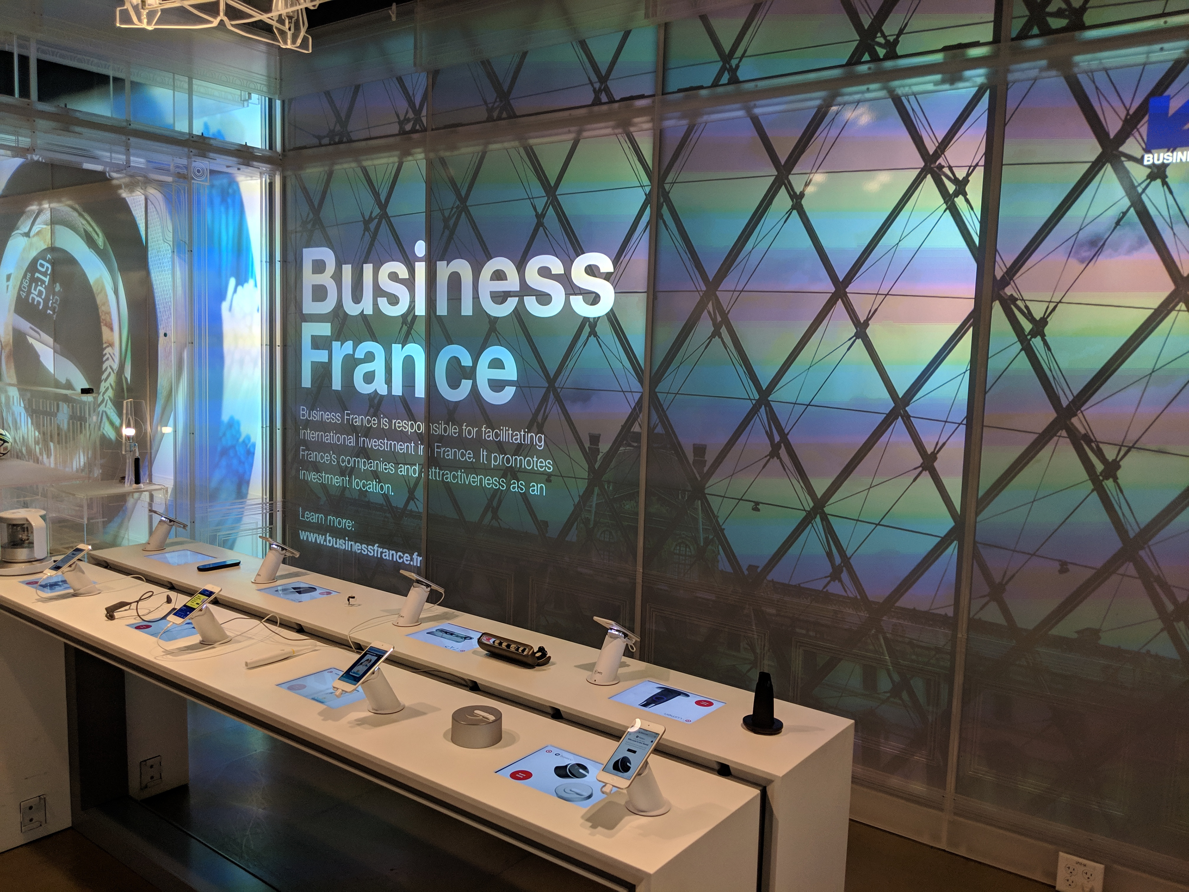
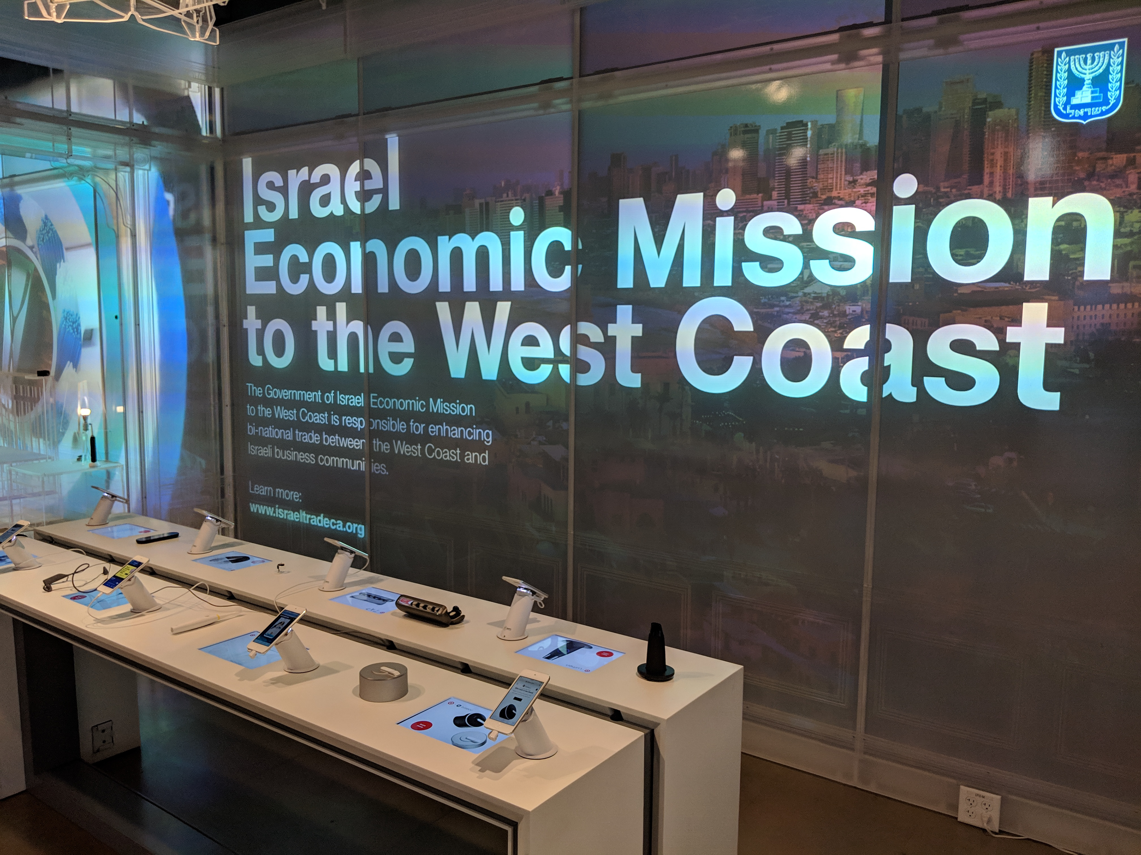
The digital experience showcases four countries and their respective international trade organizations, and two tables directly in front house two products from each country.
The digital experience showcases four countries and their respective international trade organizations, and two tables directly in front house two products from each country.
The challenge was to design an experience that was educational, that made it apparent to guests that the products were from several different countries, and that was muted enough to not interfere with their browsing experience.
Conceptual Development
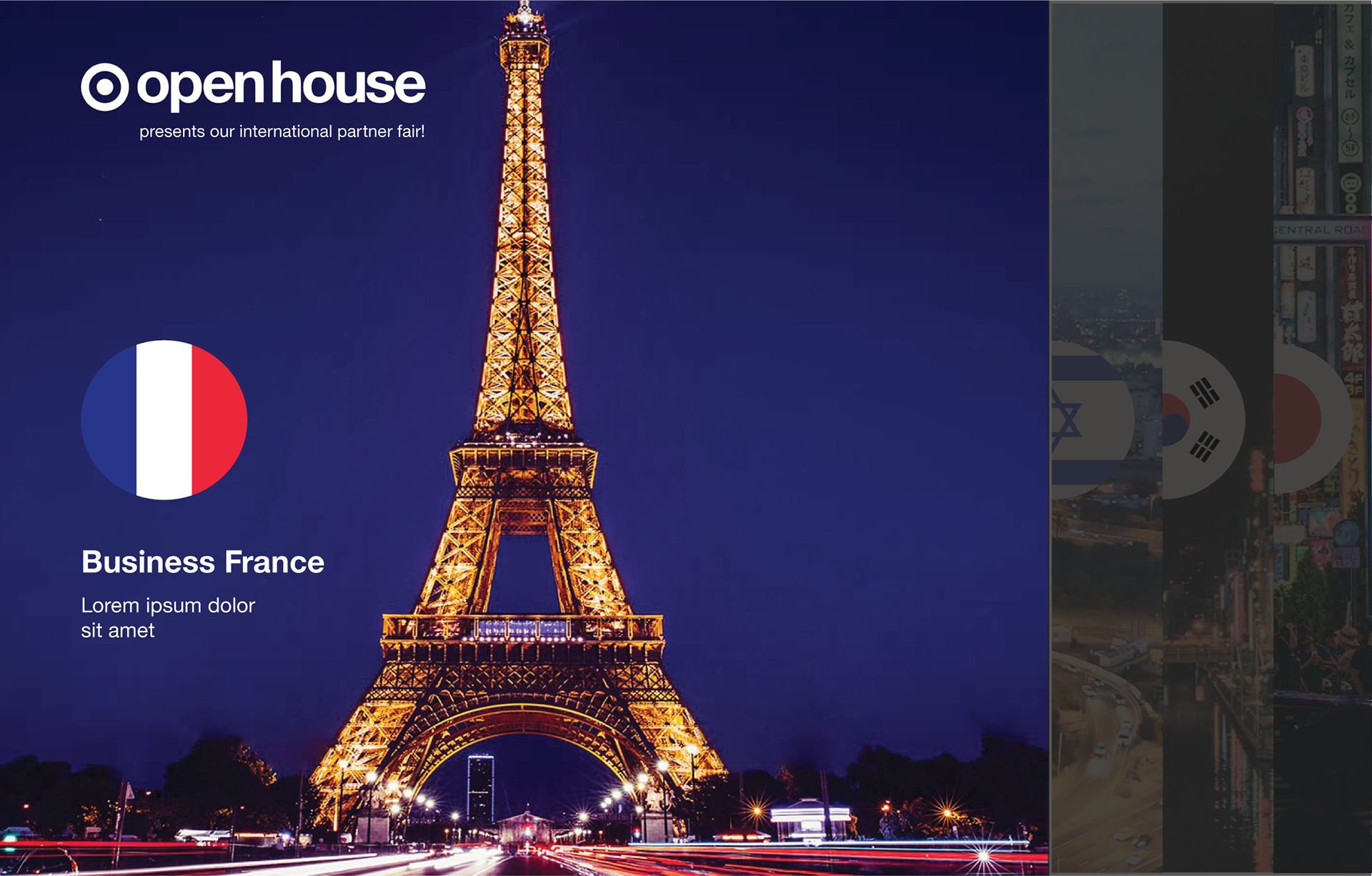
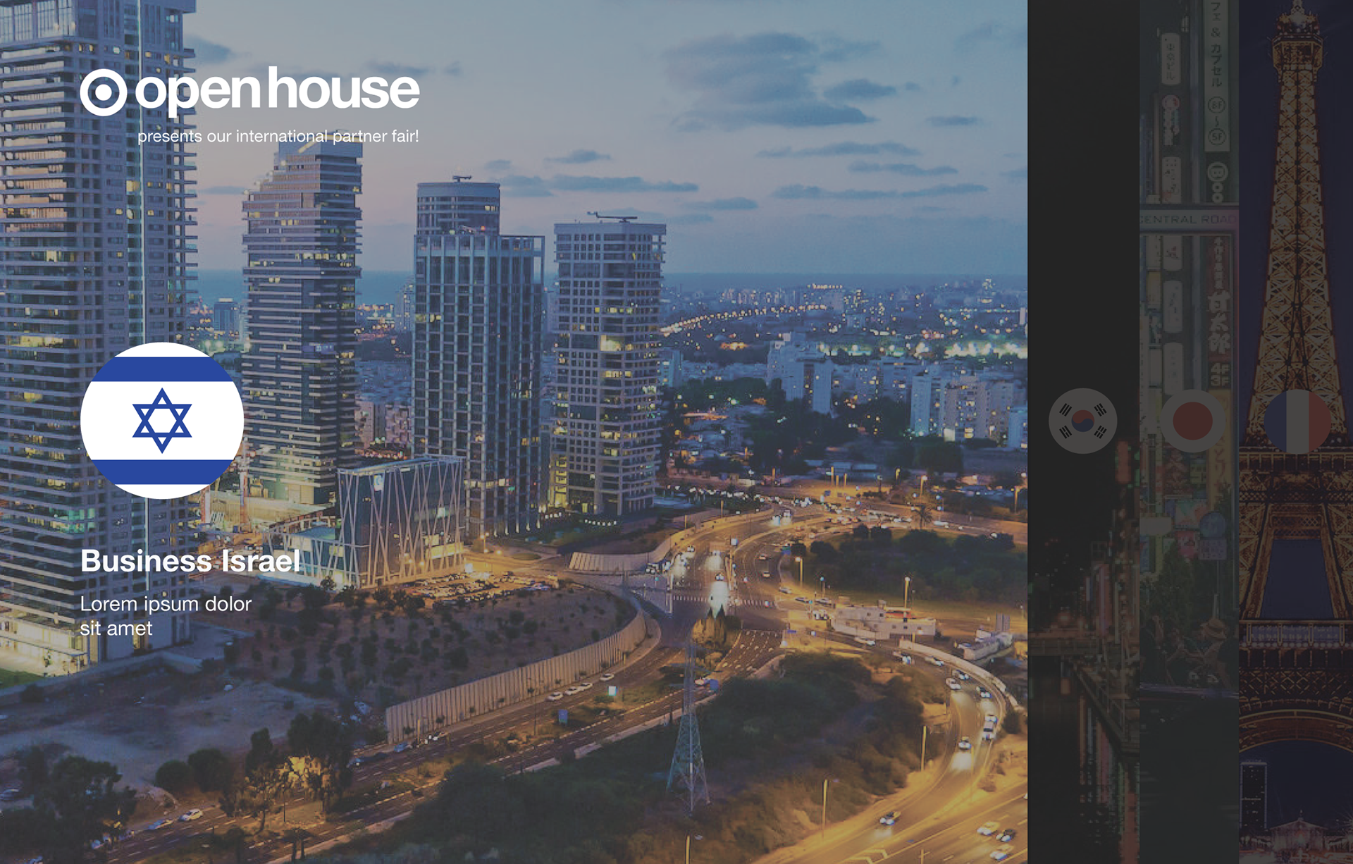
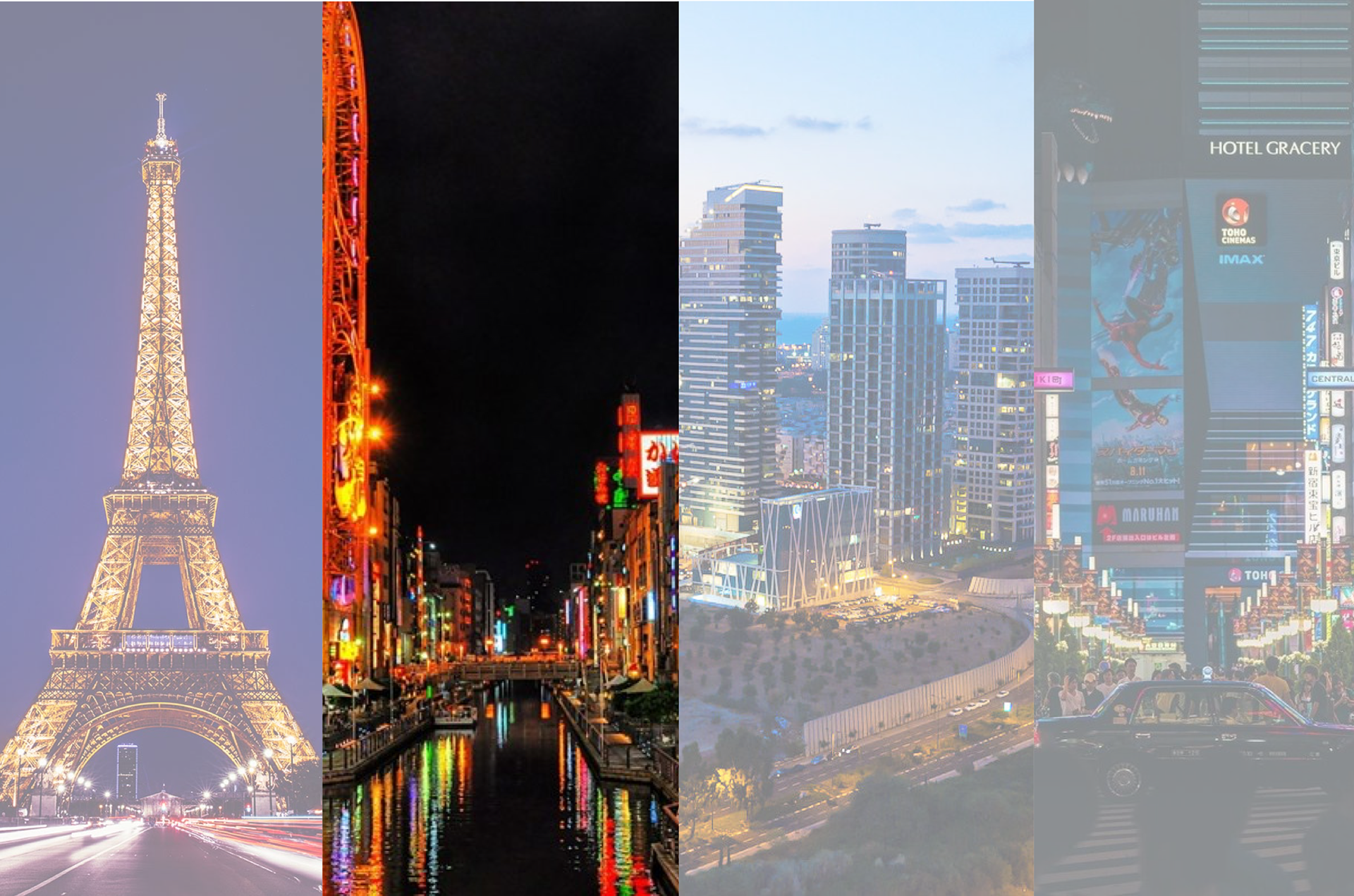
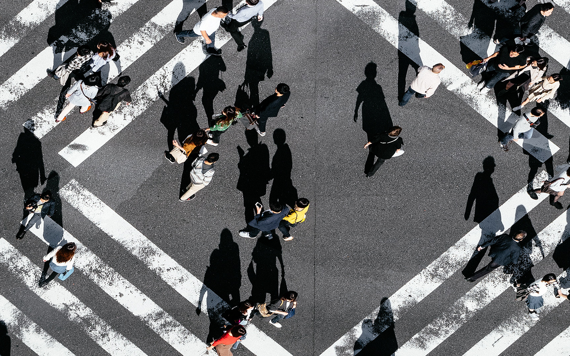
Since our first cohort would feature four countries, I decided rather early on to map one country's content to each panel in some way. In addition, it was important that the experience be muted enough to play on loop without distracting guests as they looked at the products on the table. I began by finding nighttime photos of major cities in each of the countries, and then experimented with various ways to overlay text and logos.
Each panel contains content for one country

The first panel slides forward, compressing the other three

The second panel slides forwards, and so on
Early mockup, all four countries
Early mockup, first country
Early mockup, second country
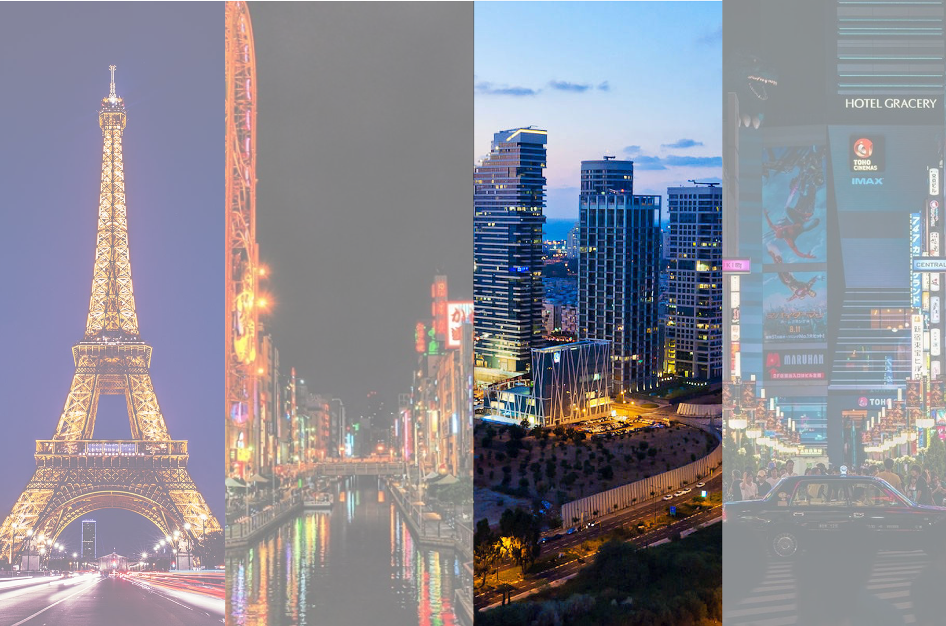
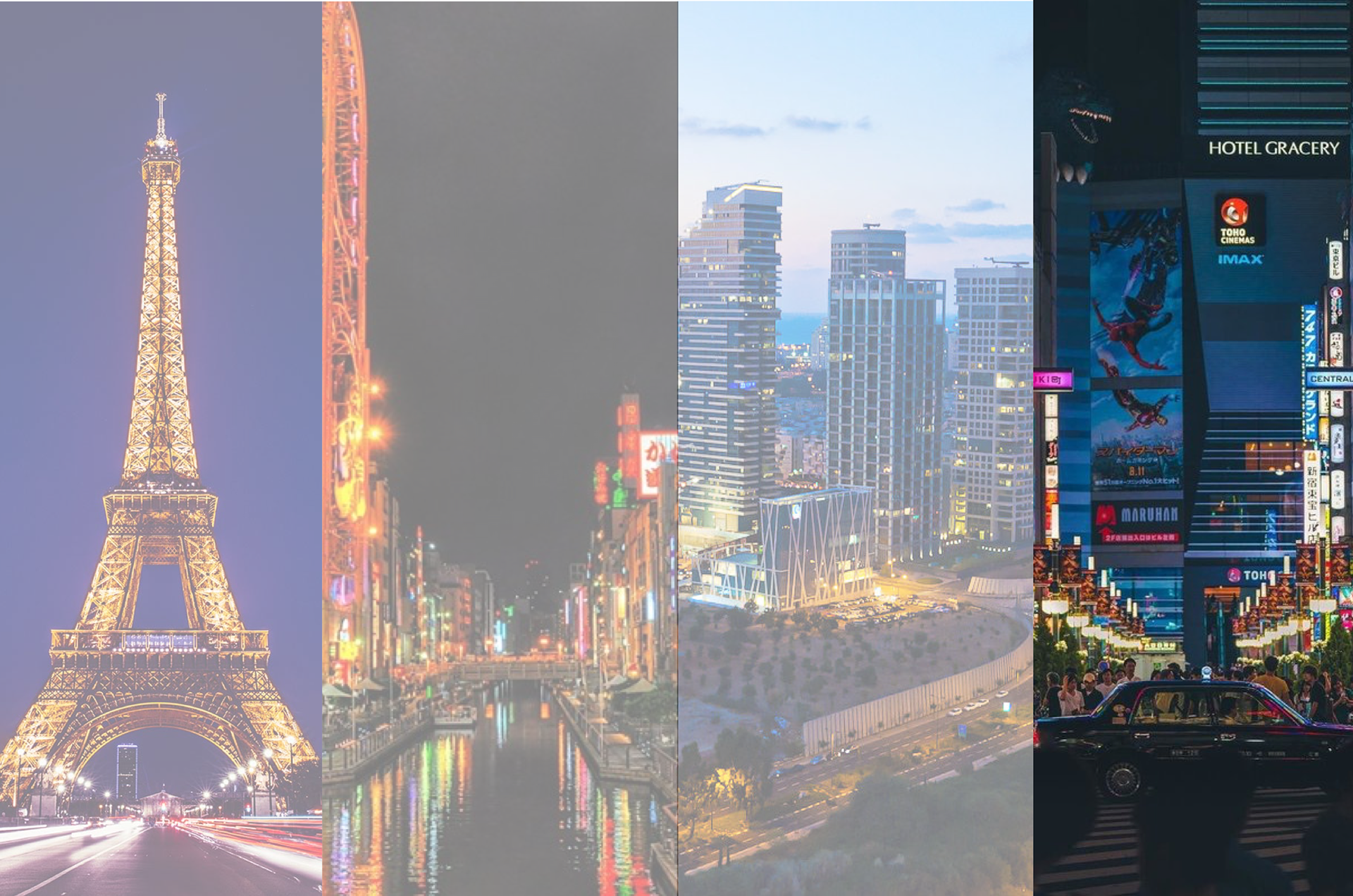
The second concept experimented with varying opacity windows that expanded to full screen. This concept allowed for the text to be displayed more clearly and for the subtle transitions to be introduced.


Preparing for Animation
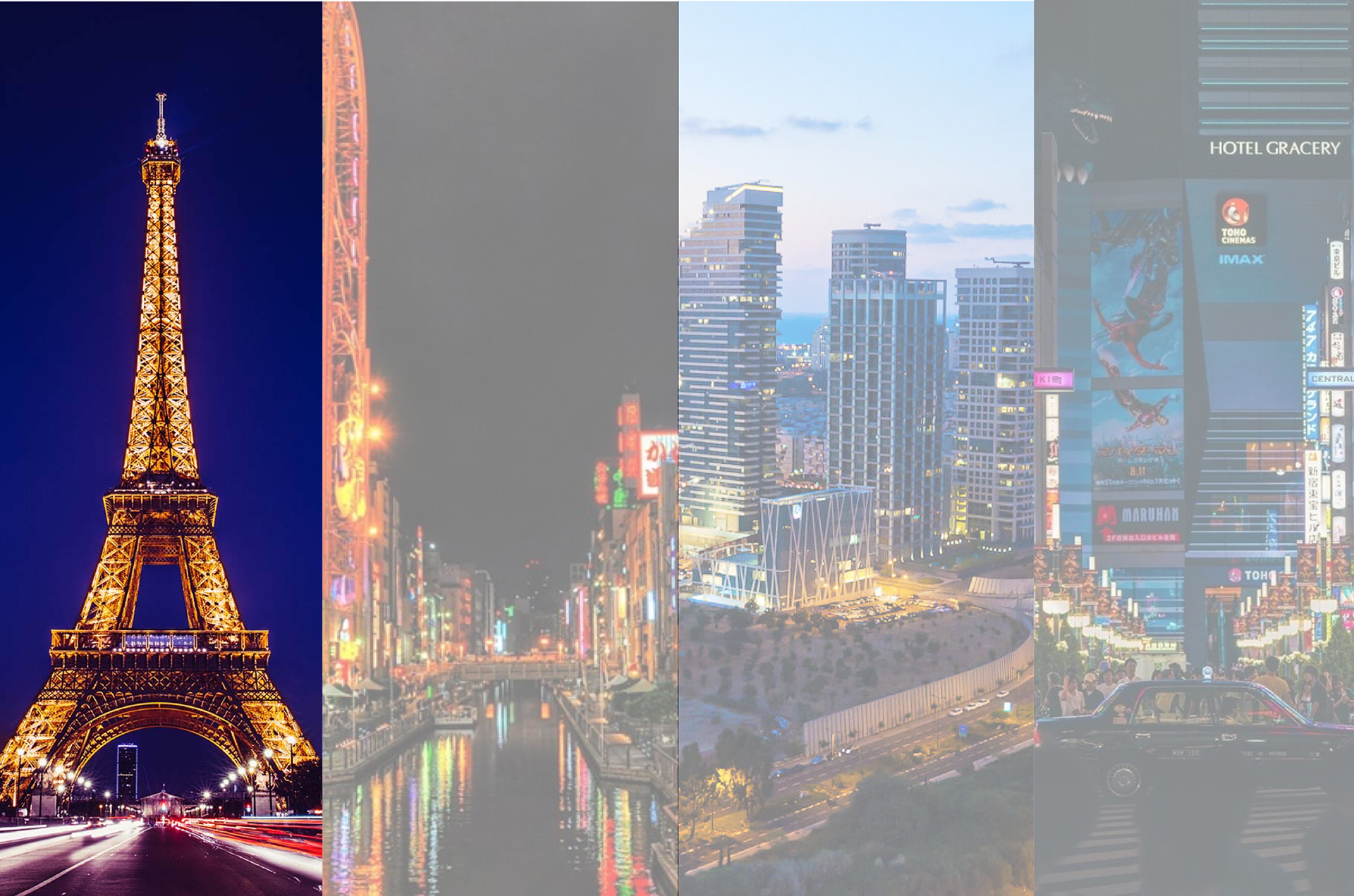
The first concept was by and large easier to animate in the time that remained, but the second concept was better at communicating information about the organizations. The next stage was to combine the two concepts and begin animating. With the large country flags being moved to the tablets, I sought out a new set of photos that visually differentiated each nation more.
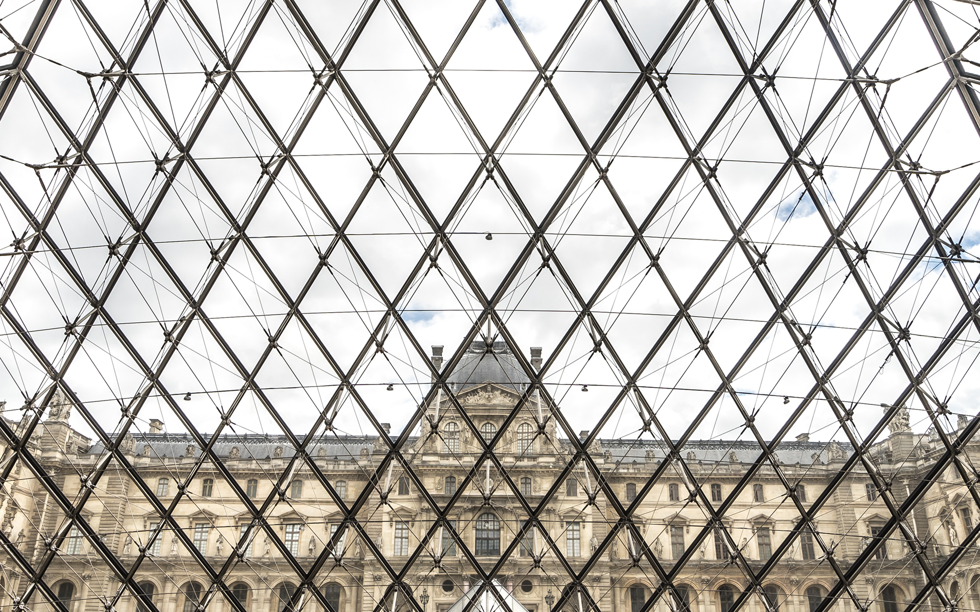
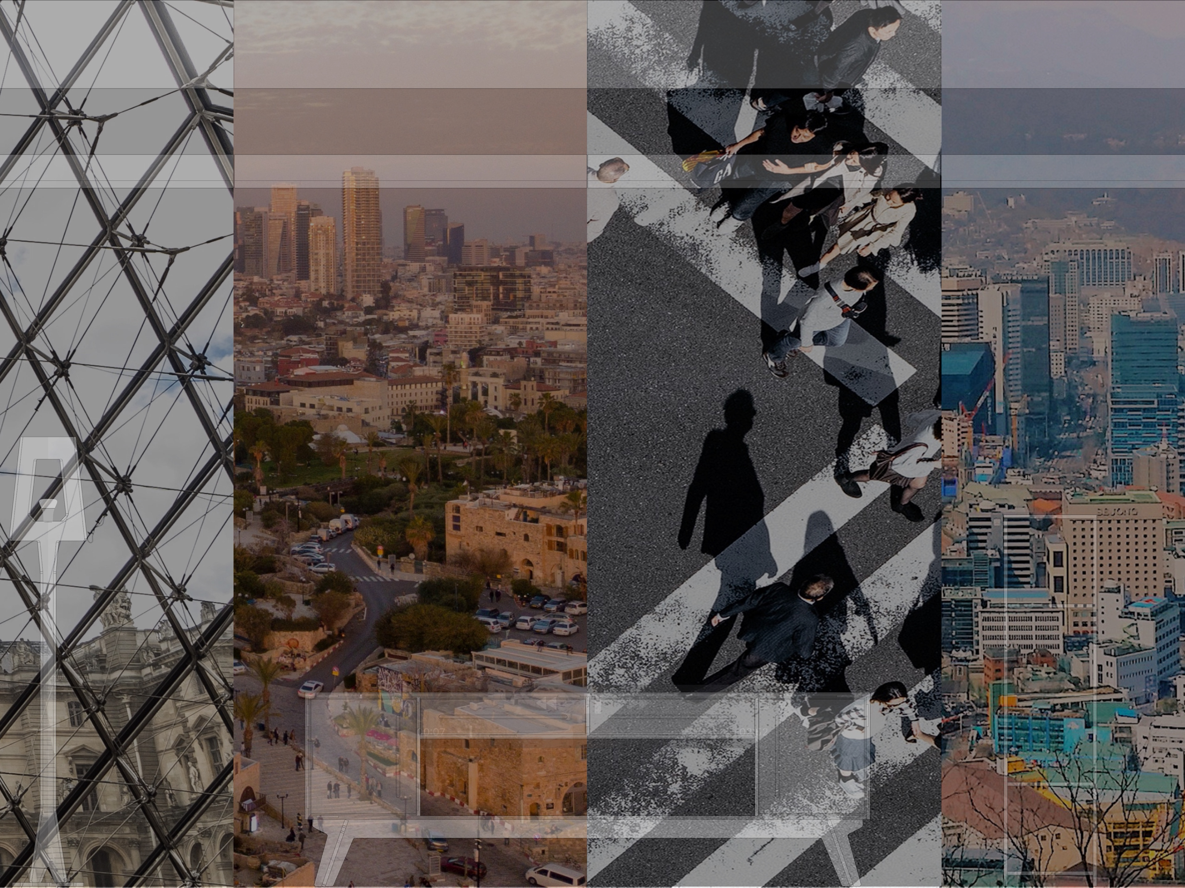
Paris, France | Credit: Will B, Unsplash
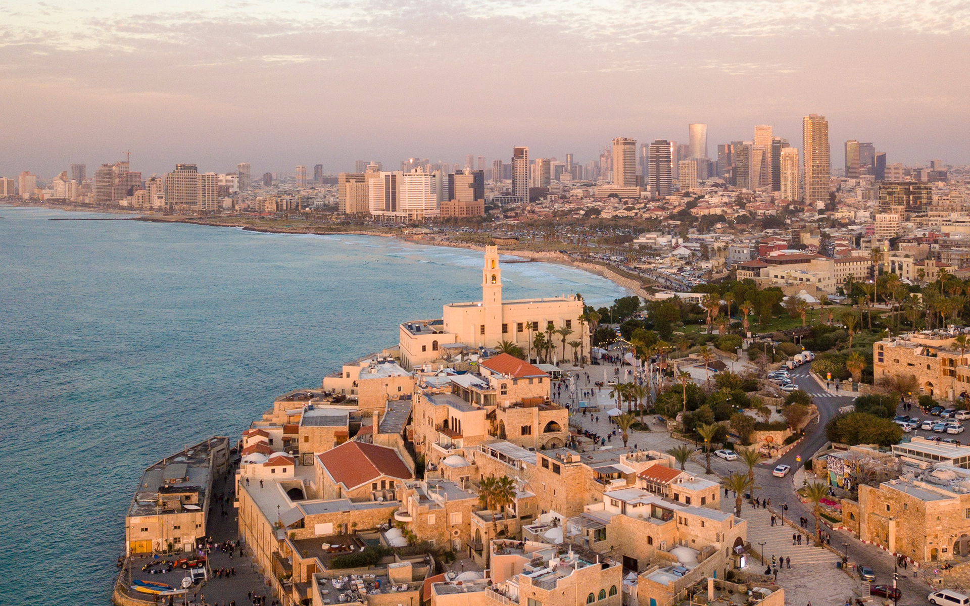
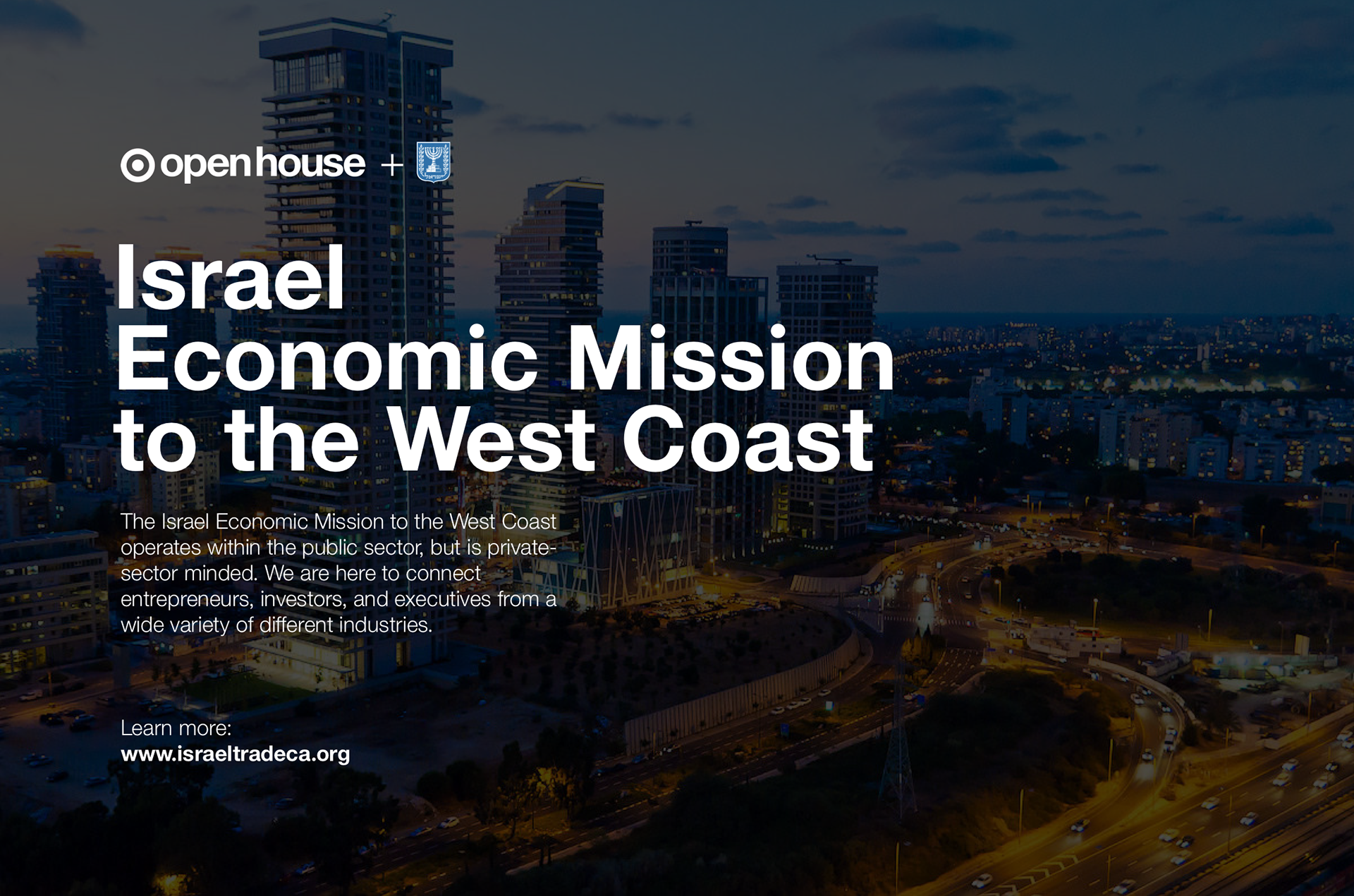
Tel Aviv, Israel | Credit: Shai Pal, Unsplash
Tokyo, Japan | Credit: Ryoji Iwata, Unsplash
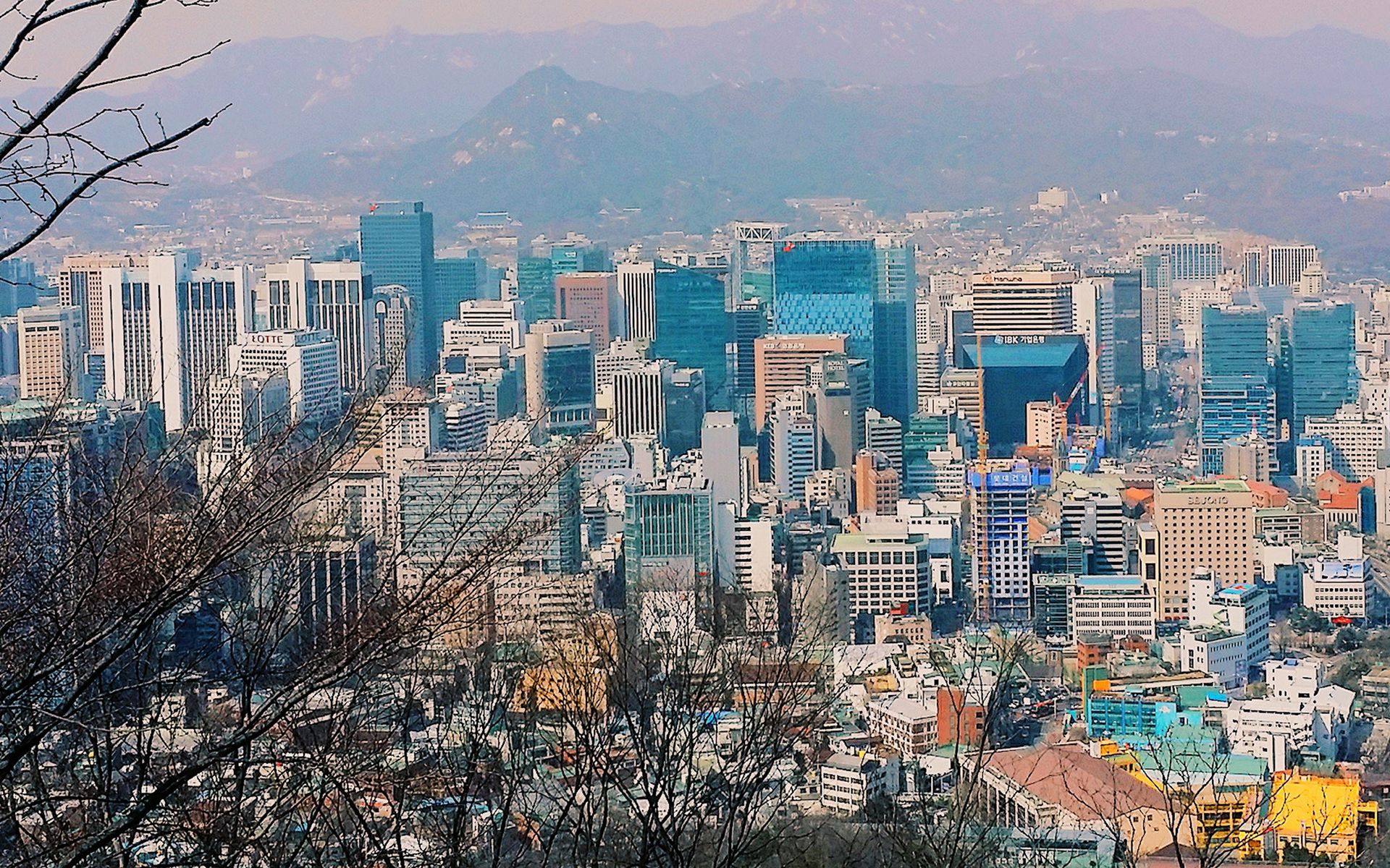
Seoul, South Korea | Credit: Jenny Kim, Unsplash
When I was about 80% finished with the first animation, I worked with one of our engineers to test the projection in the space. I prefer to test before things are finalized to allow room to improvements without repeating a large amount of work. Our first test revealed a number of issues, including discrepancies in the size of the images panels, rendering and projection bugs, issues in image and text readability, abrupt animation sequences, and more. We worked diligently to rectify these issues, making the final test a success.
The second portion of the test was to prepare the content for the displays on the tables. This included collecting, modifying, and approving all content submitted to us from the product vendors.
Preparing the evening before launch
Post-Launch
See the final video in action! This was my first time customizing Keynote so extensively to produce a video.