Key Design Decisions
1
Use language and representation techniques that are familiar to Buyers and Merchants.
2
Ensure that there is as little ambiguity as possible in the metric definitions and their values.
3
Consider and design for engineering challenges, like latency, that may occur when large datasets are processed and called.
4
Provide a way for users to export data for their own use.
The Filtering
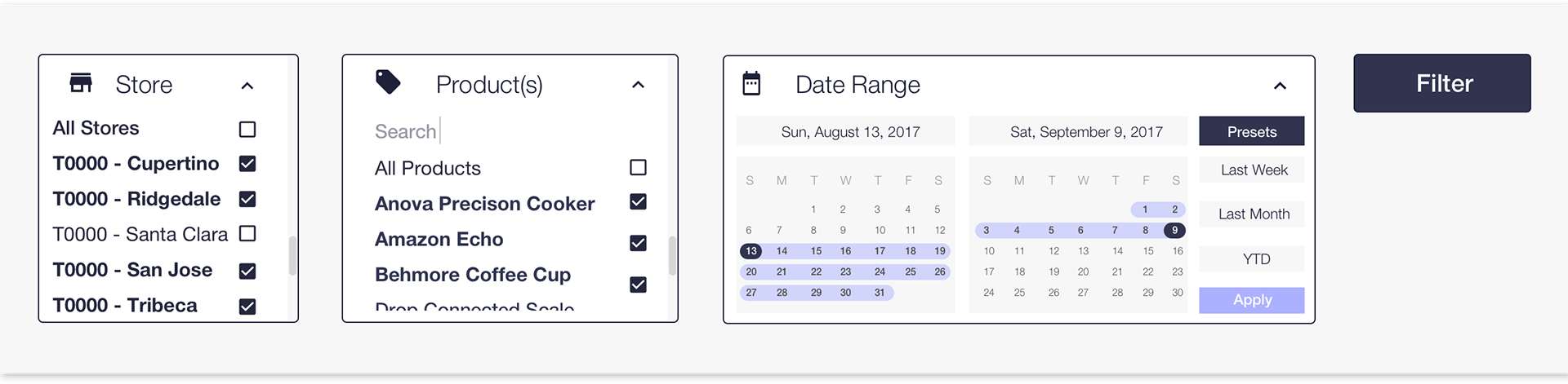
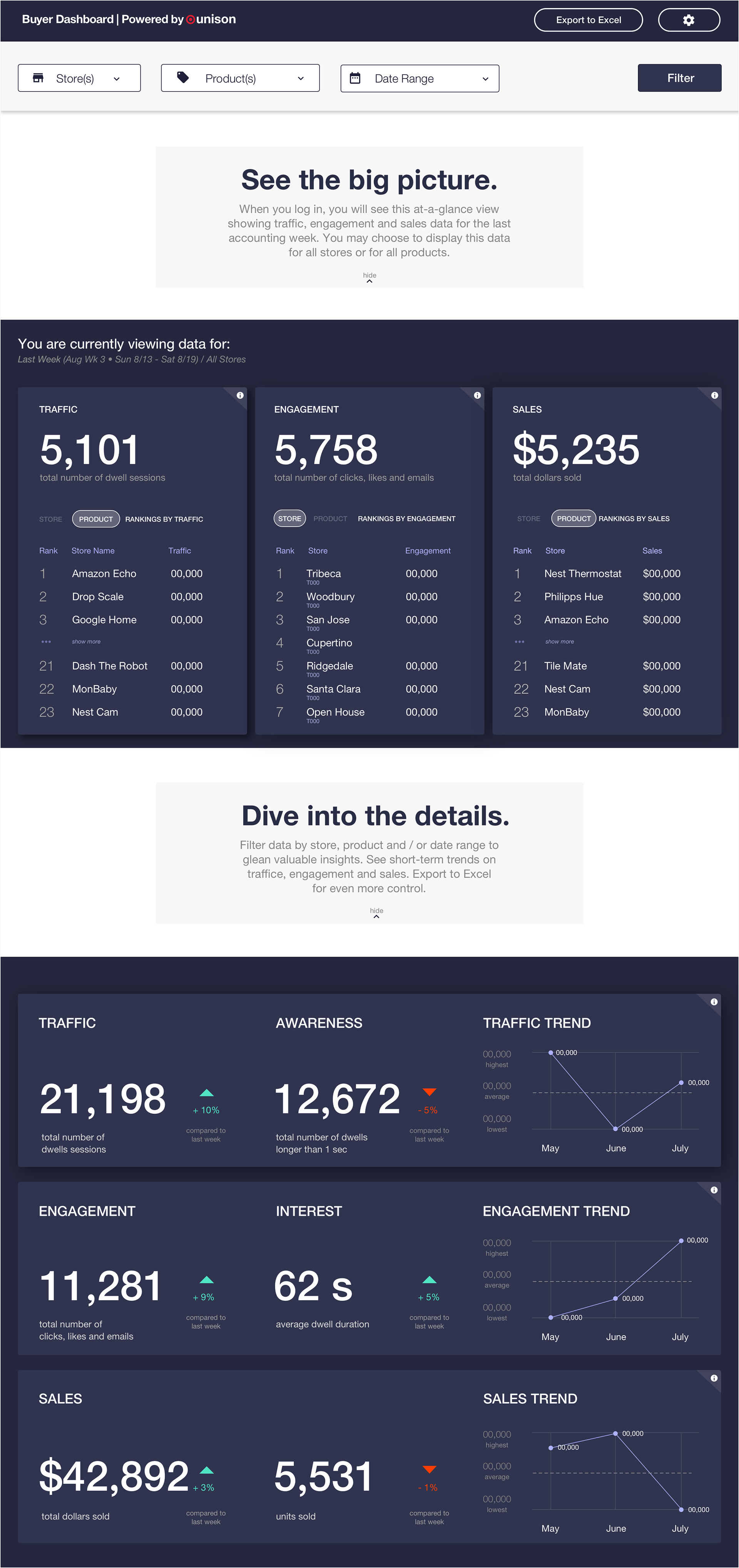
After several conversations with Buyers, we knew that data had to be filterable by store, by product, and by date; the challenge lie in the choosing the default states. Because the subset of stores was relatively small (about 8 in total), we decided that the default selections should be "All Stores" and "All Products". This also allowed Buyers to easily see larger trends before digging deeper, as was desired. For the date range, there are four customary presets: last account week (the most commonly used, and hence, our default). last month, year-to-date, and choosing a custom range.
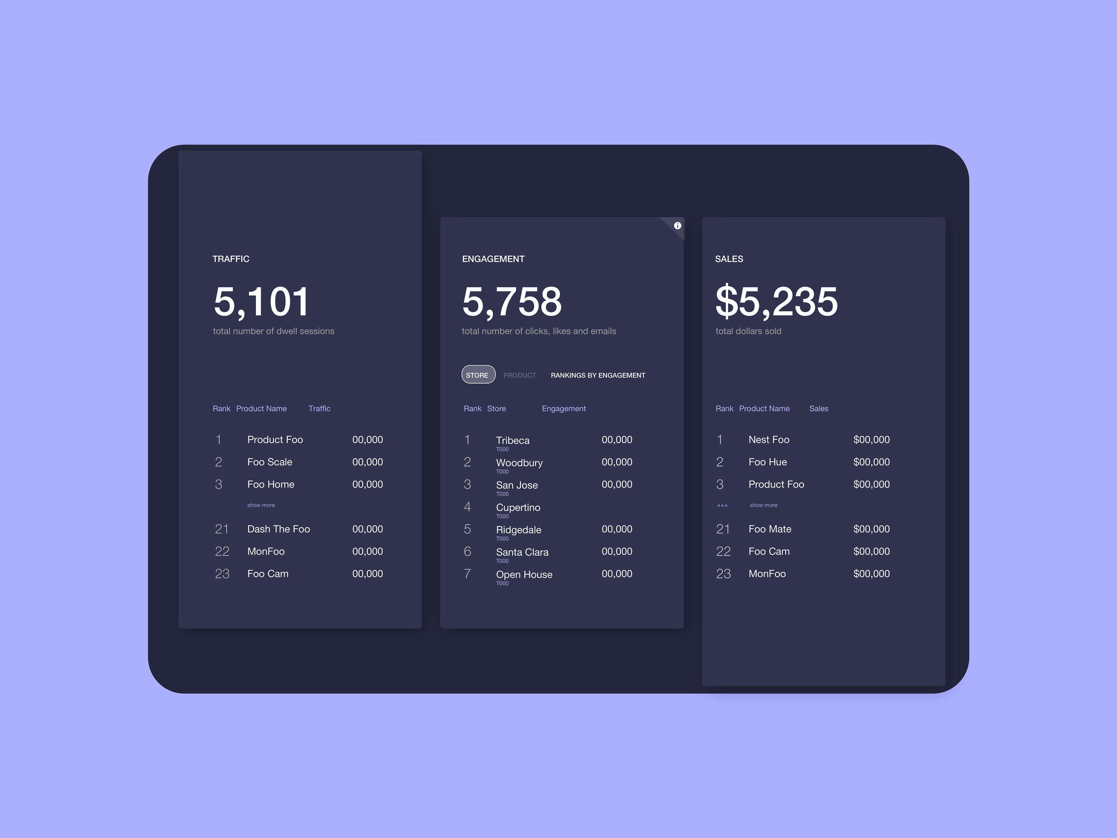
Ranking
As shown in this early wireframe, there was a need to quickly ascertain stats for the top three products or stores for particular selections.
MAIN PAGE
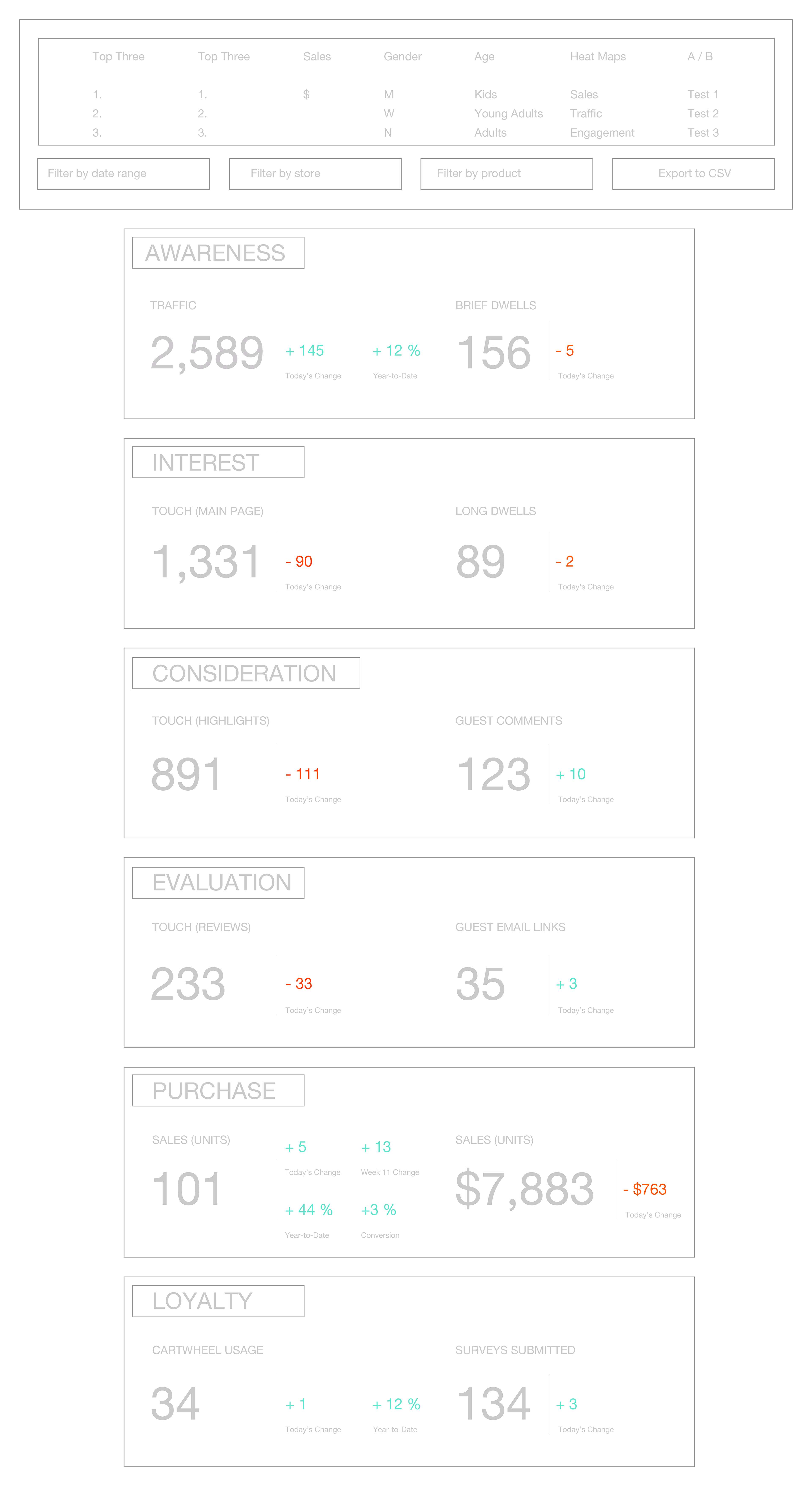
The dashboard is divided into two sections - see the big picture (an overview) and dive into the details (nitty gritty and trends). In accordance with research findings, definitions were provided at every step
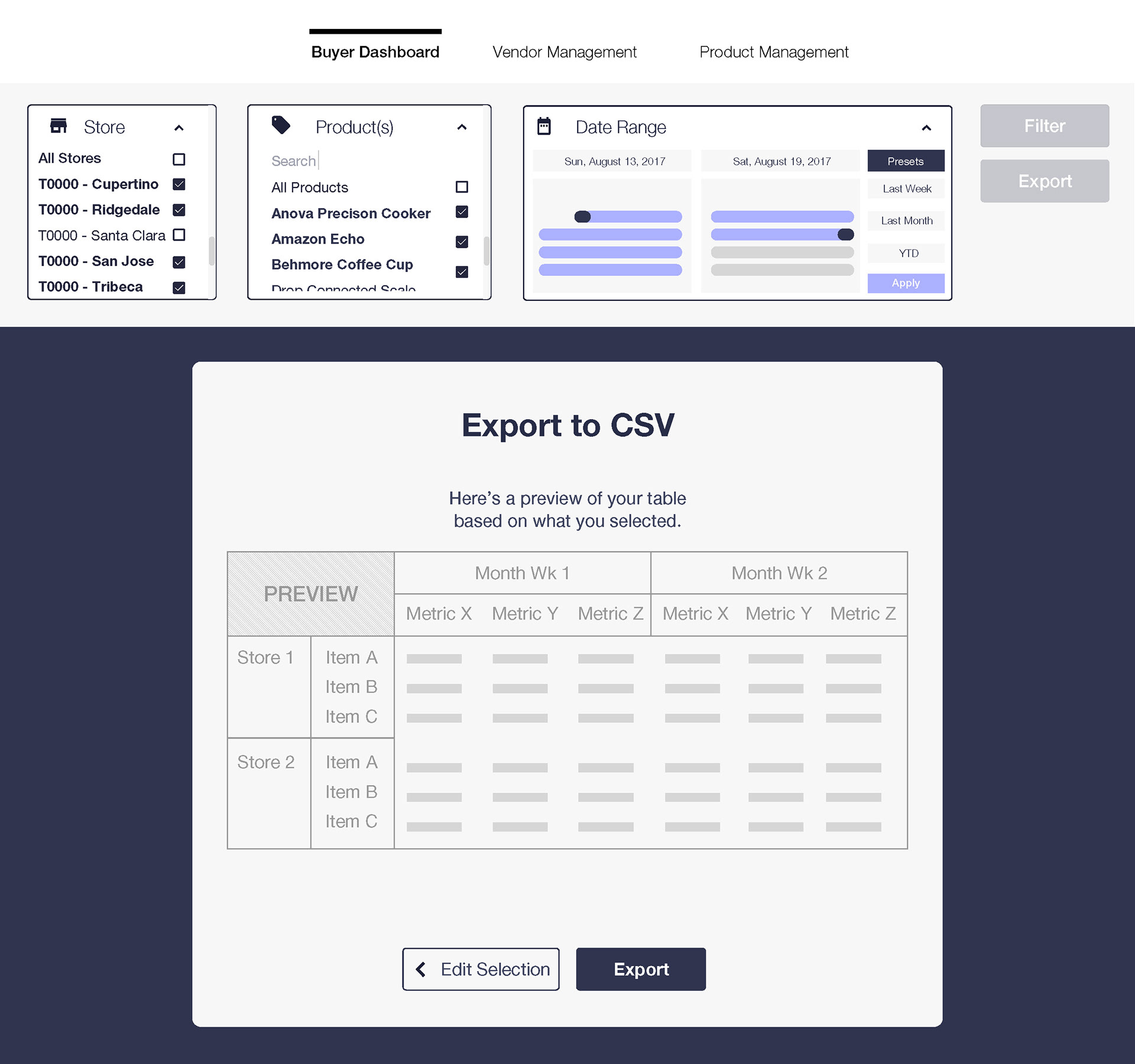
EXPORT FUNCTIONALITY
Those who work often with data tend to prefer analyzing it themselves, our research showed us. I designed a robust export featured that allowed users to choose the data they'd like to display (and how it should be organized). Though this feature was not included in the first release of the dashboard, it might be included in future releases.
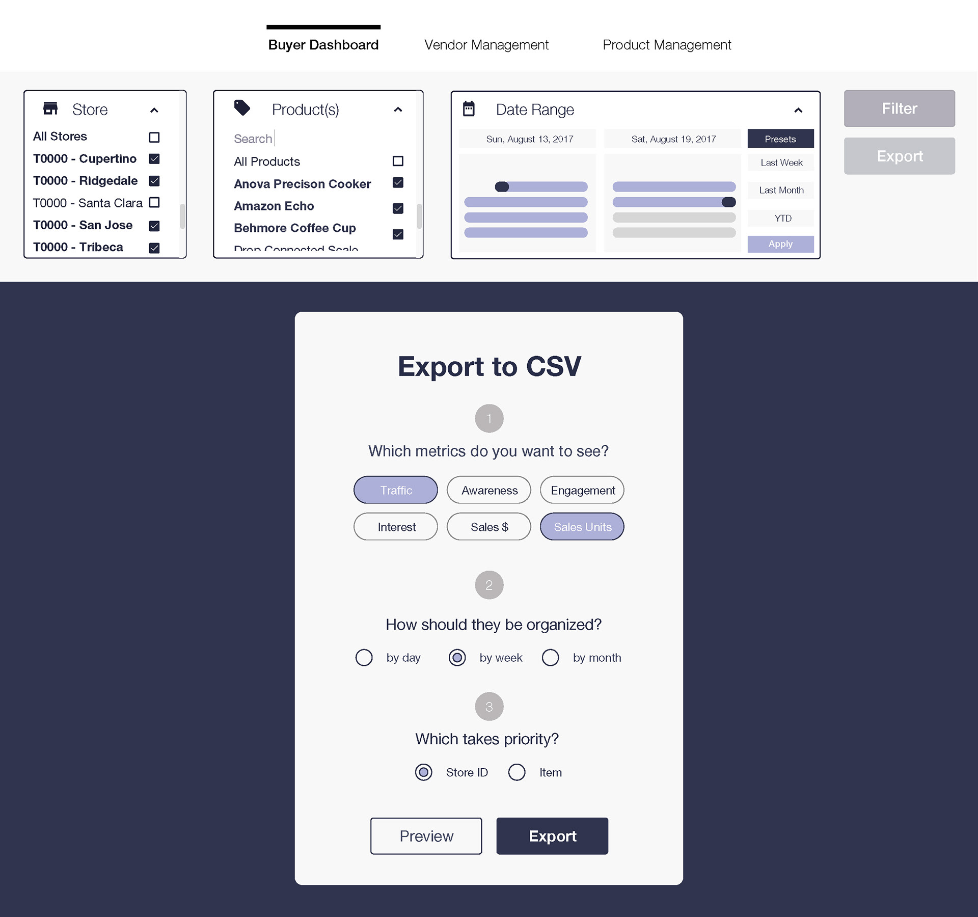
Users first select export settings.