Key design decisions
1. Use language that makes apparent the physical nature of guests' journeys.
2. Design and animate bold iconography with seamless transitions.
3. Provide user-friendly ways to understand context and benchmarking.
Icon design and animation
I designed each icon with animation in mind from the start. Since the dashboard's data shows a user journey that is physical, it was important to me that the icons and UX copy helped make that apparent. Ultimately, five icons were used: views (eyeglasses), interest (magnifying glass), engagement (finger tapping), purchase (Target bag), and likes (heart). The visual design was informed by large illustrations that adorned Open House.
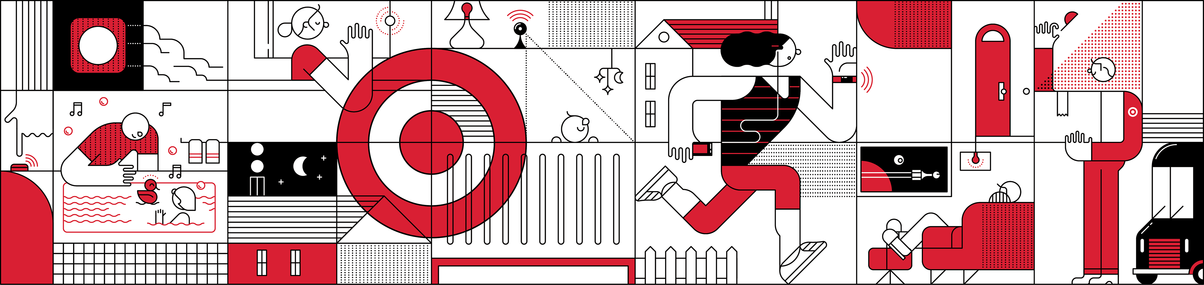
One of the illustrations that informed the visual design style. Credit and source: Target Creative
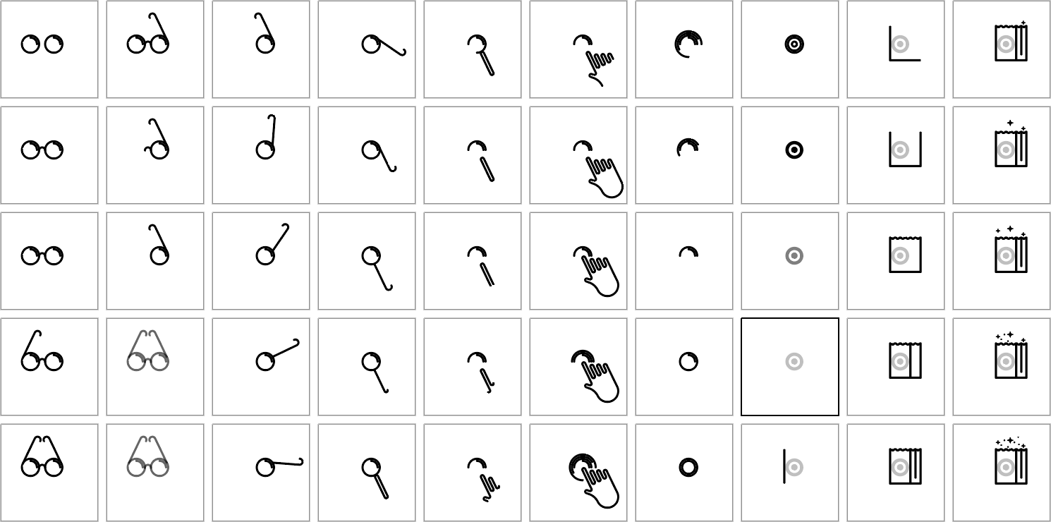
Individual frames from the early stages of icon conception
Early frame-by-frame exploration
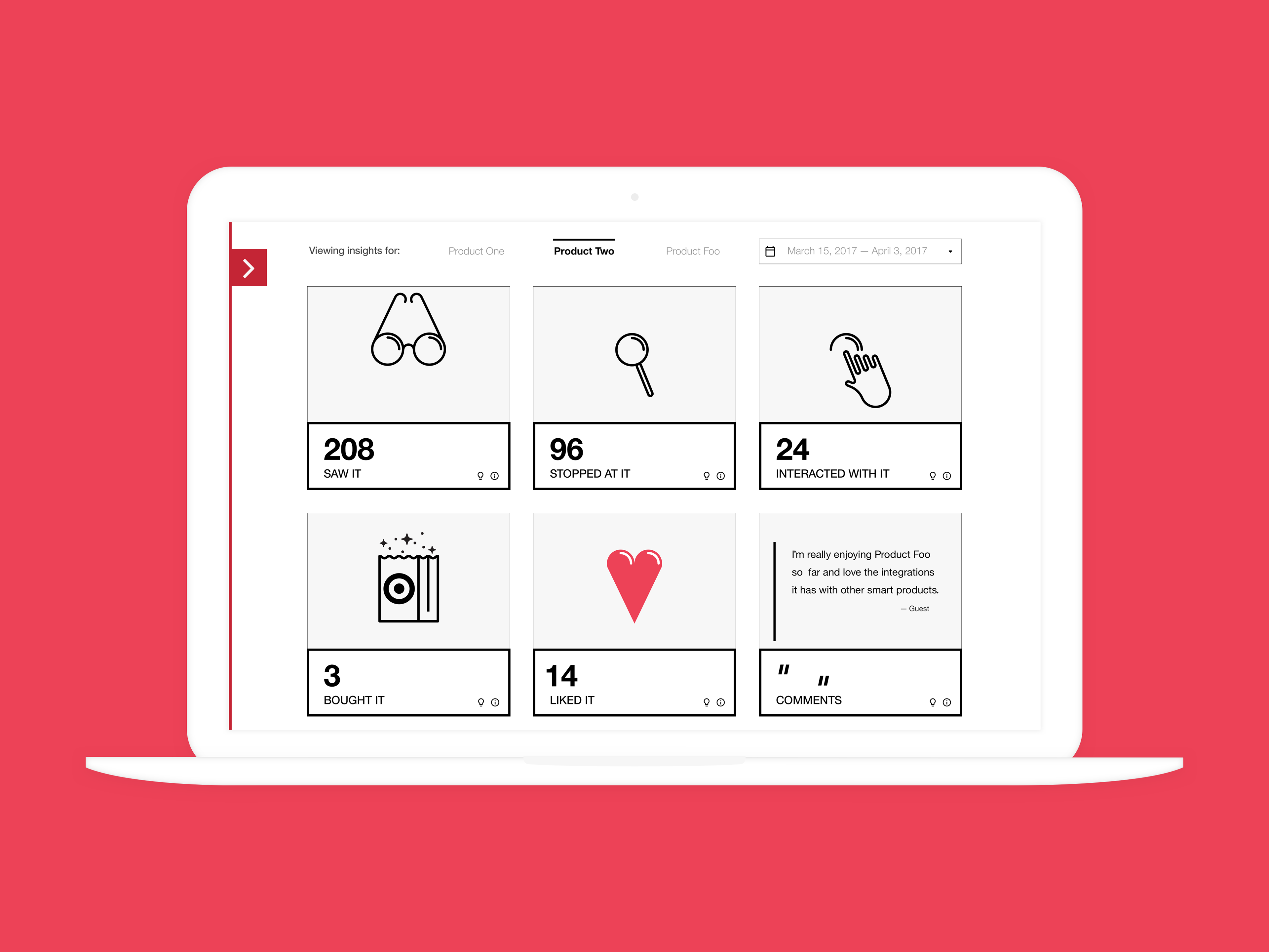
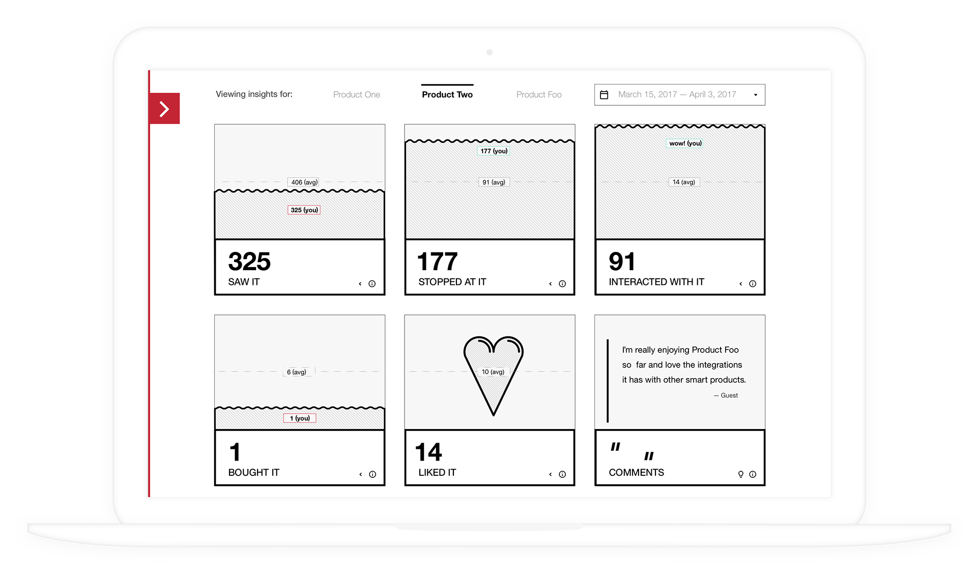
Metrics
In order to capture guest engagements, each tablet fixture was equipped with sensors and the tablet's touch events registered. There was one tablet per product. Ultimately, six pieces of data were shown: views (very short dwells or someone walking by), interest (slightly longer dwell or someone standing), engagement (dwells with taps and swipes), sales, likes, and comments. The descriptions of how our system arrived at each metric is available on the back of each card. Tapping the information icon brings it up.
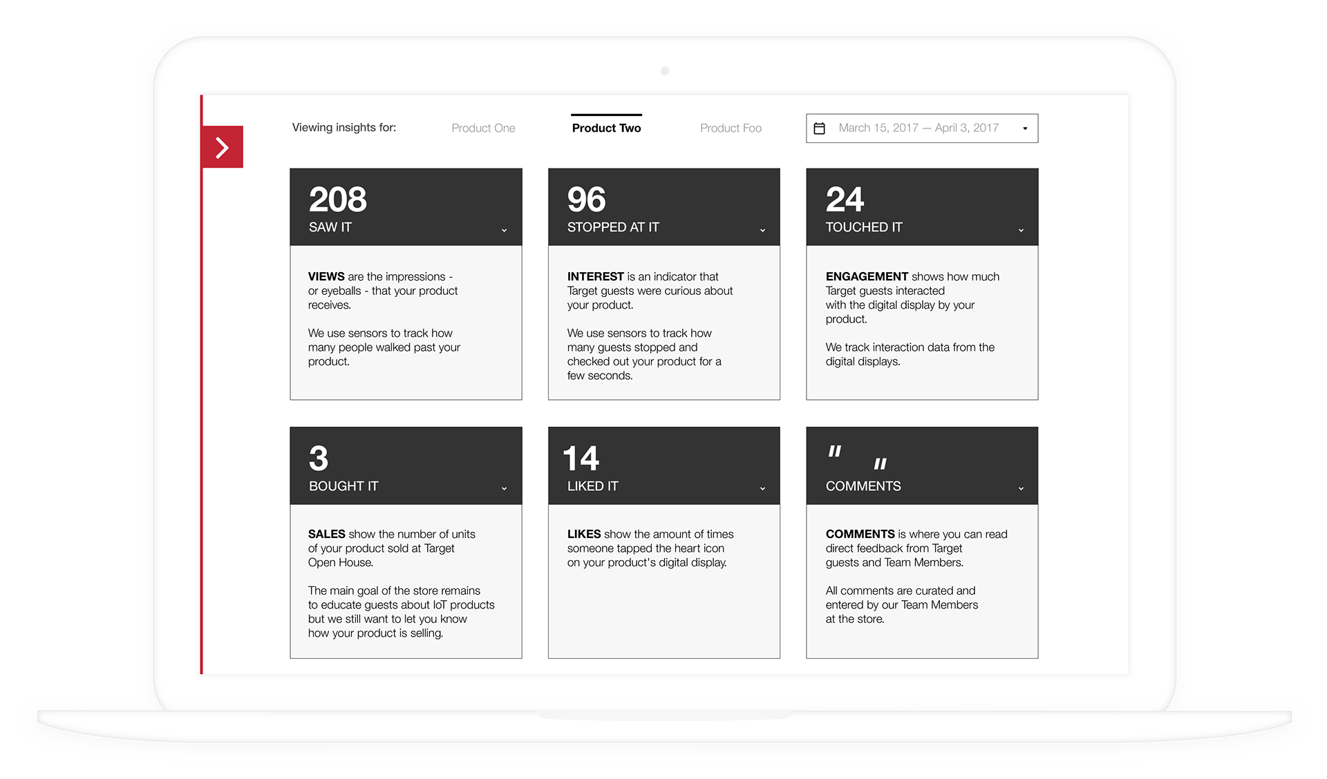
Metric definitions
Benchmarking
A key component of meaningful data is benchmarking. We provided two pieces of data: 1. the average for a metric for all products in Open House for the time period selected, and 2. where the selected vendor was in relationship to this average.
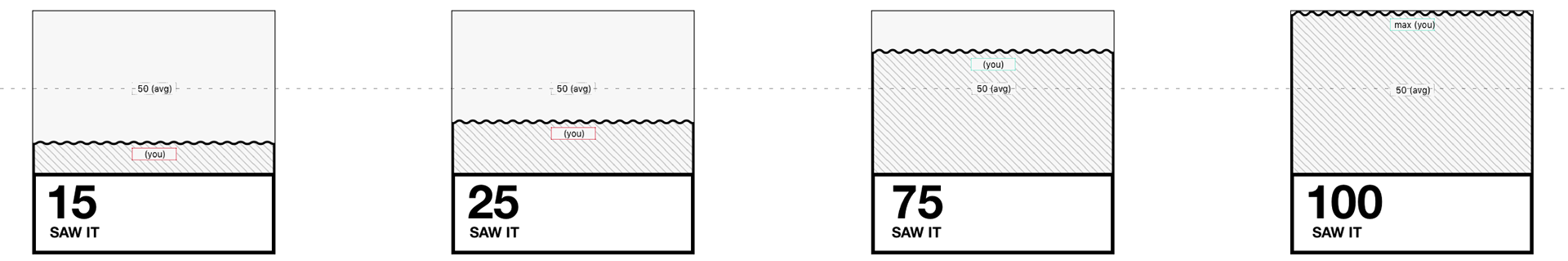
Stylized bar graphs with benchmarks called out. Notice that the average line remains constant for visual clarity.
See it in action!
Engineering and development by Tianwei Liu, Sr Engineer