
AI Generated Logo
Here's the logo we generated with the online AI tool. We used their tool to choose the color palette and the font. Edwardo liked the hexagonal shape. But we both felt that the logo needed a stronger symbolism to be unique.

Keyword Search
Rather than begin looking for design inspiration on curated sites like Dribbble, Pinterest, or Behance, this logo design process relied, intentionally, on Google Image search. This is similar to how the initial program began to tie images to keywords. A clear visual pattern quickly emerged: concepts behind the terms "nodes", "robots", and "connectivity" showed up in a number of different logos and fonts.

IDEATION
Since many of the logos found used a grid of dots that began to bleed together (not unlike a fluid), I began in the same way with a 3 x 3 grid made of circles of the same radius. Eventually, I noticed that the letters "a" and "i" could be formed in this way, and explored nearly two dozen versions.


Final Logo
Here are the final lockups. Tweaks include rounder radii on hexagon and the use of only two colors.


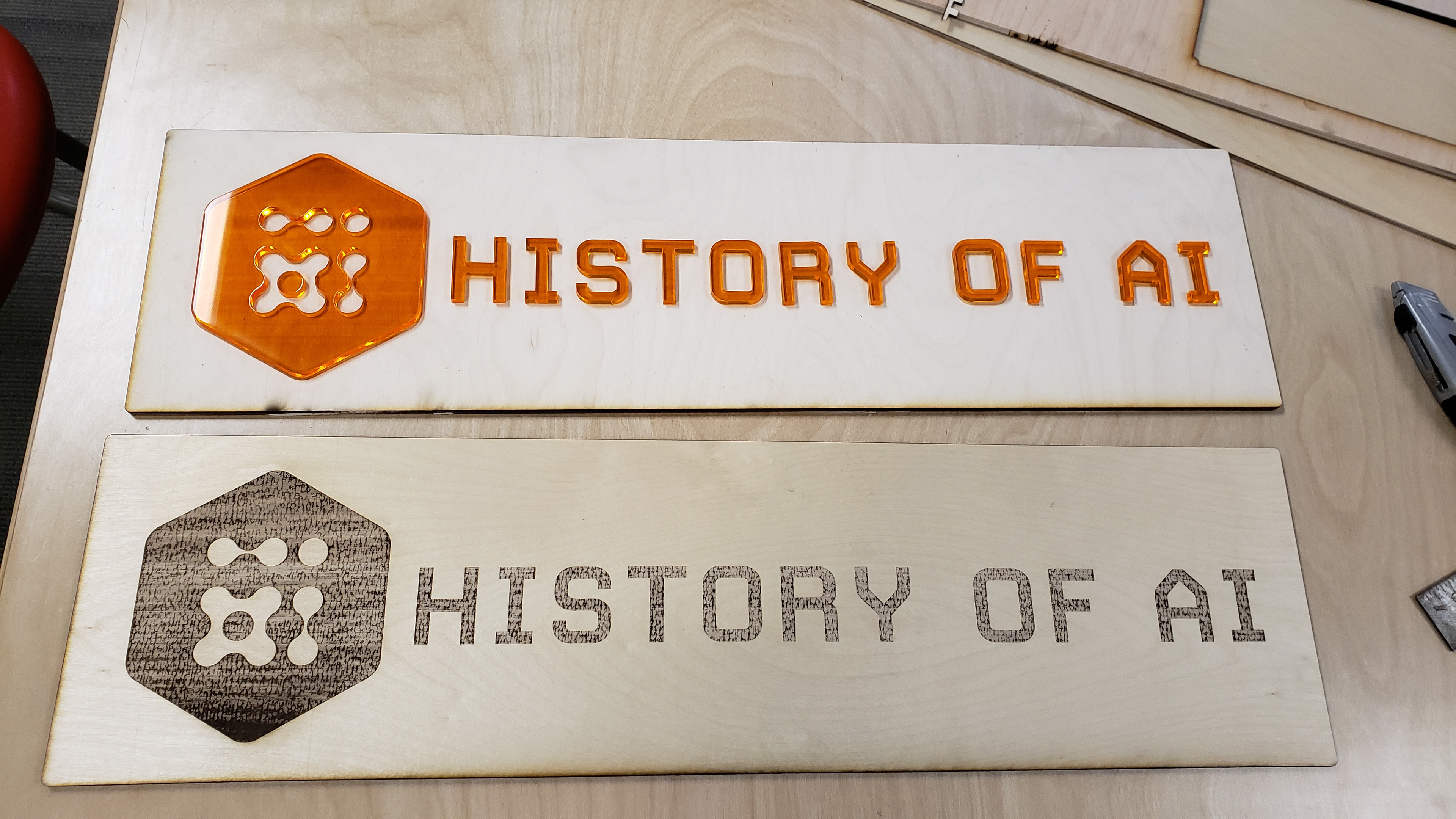
Fabrication
Since Edwardo was using a number of technologies to fabricate the exhibition, including laser cutting, the logo had to be designed and built with that in mind. This meant large, bold fillets and closed paths, similar to designing for SVG. Here are photos from his tests.
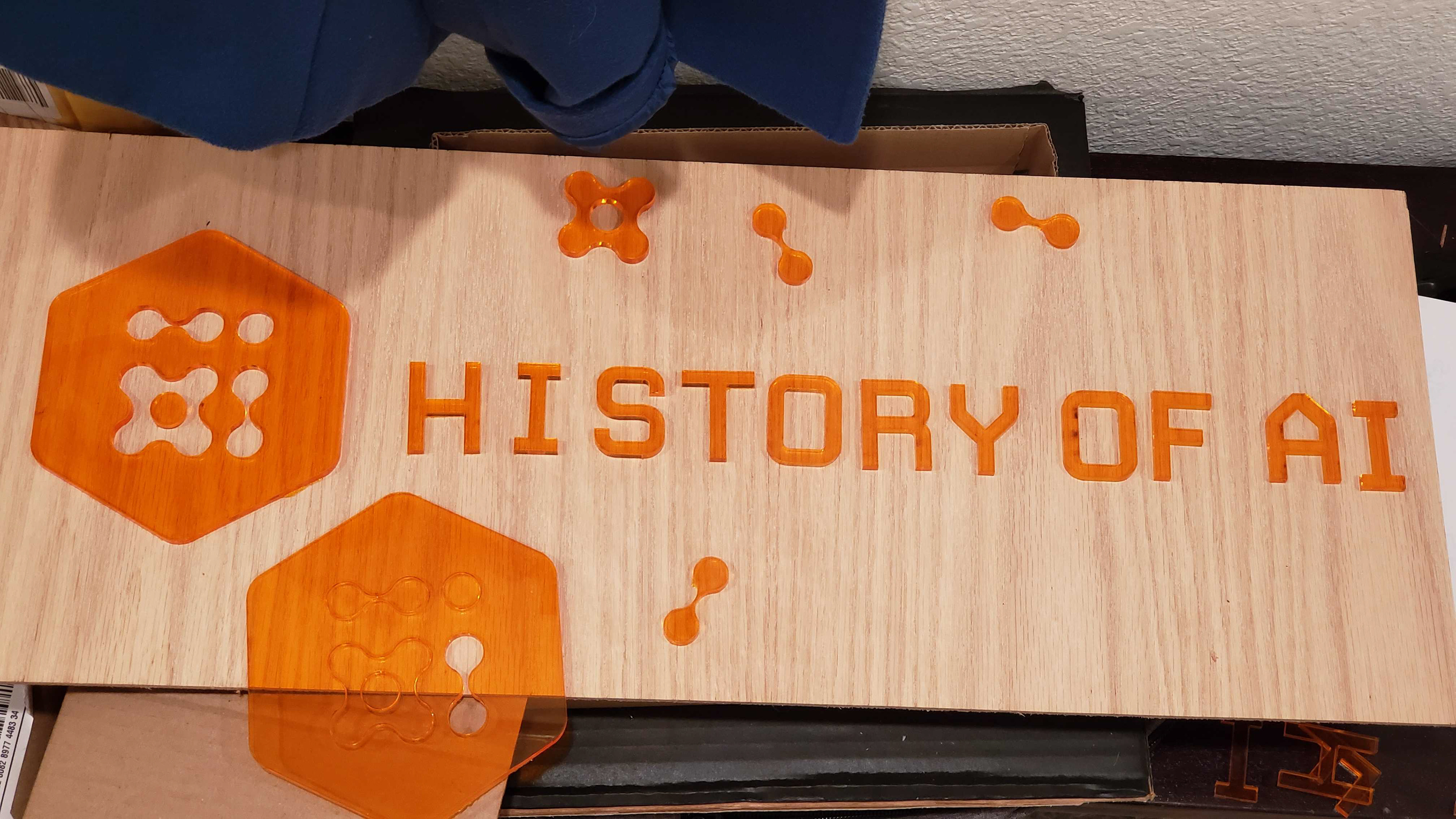
Experimenting with shallow inlay