Organization
This particular project would be a significant undertaking and would set the foundation for subsequent B2B UIs. The first goal was to speak to everyone who'd been handling varying tasks, and then find a way to link those tasks together seamlessly. I began by asking questions. For example, who was entering a new vendor into our spreadsheets? How were product samples delivered to the store? Who was uploading or collecting images, videos, and product information from the vendors? What did the email correspondence between our team, the vendors, and Target's systems look like?
Using email correspondence to understand User Journeys
I worked closely with our Sr Merchant and Product Owner - who handled many of these tasks - to devise a flow diagram. I extended that diagram to include decision points for both the user and our team. Since most of the process was handled through emails between our team and the vendors, it made to begin by designing a set of emails that would be sent from this new system. These templates, in whole or in part, could be used to automate some processes while we designed the Mission Control portal. Here are some of the templates.
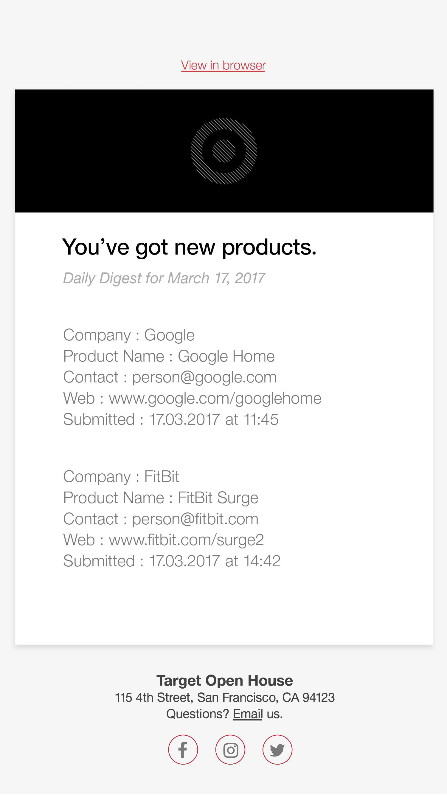
A daily email that sends our team an aggregate of products submitted for consideration.
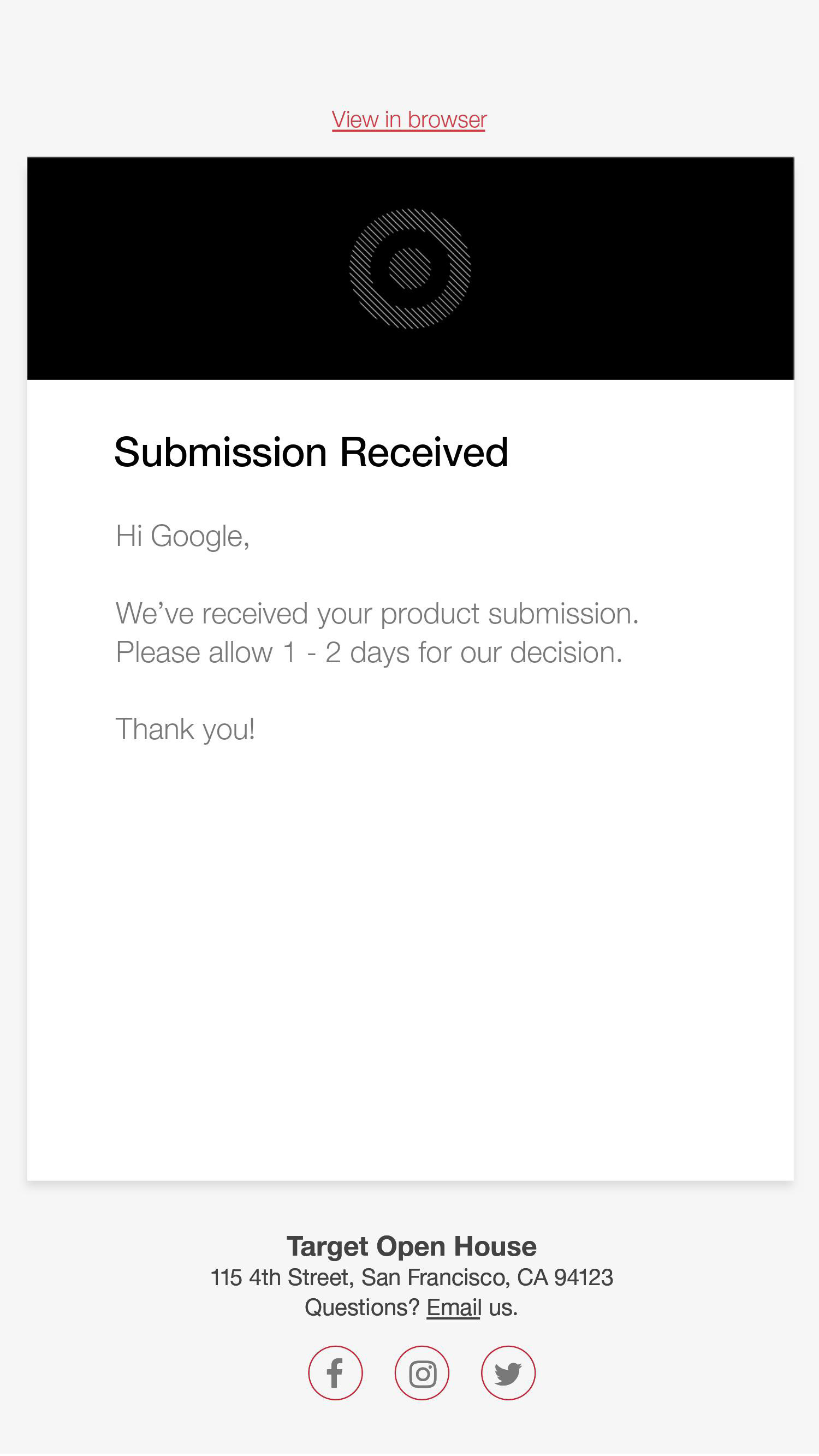
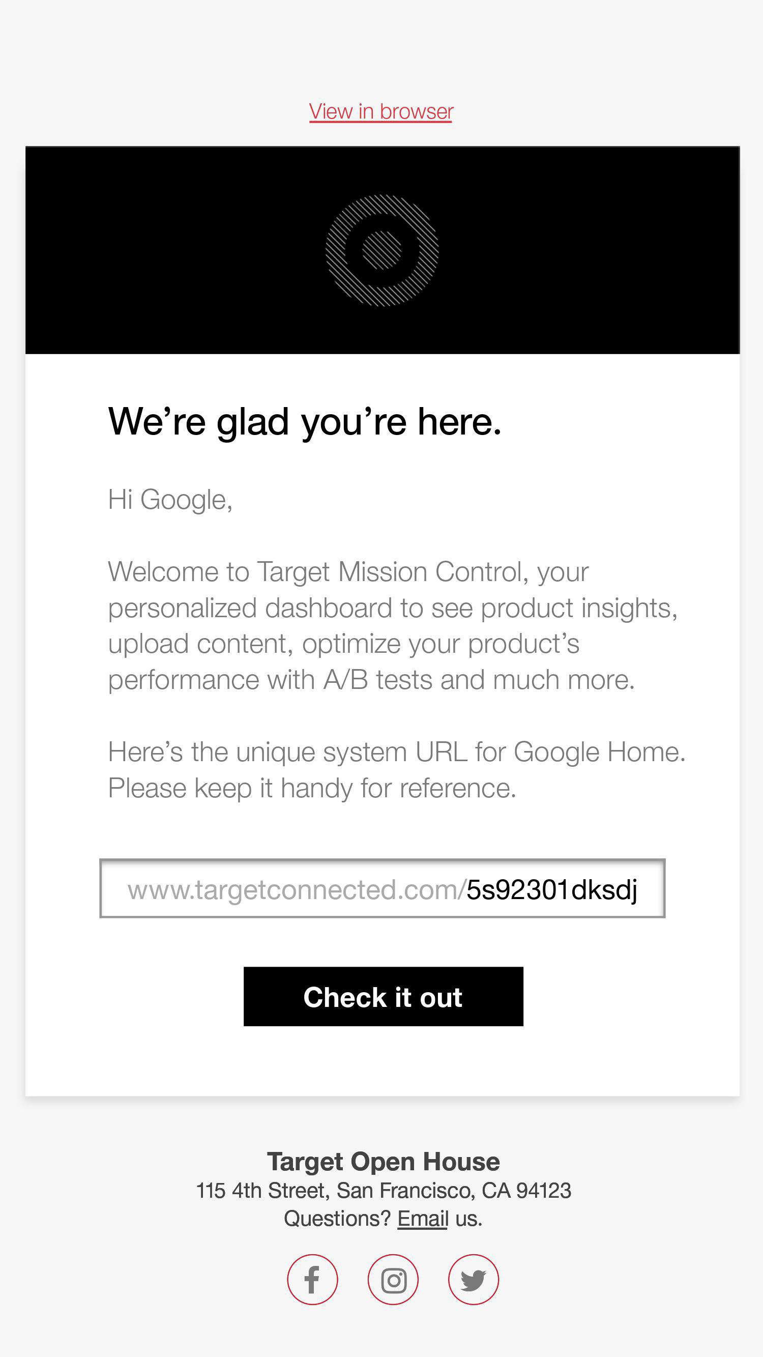
What a vendor sees once they've submitted their product for consideration.
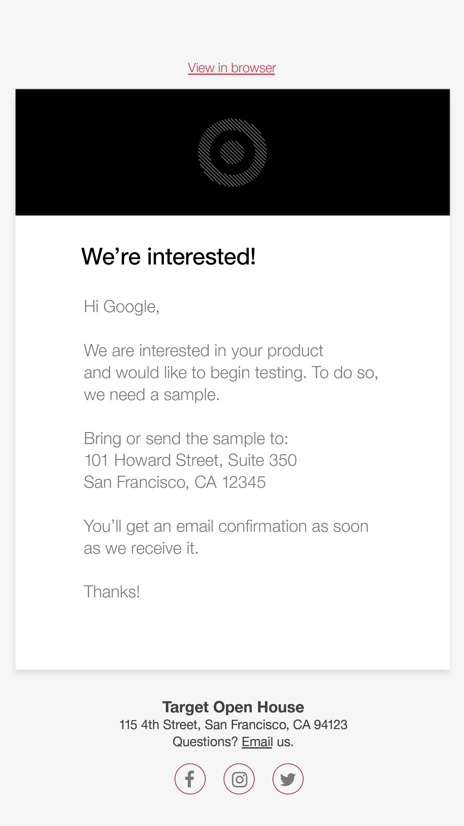
The vendor hears back with next steps immediately.
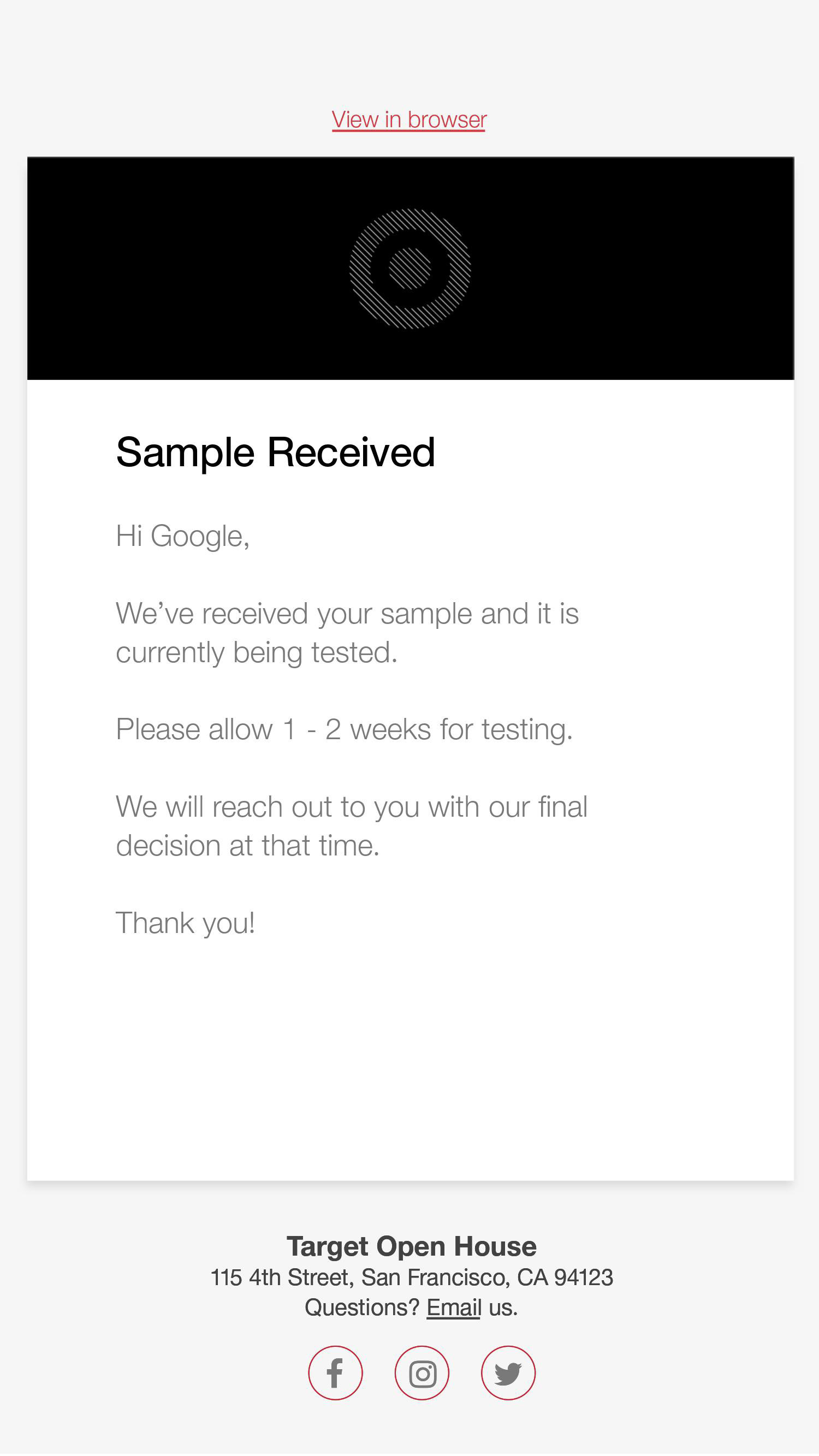
The vendor is alerted that we're testing their product.
A unique link is automatically sent to vendors once we 'turn on' the product in our system.
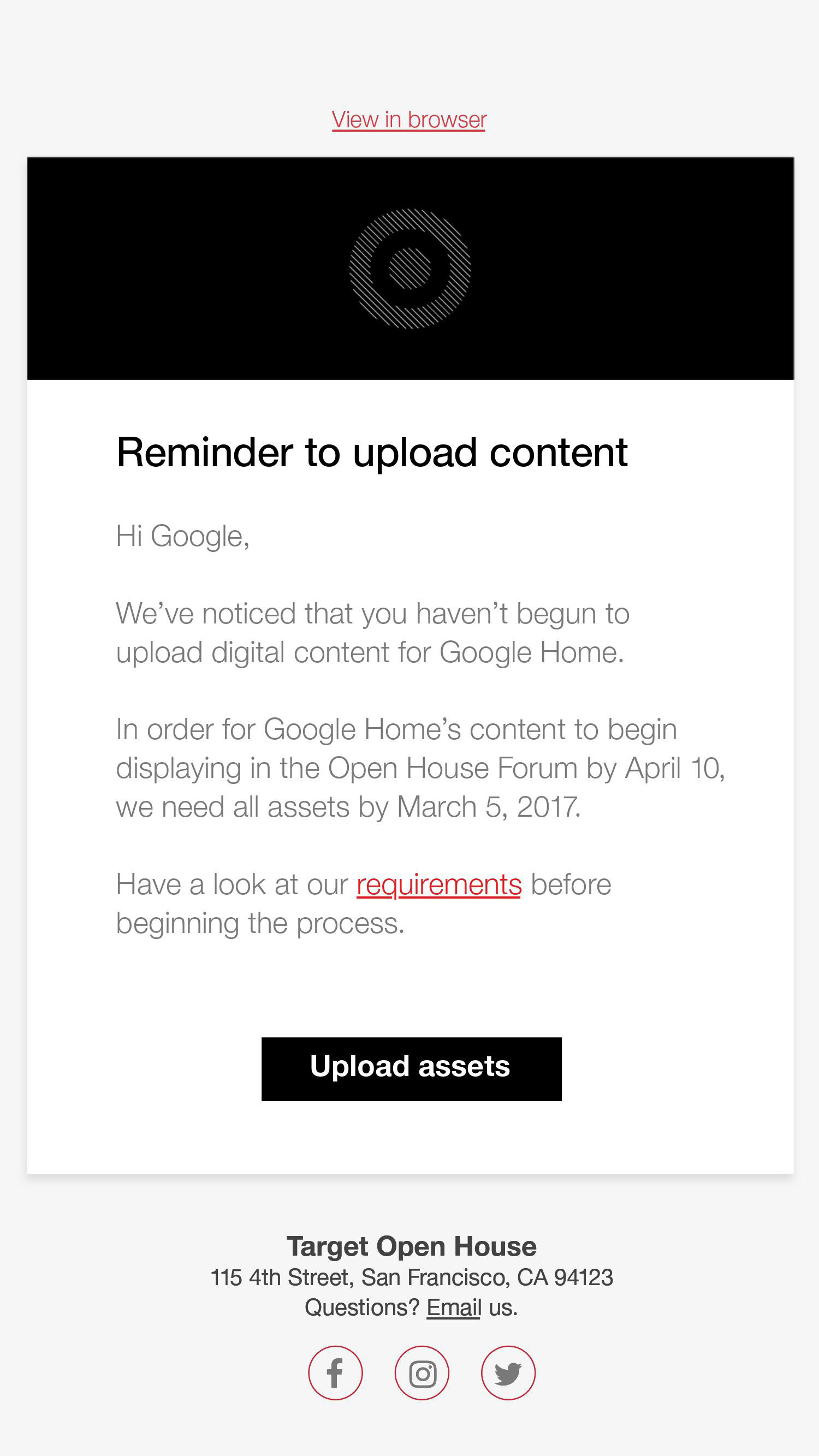
A reminder to upload assets.
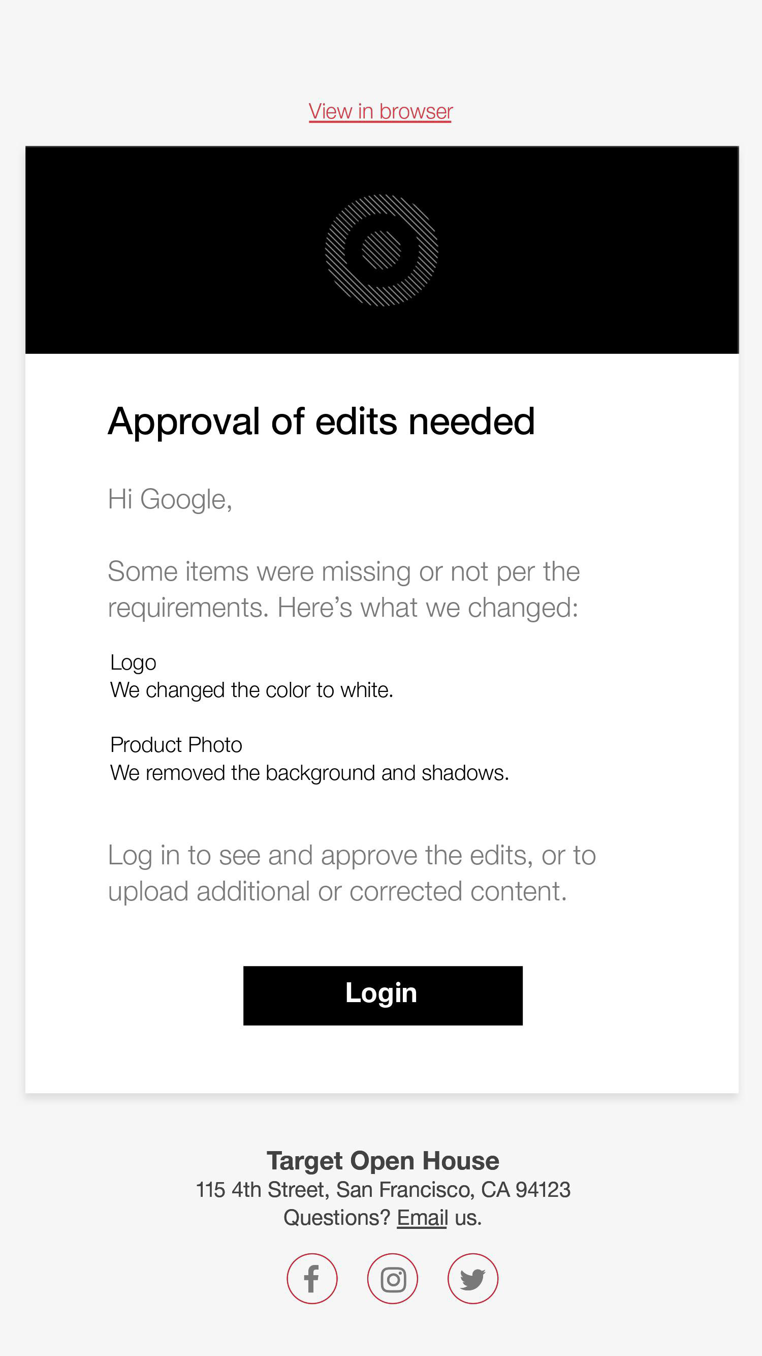
If edits were needed, vendors were given direction on how to make the improvements.
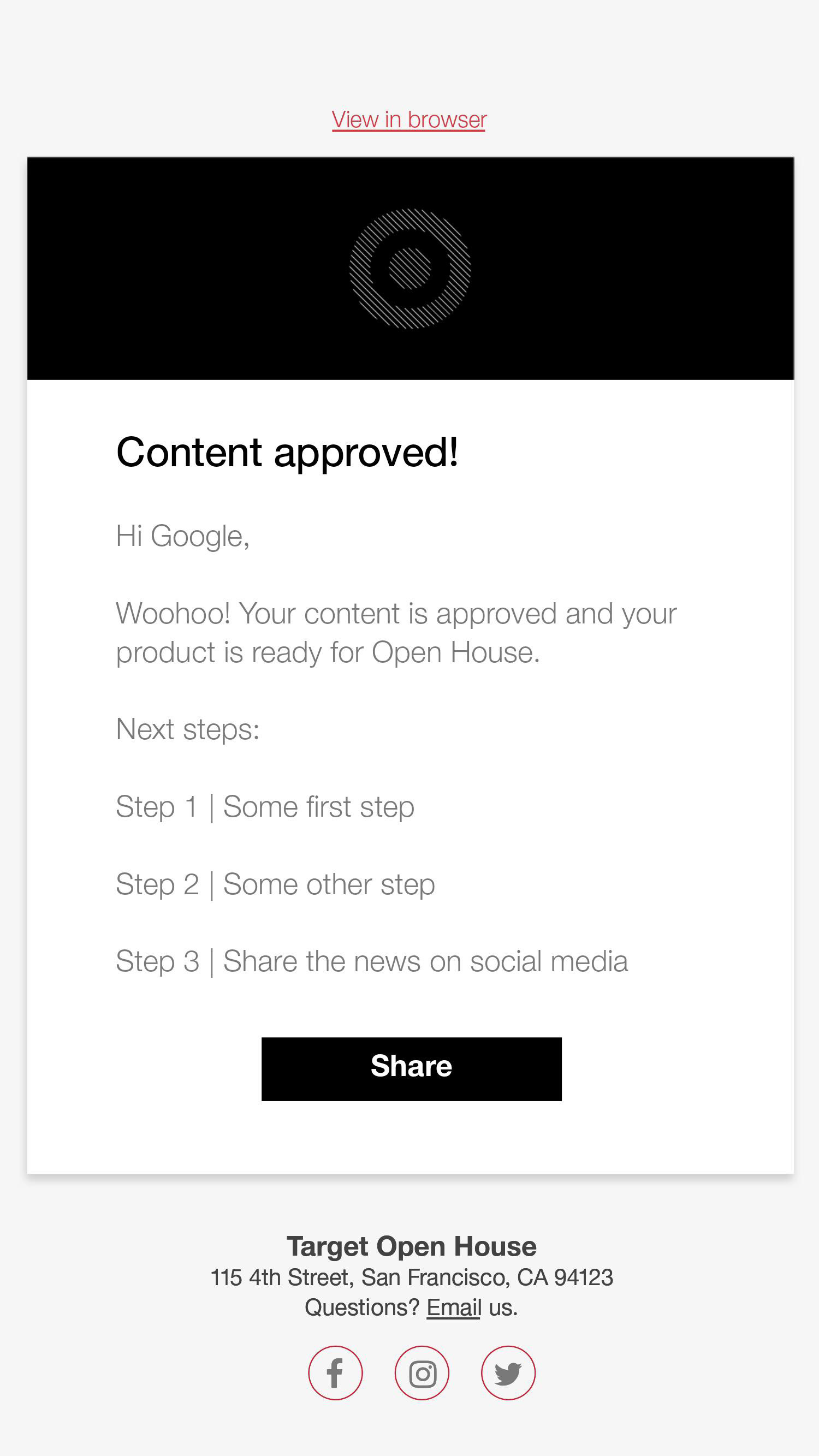
A sample email with next steps.
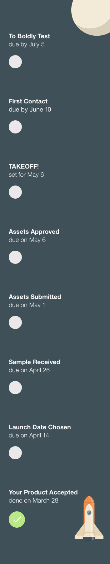
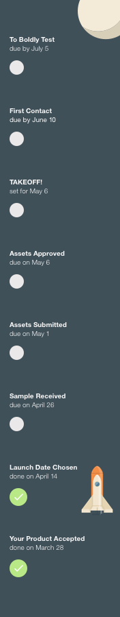
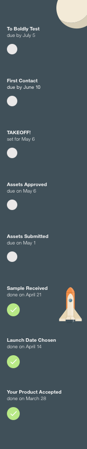
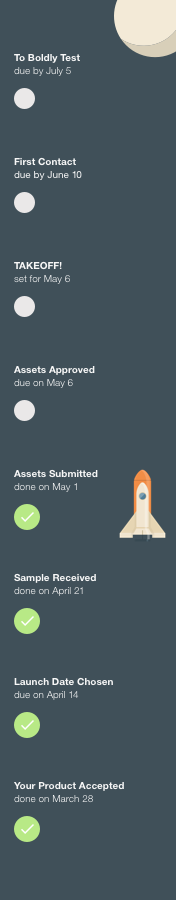
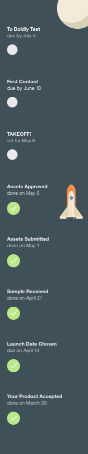
Mockups for Mission Control
The flow is roughly divided into three major sections:
Getting Started
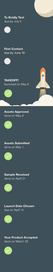
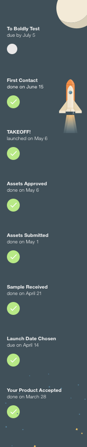
Vendor Takeoff
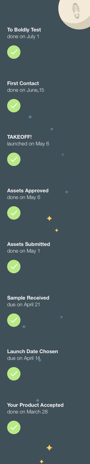
Vendor Landing
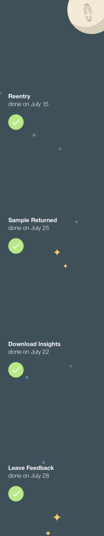
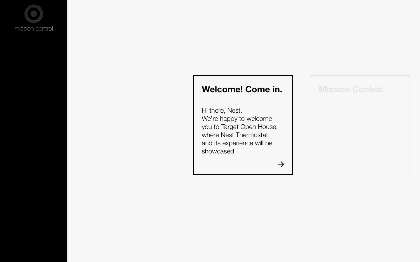
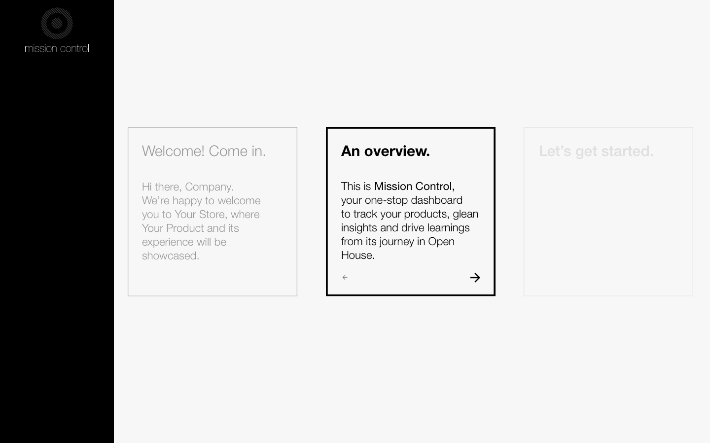
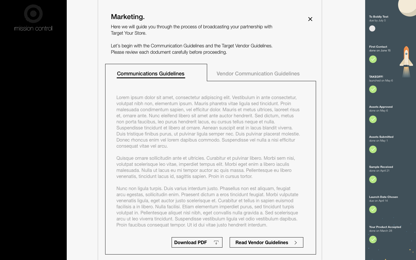
Getting Started introduces the vendor to the platform and set expectations. It follows the adage, "Tell them what you're going to tell them, tell them, tell them what you told them." This is a philosophy I use often when designing task-based UIs.
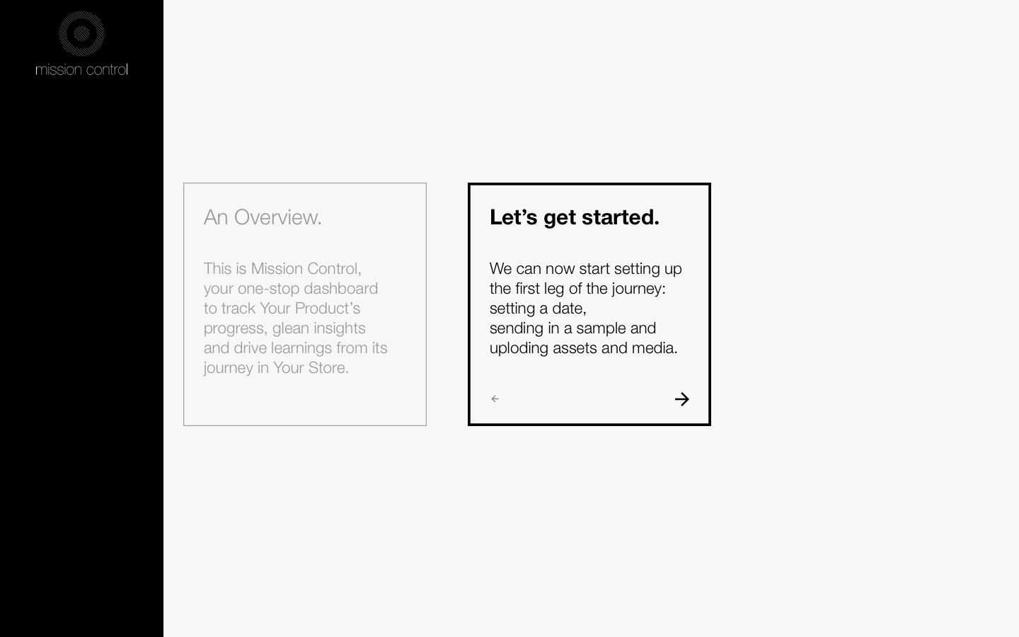
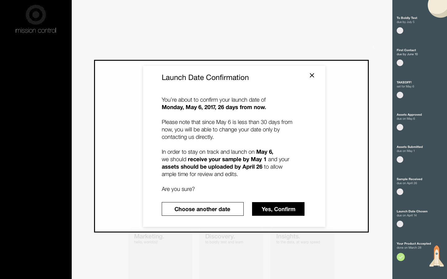
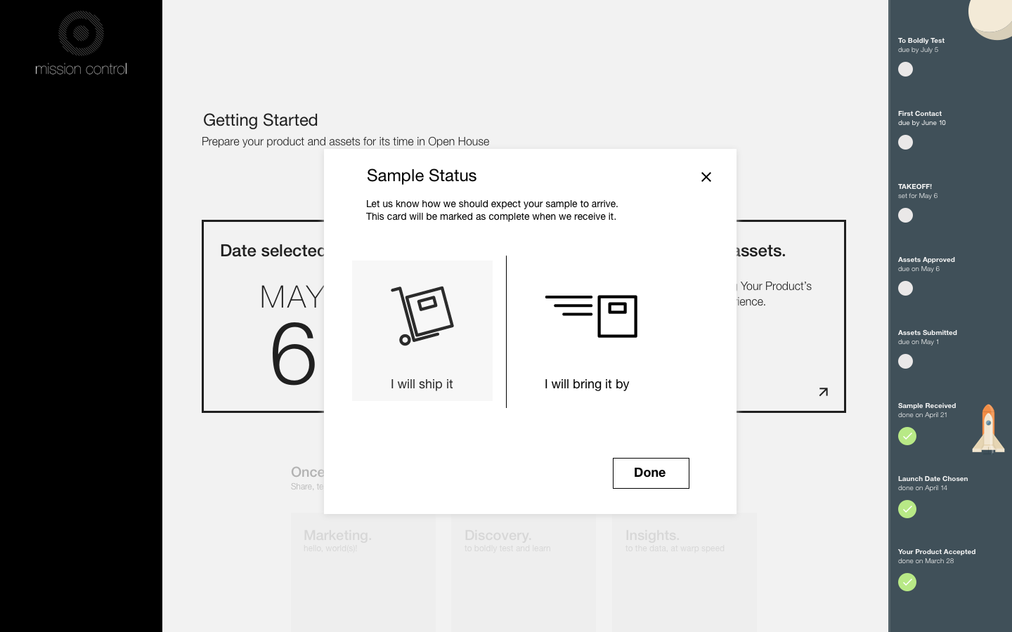
Now comes the first decision: choosing a date. This one was particularly challenging to design for for a number of reasons. Our merchants wanted to plan new products in batches, but that was difficult to ensure due to lags in shipping times for samples, delays in the content approval process, and more. The goal of this experience was to encourage the vendor to build in buffer time around the date of their choice, and then to stick to the confirmed date.
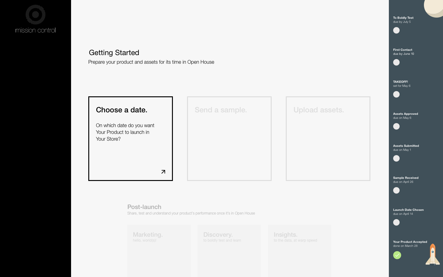
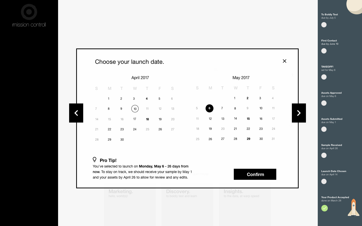
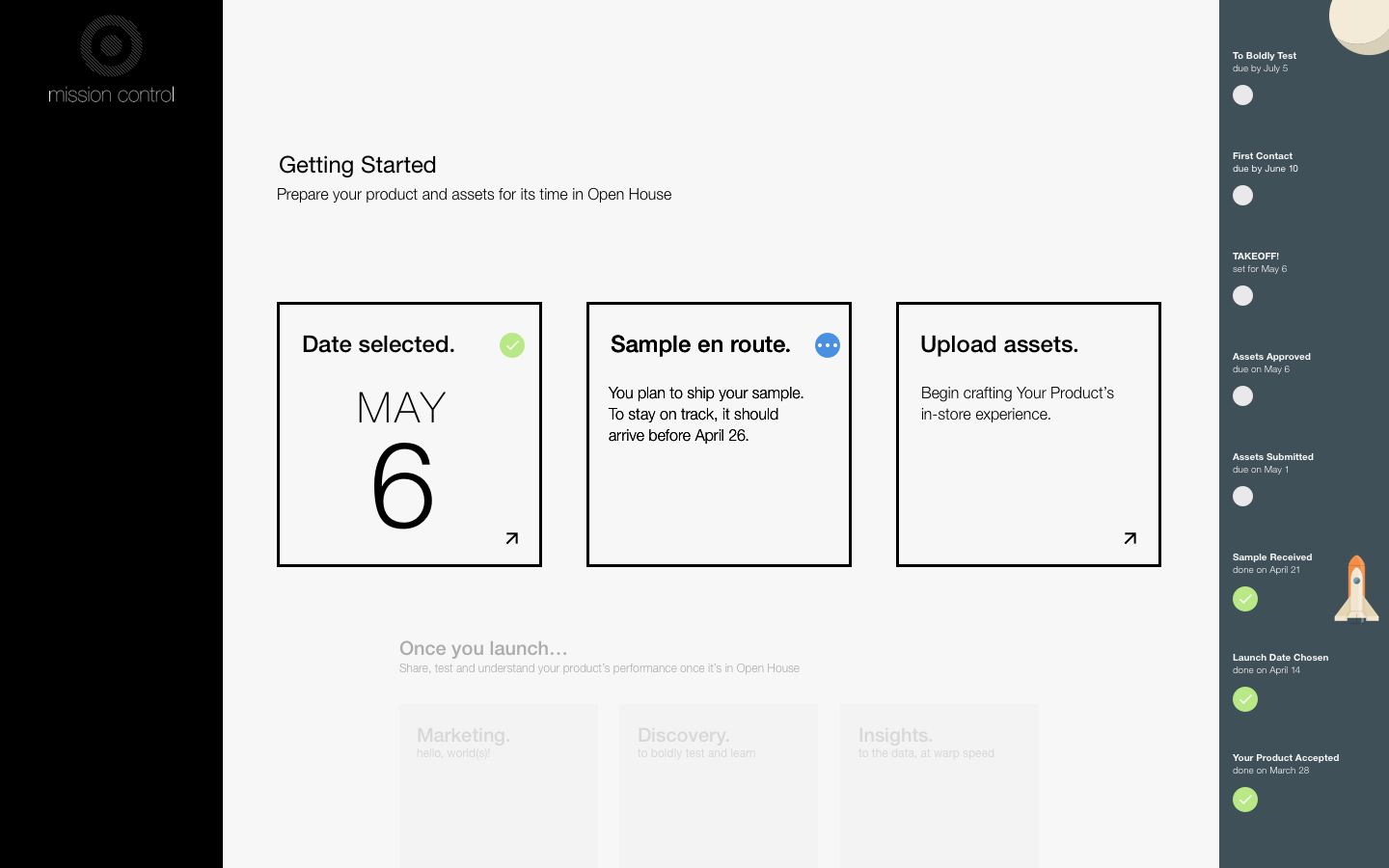
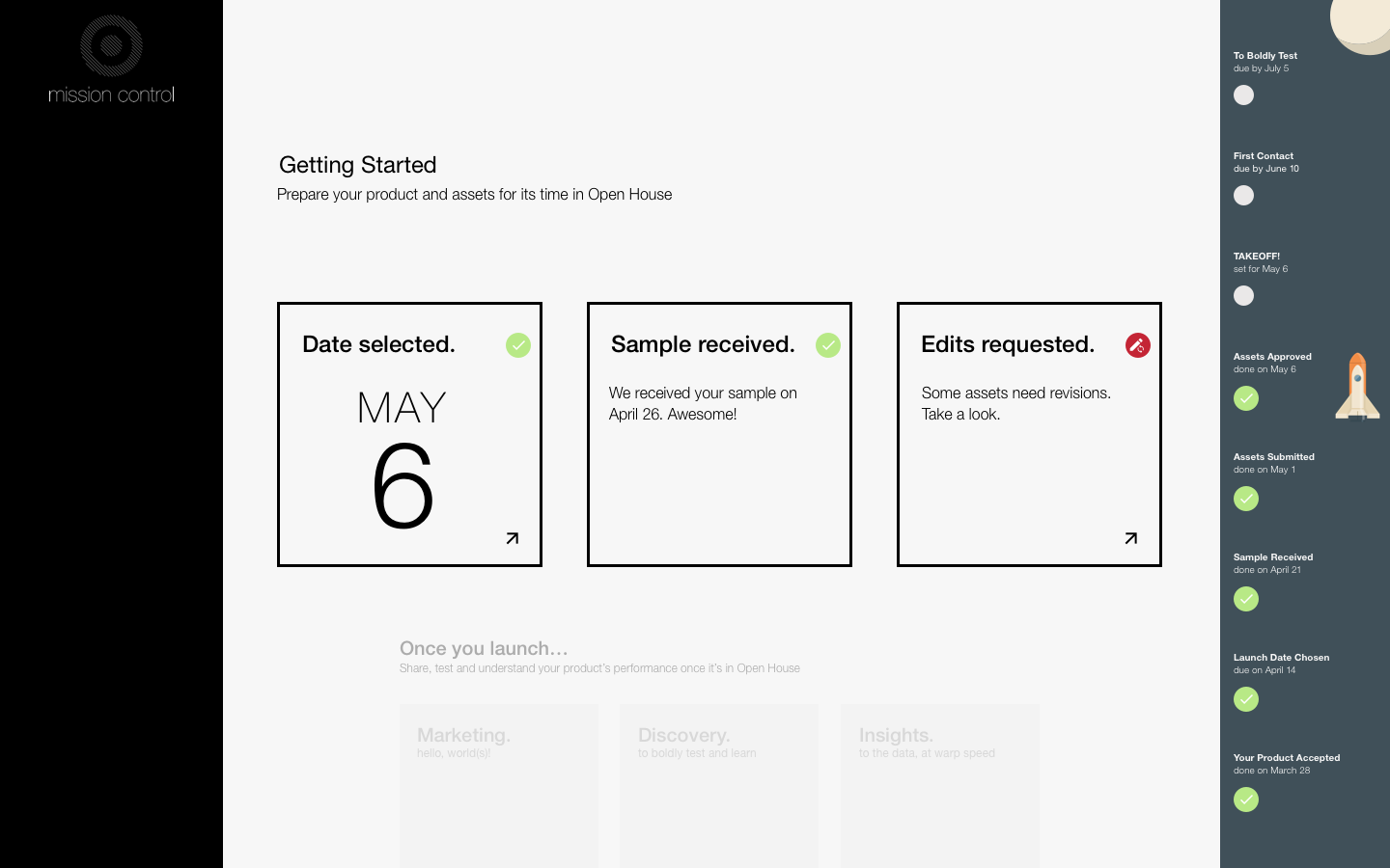
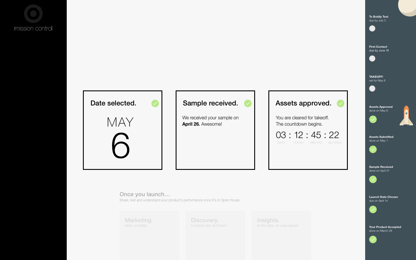
Once a date is chosen, the state of the card changes to 'green', their rocket passes another stage, and the other two cards become active. They can now actively tackle the next items on the list: sending a display sample to our office and uploading product content.
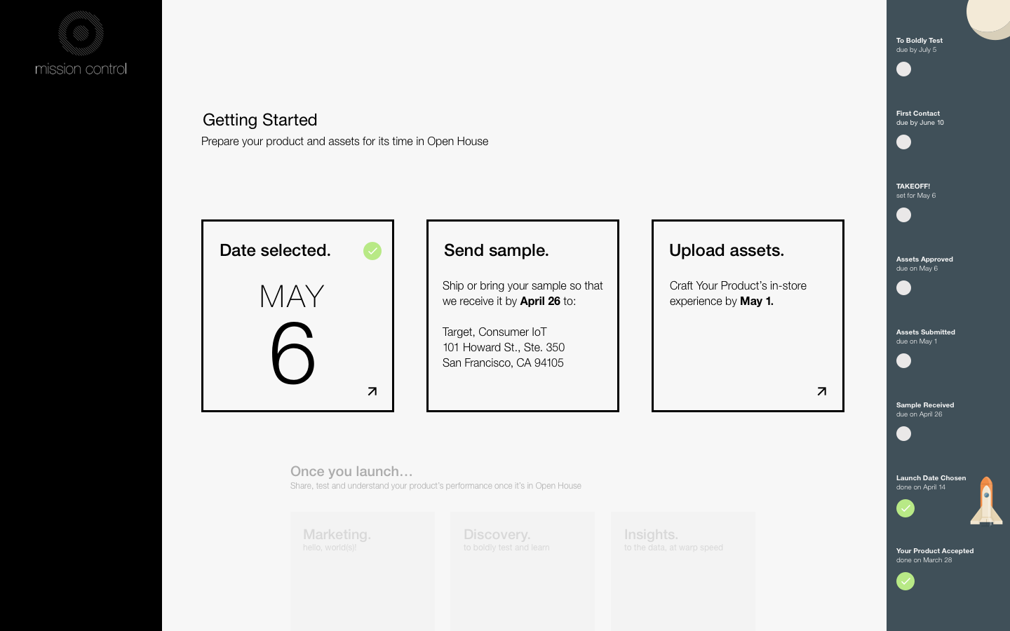
The collection of high-quality logos, images, videos, and copy from vendors was a tedious and time-consuming process. Another section of this portfolio goes into detail on how that system was designed.
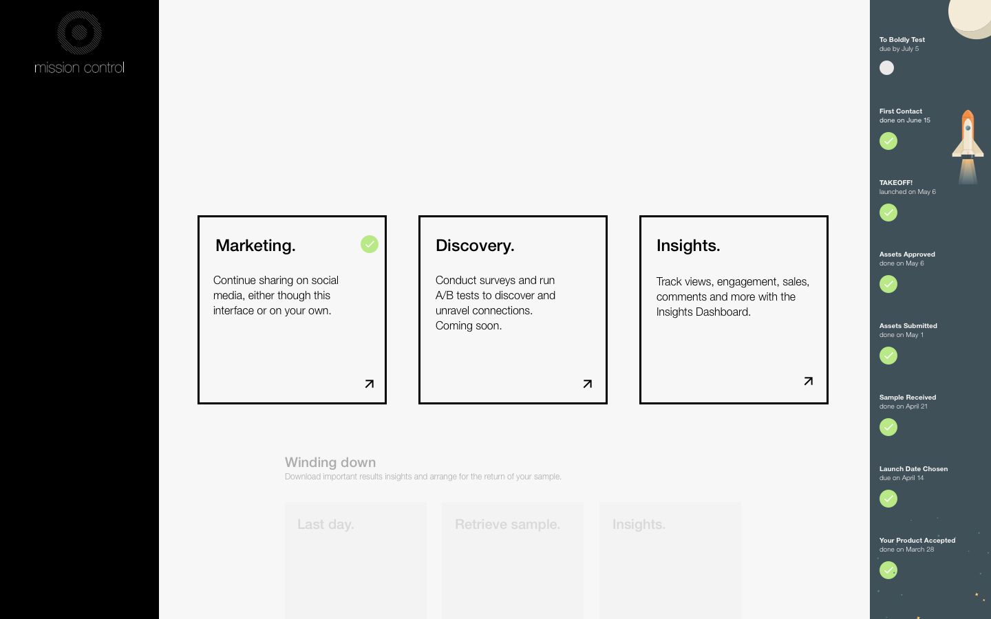
Once notices here that the next phase of the UI is visible underneath the primary cards.
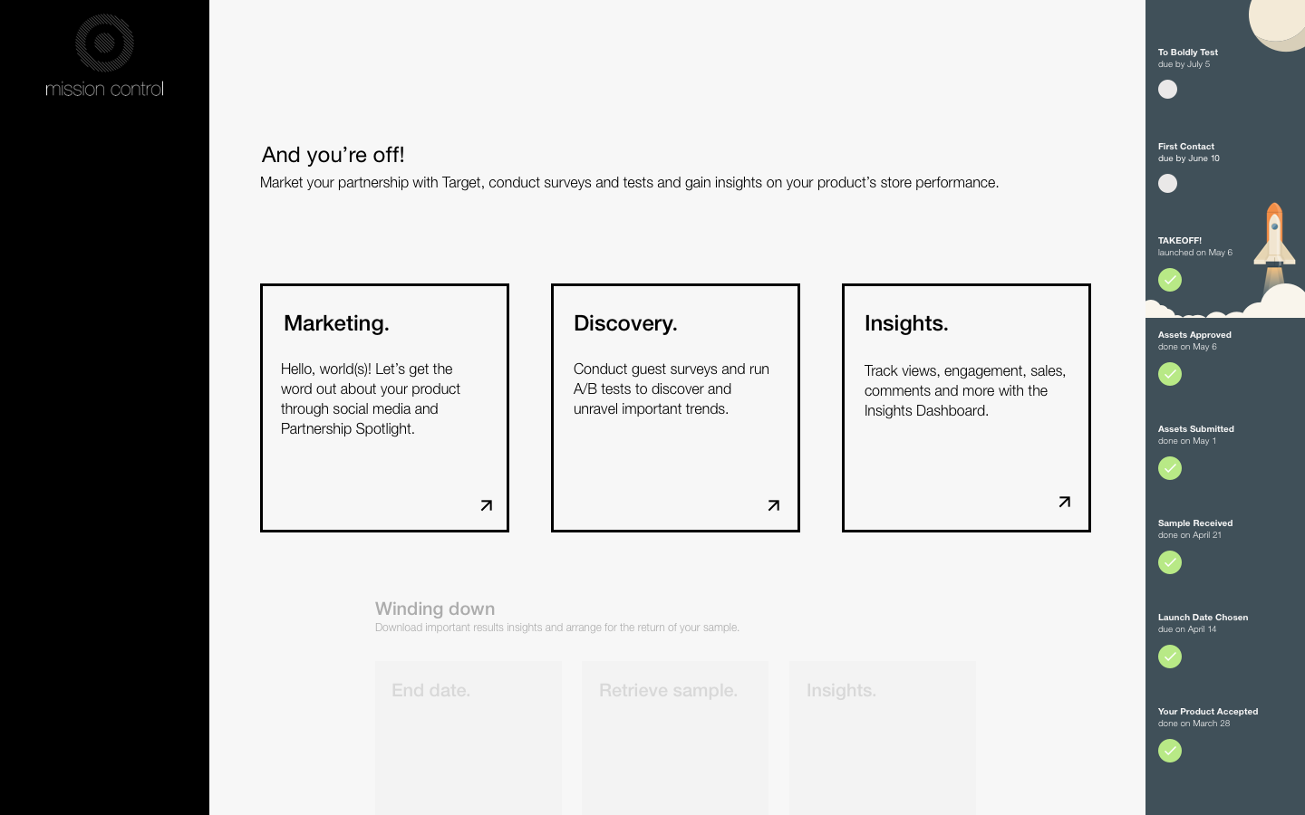
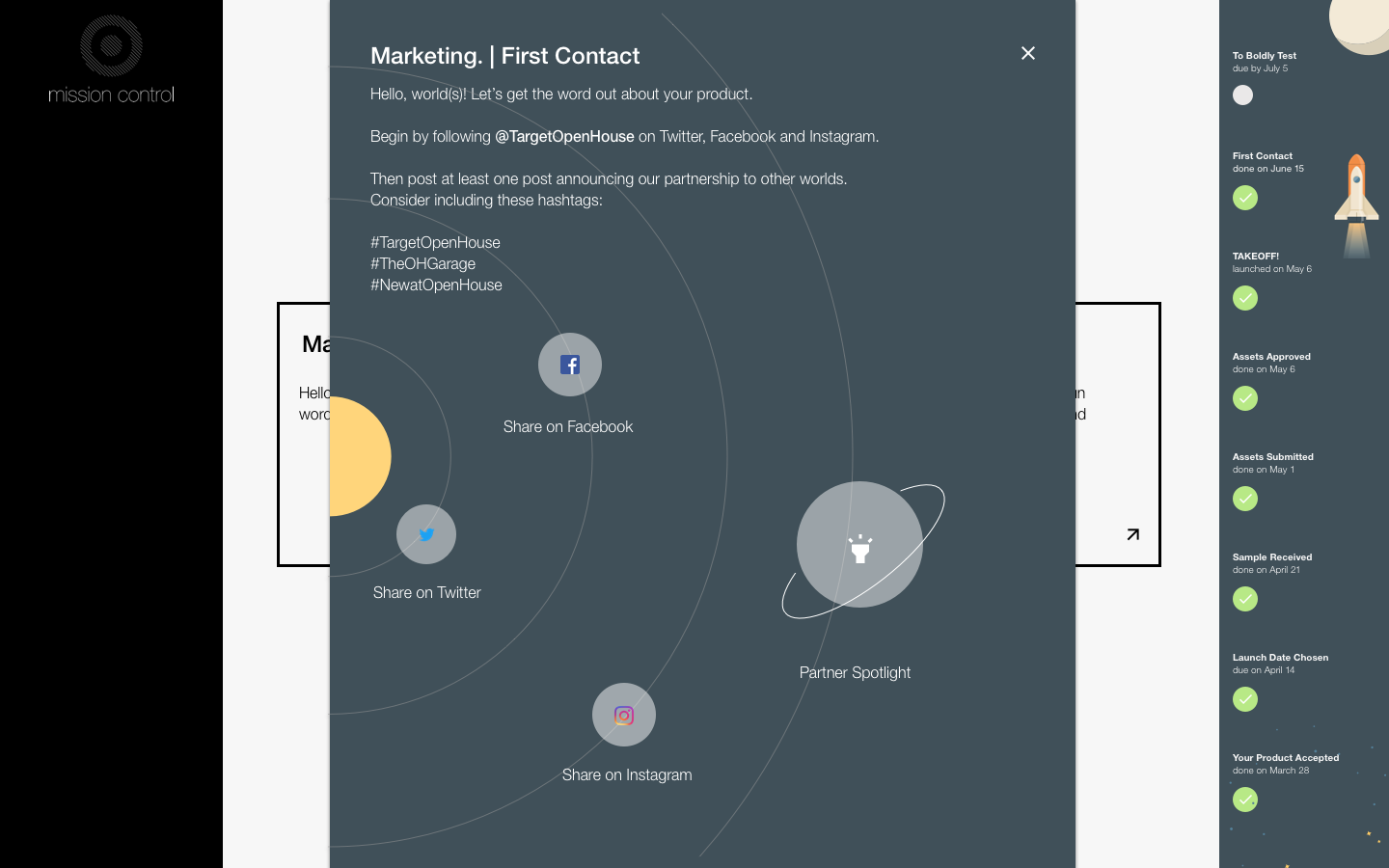
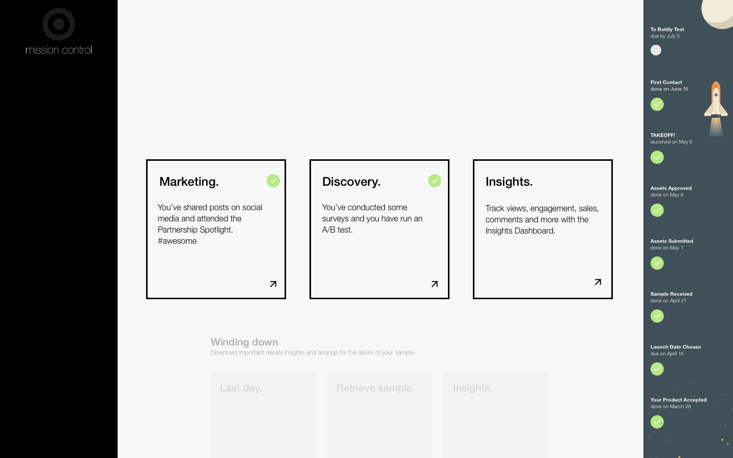
Vendor Takeoff. At last, the rocket lifts off! Everything is set up in the store and the vendor's product is live. The process now enters the fun phase. Vendors can begin sharing more about their partnership with Target on social media, scheduling Saturday Spotlights in the store and conducting A/B tests with their content.
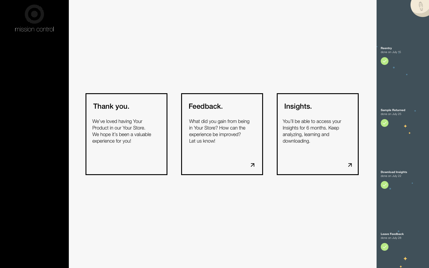
After their product has enjoyed a certain number of weeks of exposure in Open House, the vendors enter the final phase: Vendor Landing. Here, all the insights and metrics are bundled up and available for download. During this last phase, we thank the vendors for their participation and ask them to leave feedback on their experience.
UI Gamification
While not a full-fledged game, these simple illustrations were designed to imbue the experience with a sense of playfulness. Open House and Unison were, at this time, new and exciting ventures that would deliver valuable insights to our vendors. This was most vendors' very first time working with a retailer or showcasing their products in a physical store. By building a little fun in to the logistical processes, my hope was that vendors retained a bit of the excitement that led to their partnership with Target in the first place. And - shamelessly - I love space-themed UIs.