Project Overview
Adobe Xd is a web app that allows product designers and others to design, prototype, and share experiences. It is currently free. This particularly project sought to improve users' onboarding and the rate with which they returned to the app.
It was found that only 65% of users launched Adobe Xd a second time in their first month, and only 40% of users return after one week. Although new users receive beautifully crafted onboarding emails, these metrics suggest that those emails, which contained multiple CTAs linking to a wide variety of content sources, might have required folks to make a lot of decisions.
It was found that only 65% of users launched Adobe Xd a second time in their first month, and only 40% of users return after one week. Although new users receive beautifully crafted onboarding emails, these metrics suggest that those emails, which contained multiple CTAs linking to a wide variety of content sources, might have required folks to make a lot of decisions.
Our hypothesis was that if we provided a simplified welcome email series, with project-based instructional content and an overview of available resources, like UI Kits and Plugins, users will engage with this content more easily and achieve success much earlier with Adobe Xd.
Key design decisions
I was instrumental in suggesting and implementing a few key design decisions to make this experiment a success.
1. Harnessing the power of GIFs to show the step-by-step nature of complicated actions.
2. Designing for both mobile and web from the beginning, so that the content could be relevant to folks wherever they happened to be.
3. Streamlining the content to the bare minimum so as to reduce ambiguity and confusion.
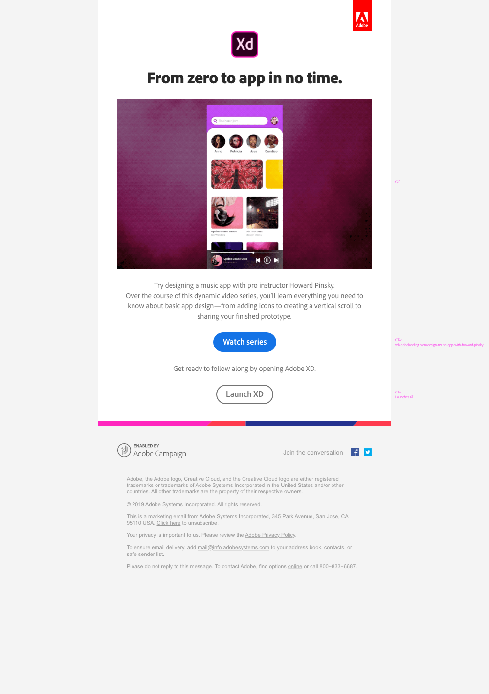
Day 0: Welcome
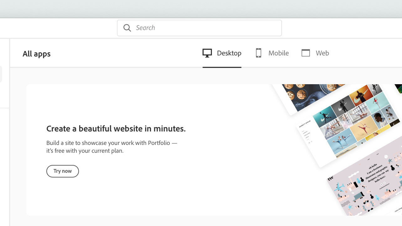
The user journey for this experiment is a bit nuanced. Users enter via a welcome email that arrives on the very first day. This email is a personal welcome from Adobe's Sr Xd Evangelist, Howard Pinsky. The primary CTA takes folks to a webpage where they'll learn to build a music app with Howard's help. Our hope was that a personal touch and very clear action might help folks - who are the most motivated to learn on their first day - to get started. On desktop, the webpage that they're guided to has download files and seven bite-sized videos arranged in very clear sections. On mobile, users are shown the four most important videos and are encouraged to try it when they're at a computer.
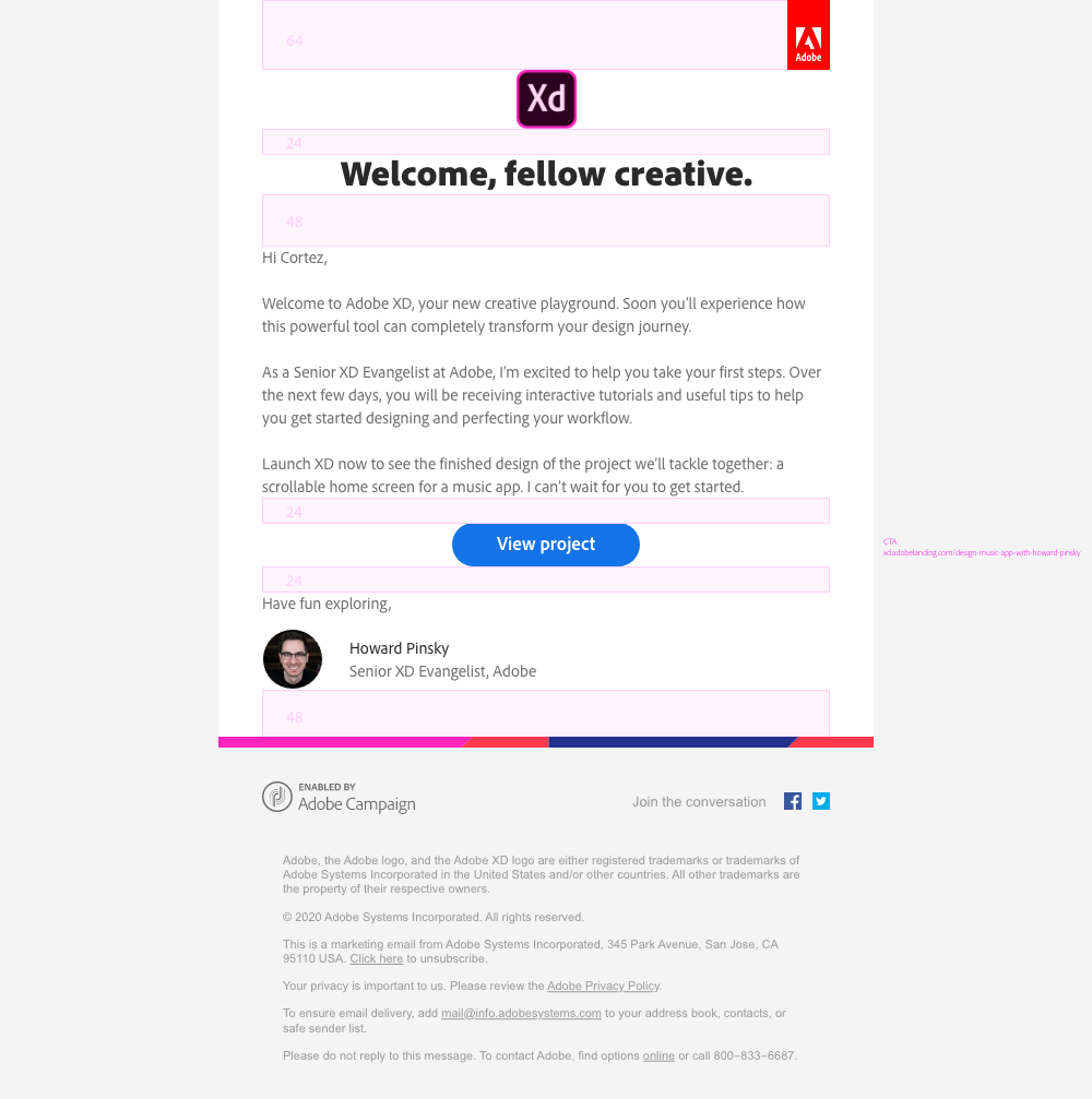
An annotated version of the first email.
Day 1: Learn
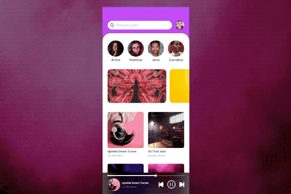
The next day, users receive an email that talks about designing a music app. Here is where the GIF shines. Since the CTA directs users to a webpage where they'll learn how to make a music app from scratch, I saw a perfect opportunity to reflect that building in the GIF. This concept was inspired by the introduction in Howard's video, which shows the app being built in 3D. The goal here is to demystify the process, allowing users to see that making a beautiful app is a collection of steps that they will undertake.
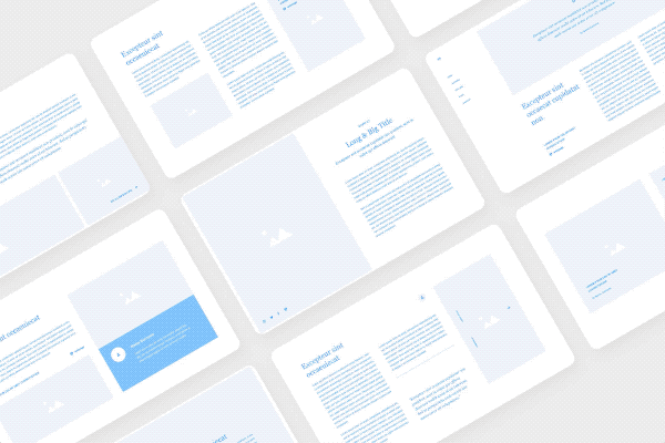
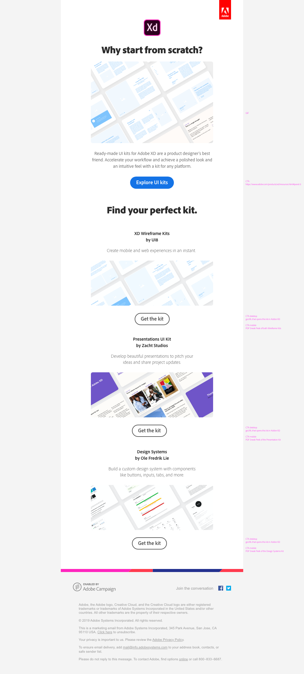
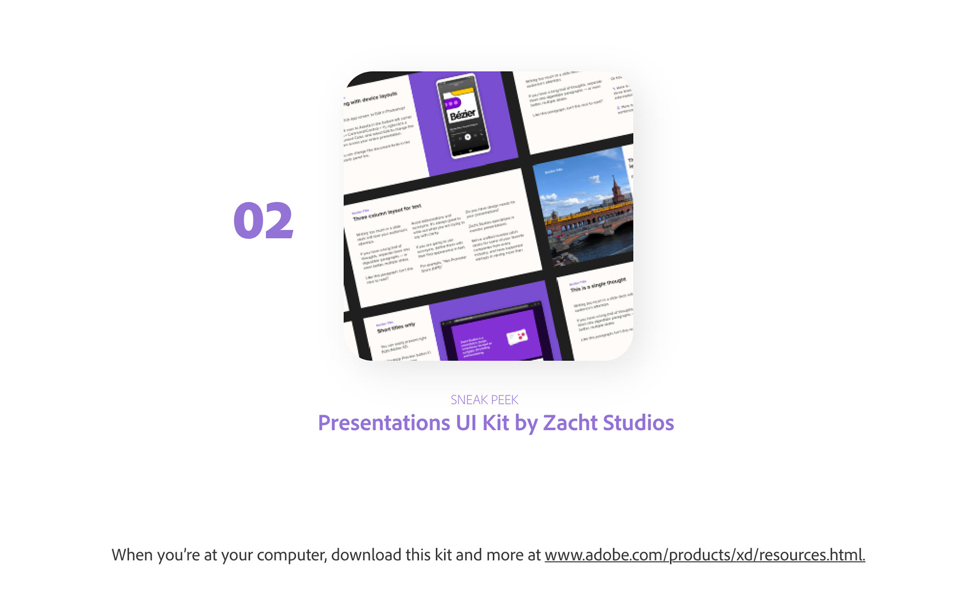
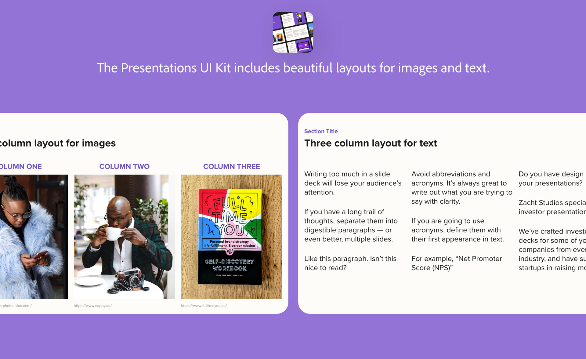
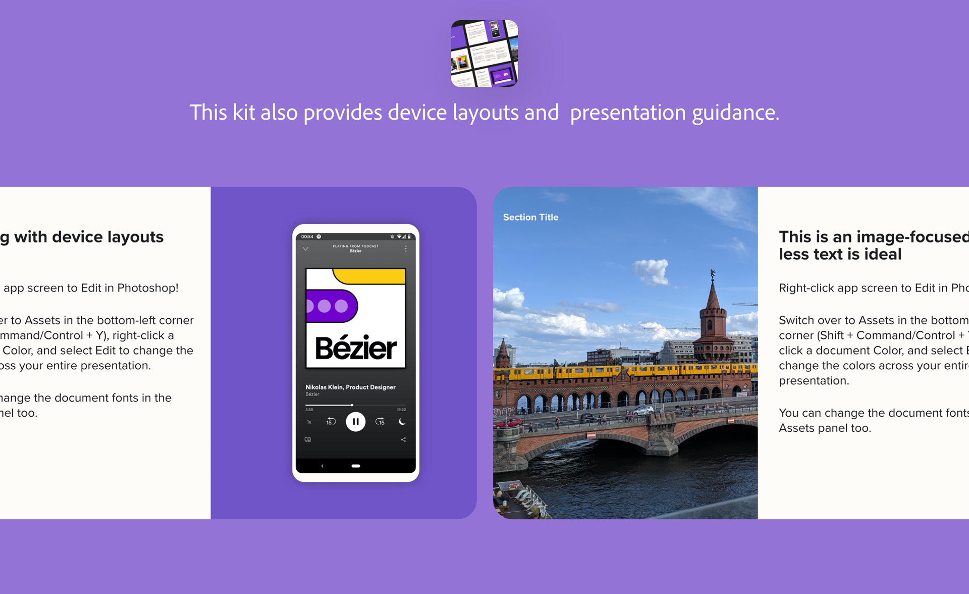
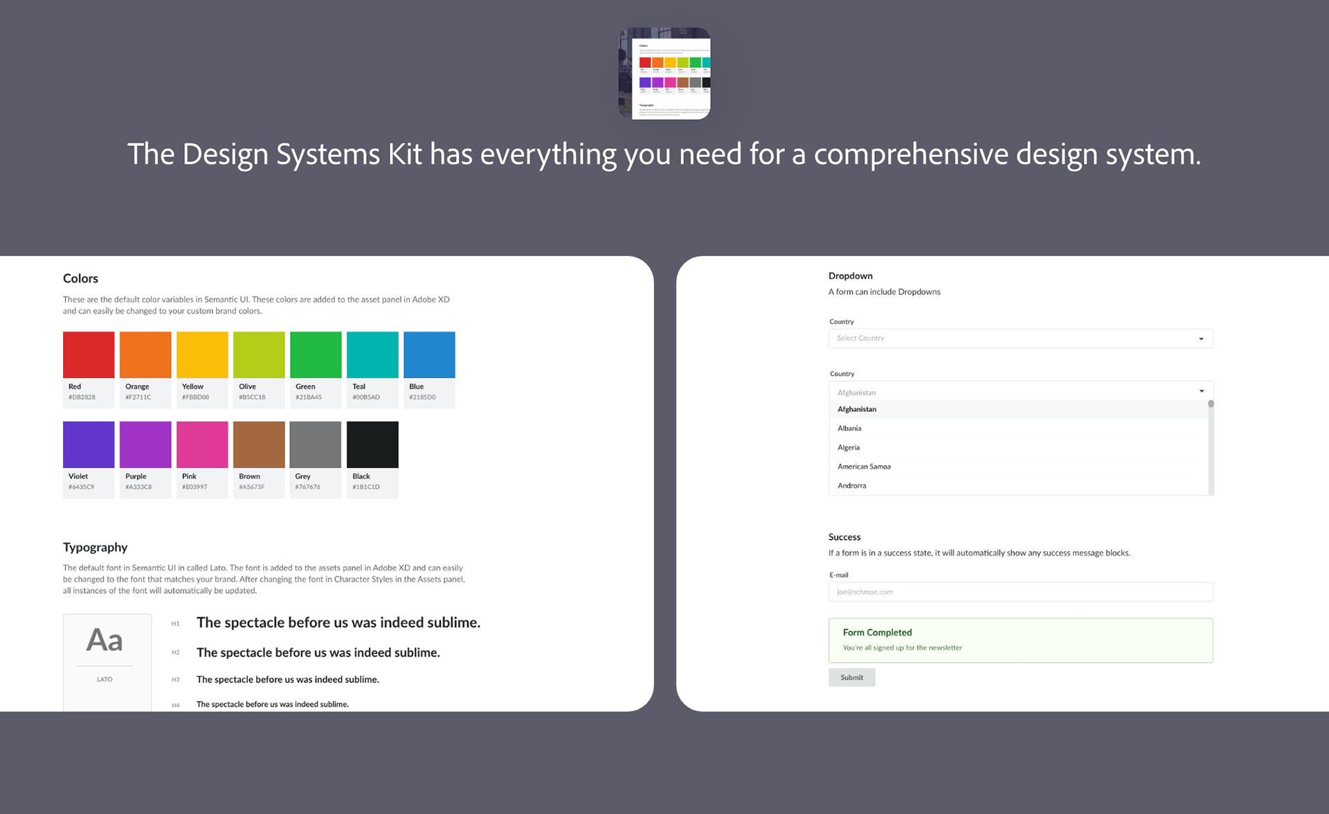
Day 5: UI Kits
Now that folks have had some time to learn with Howard, they might be more receptive to learning about timesaving features. On Day 5, towards the end of their first week, we introduce them to UI Kits. We surfaced three kits: one that focused on quick wireframes, a second on a presentation/slideshow, and a third that focused on a design kit. The breadth was carefully chosen to appeal to the mindset of newer users. As with the first email, there's a main GIF that seeks to show the versatility of these kits without being overwhelming. Additionally, each CTA is a big image with a button in an effort to keep the email short, sweet, and to the point.
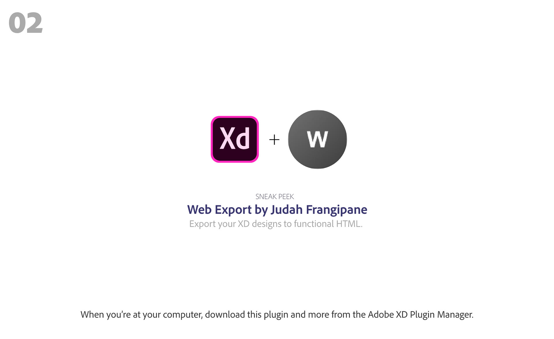
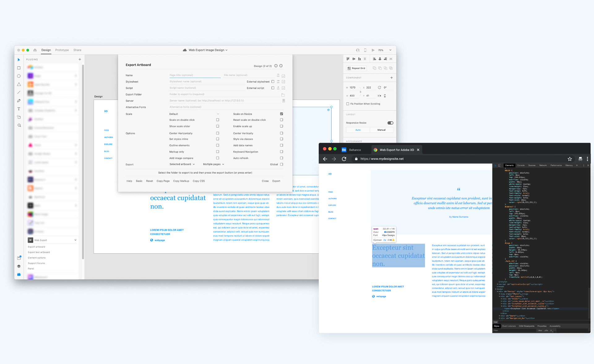
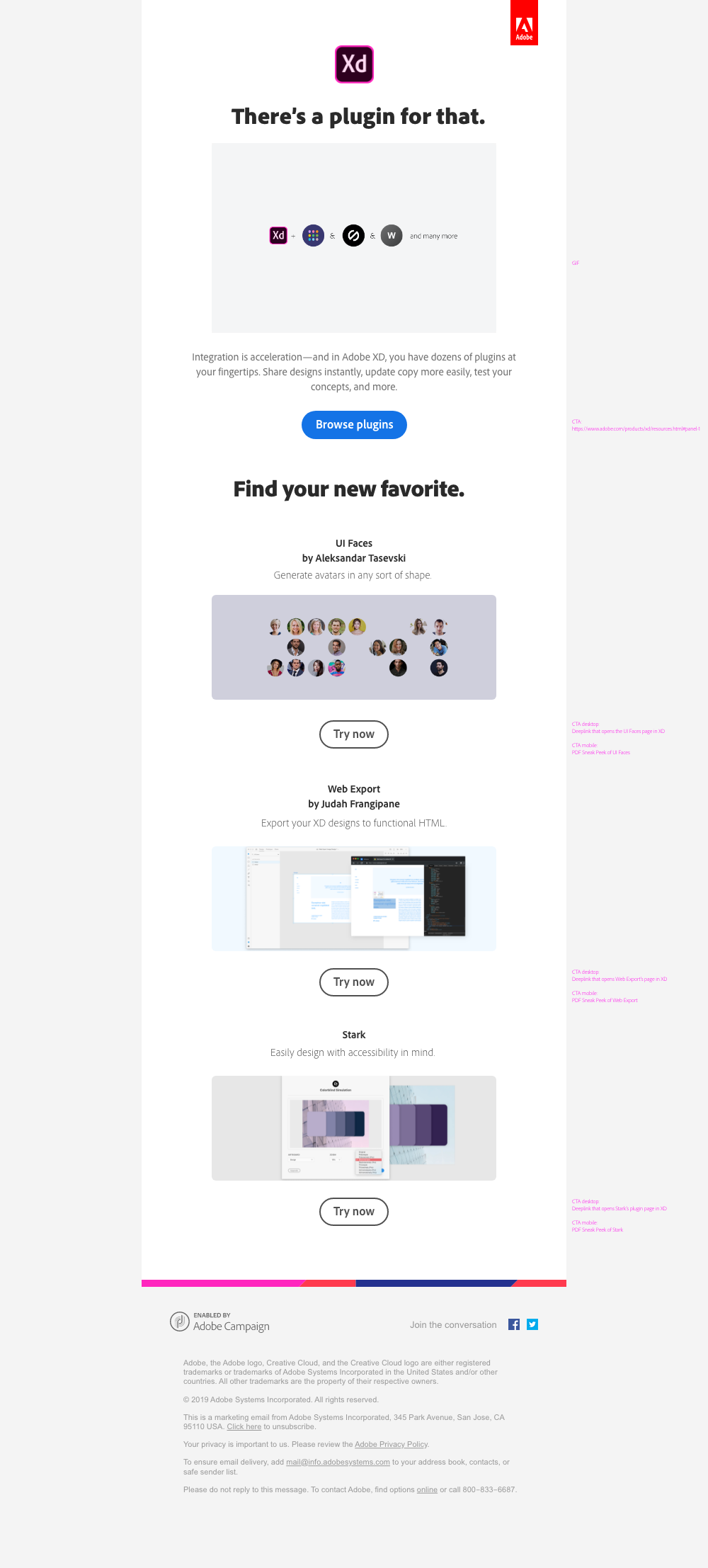
Day 7: Plugins
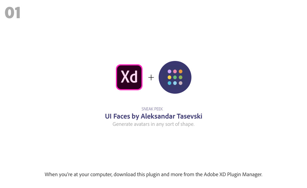
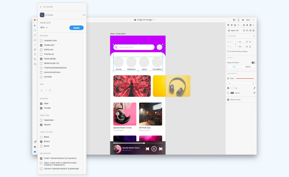
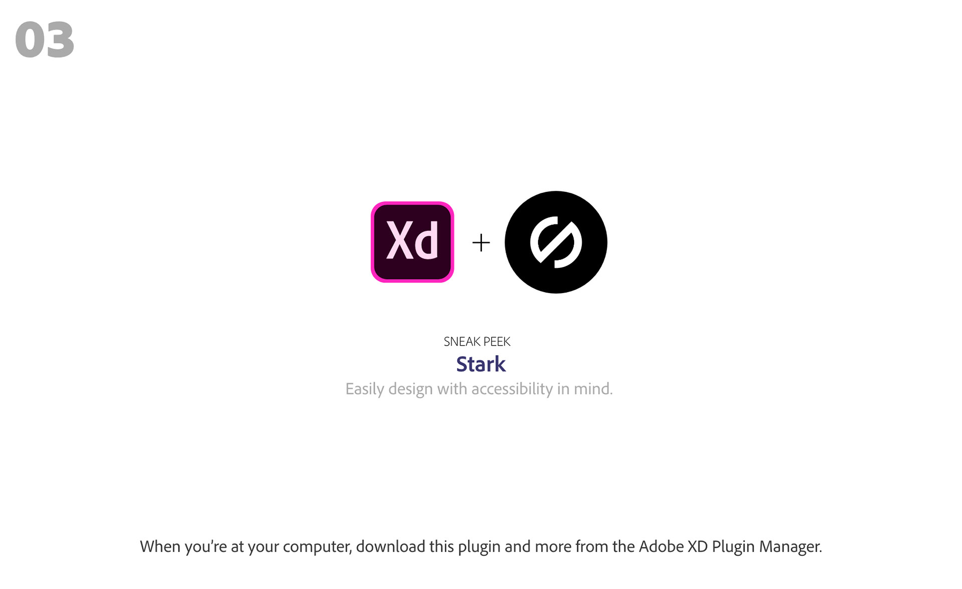
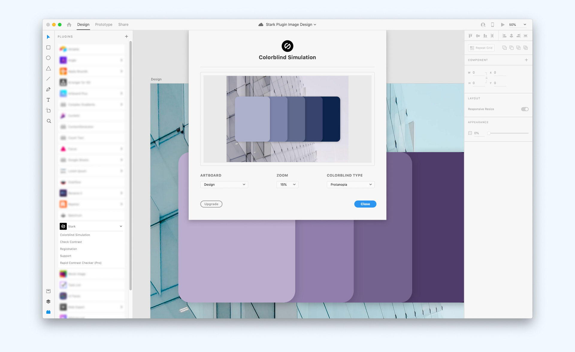
We save the more complicated email for last: plugins. Adobe Xd's plugin library is rapidly expanding, and plugins are most designers' secret weapon for supercharging workflows. We showcase three popular plugins. In the GIF, I made an attempt to show how the three plugins mentioned might work together. First, one might use UI faces for quick avatars. Then, in order to ensure accessibility, one might run their design through the contrast checker. Finally, if you're ready to go live, you can export your Xd design to code.
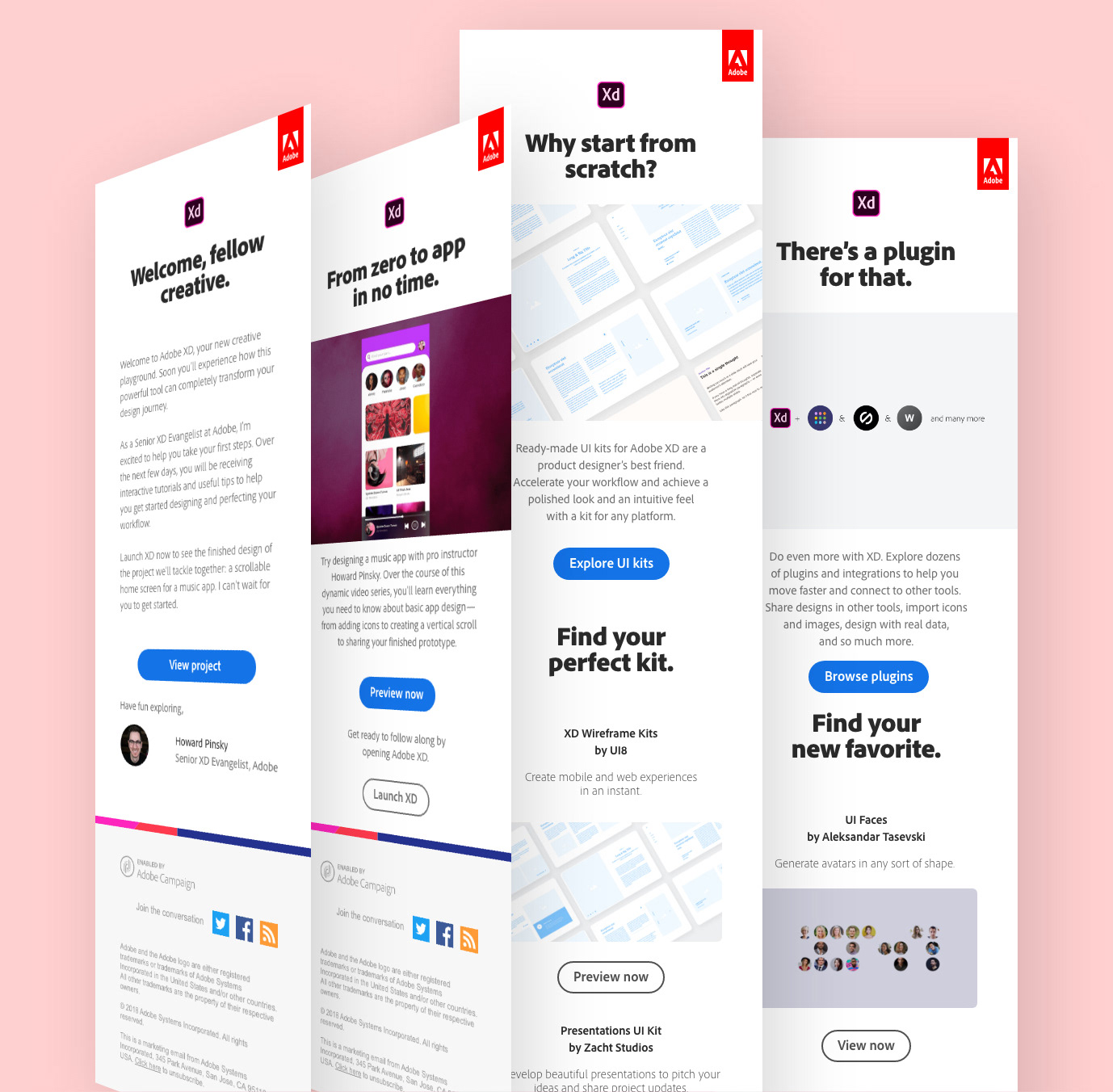
The three main emails
Video walkthrough of the four emails.
Designing for a desktop app...on mobile?
This is an issue we've run into quite often. Many of Adobe's apps are desktop-forward, with mobile versions that don't yet exist or that are very new/available for iPad. In the case of Adobe Xd, there is no mobile app that someone can learn and play with (there's just one to aid with mobile prototyping). This means that mobile interstitial experiences should be crafted to cater to those on their phones.
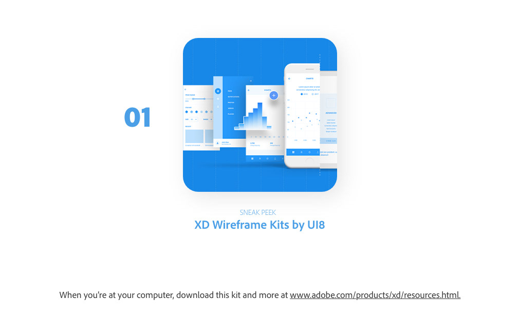
For the website, the solution was quite simple: design a mobile version of the website that includes the most important videos. For the emails, however, the default experience might be to 1. click on a link to, say, download a specific UI kit or plugin, then 2. find out that that can't be done from a phone. Additionally, the section of Adobe's website where one downloads Adobe Xd UI kits and plugins just includes a photo and a brief description; it doesn't give the user any sneak peek of what those UI kits or plugins might do.
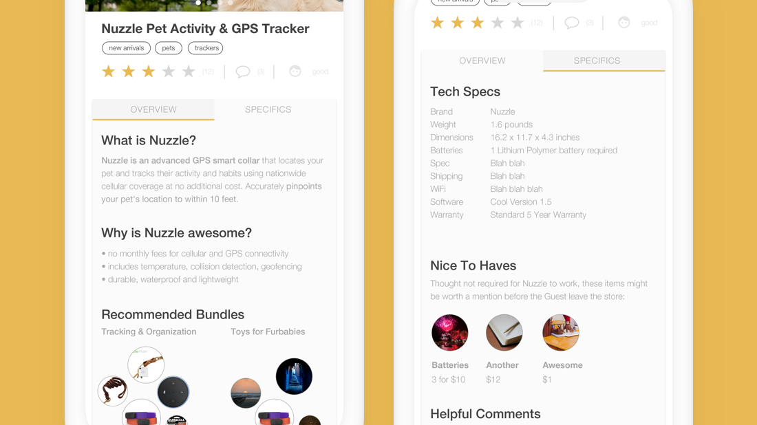
My hypothesis was that if users don't know what the plugins or kits actually do and can't experiment with them, they are very unlikely to recall them when they're back at their computer using Adobe Xd. I suggested that we include very simple PDFs for those CTAs instead of directing users to the website. The PDFs are minimal: one page saying what the kit or plugin is and another page showing what it looks like and does in the app.
Though not perfect, I believe this fallback experience is infinitely better for newer users than going to the Adobe Xd website and getting lost in a sea of options.
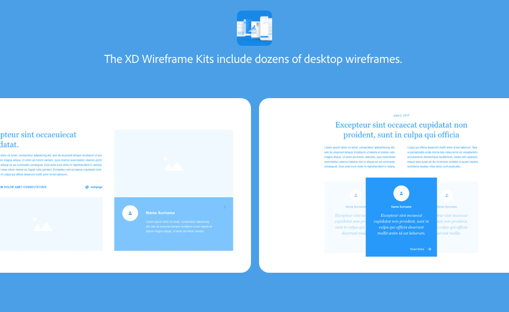
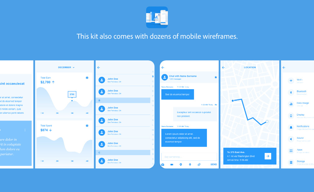
Sneak Peek PDFs for the UI Kits.
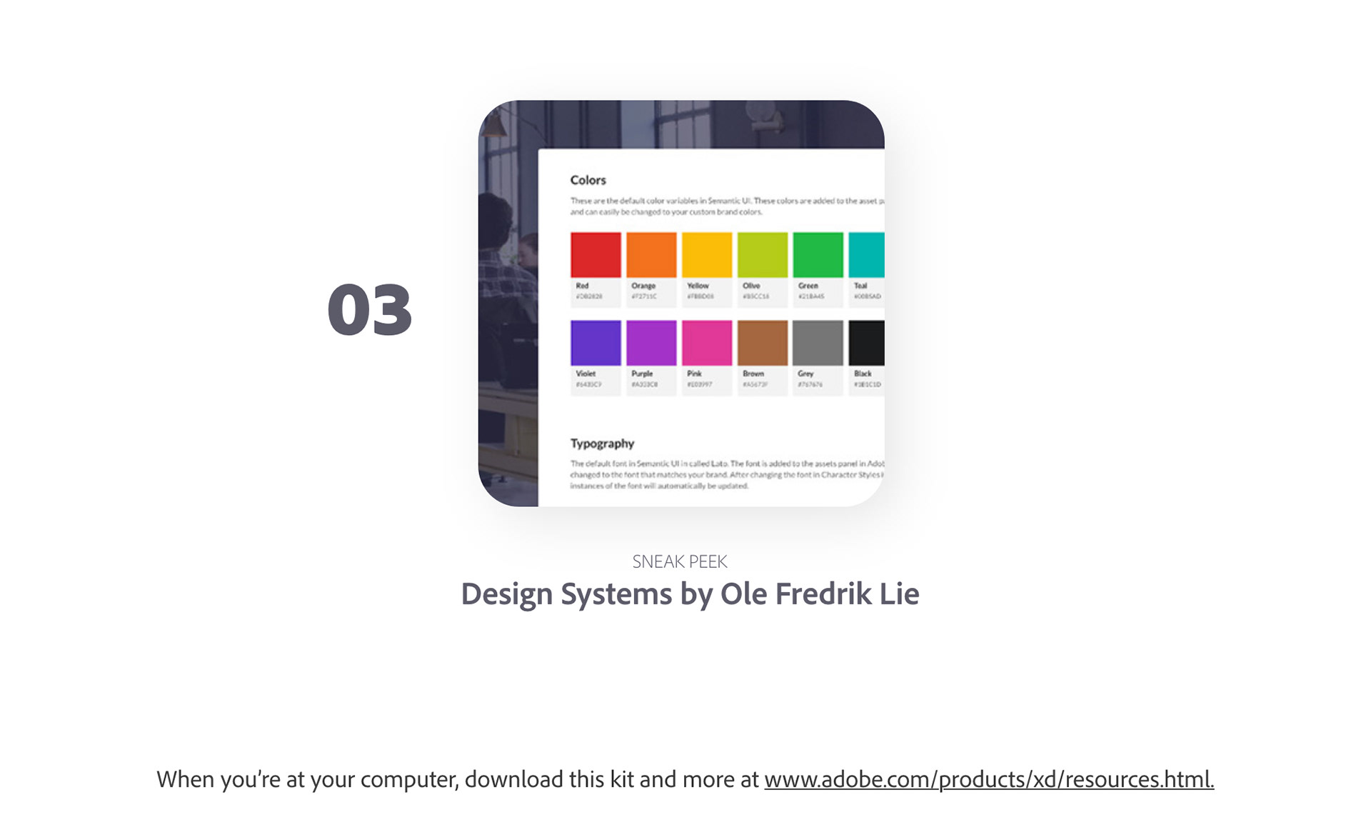
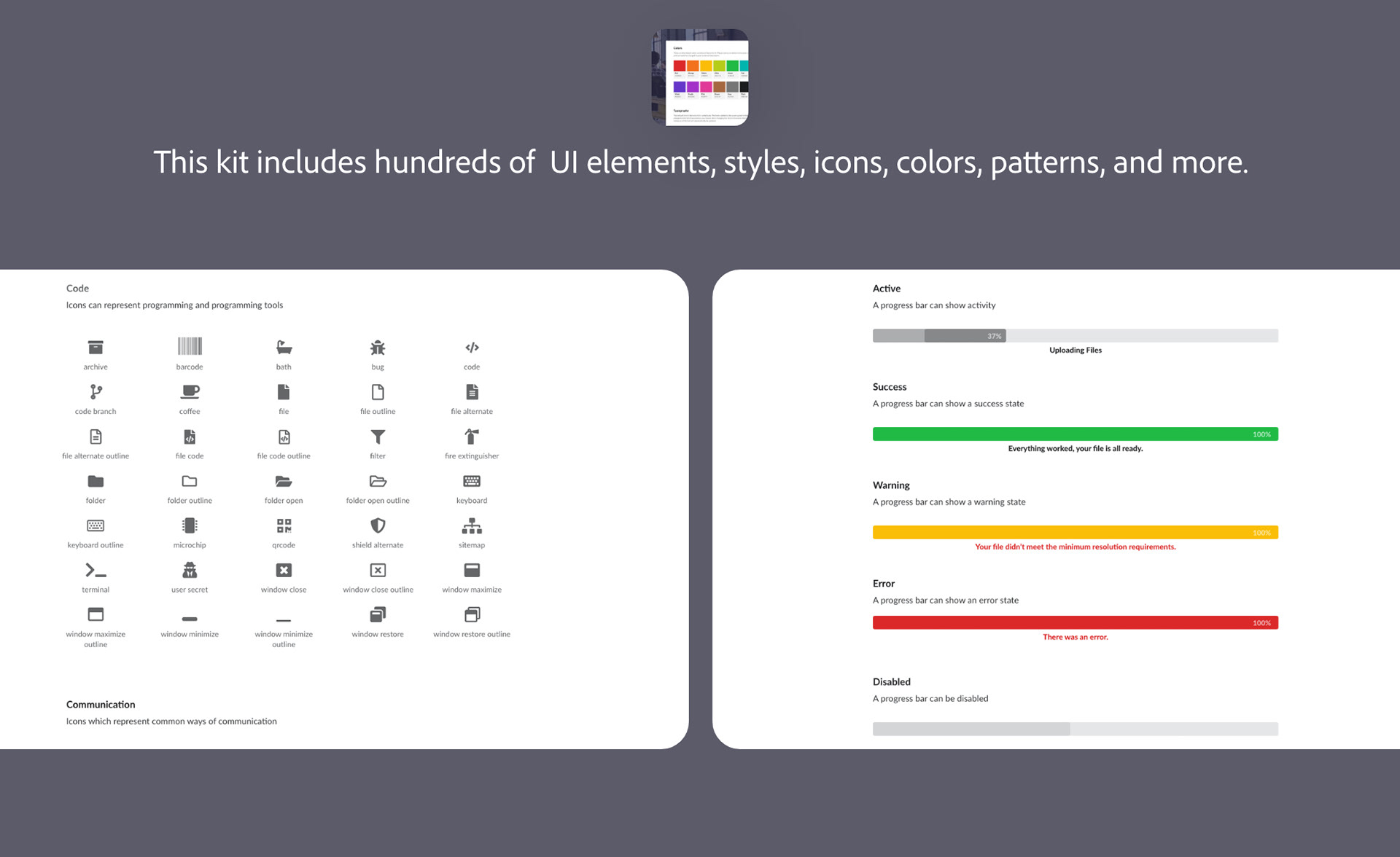
Sneak Peek PDFs for Plugins.